3.6 Random Forests
Contents
3.6 Random Forests#
1. Decision Trees#
TO ADD
2. Random Forest#
In this tutorial, we will apply random forest regression model on a set of features to predict maximum temperature on a current day. Our example dataset is obtained from NOAA (https://www.noaa.gov/) and contained one year recording of daily temperatures at Seattle in 2016.
This Jupyter notebook is modified from Will Koehrsen’s tutorial on Random Forests at towardsdatascience.
First we will download the data#
import wget
wget.download("https://docs.google.com/uc?export=download&id=1pko9oRmCllAxipZoa3aoztGZfPAD2iwj")
'temps (6).csv'
Exploring the data#
# Pandas is used for data manipulation
import pandas as pd
# Read in data and display first 5 rows
features = pd.read_csv('temps.csv')
features.head(5)
| year | month | day | week | temp_2 | temp_1 | average | actual | forecast_noaa | forecast_acc | forecast_under | friend | |
|---|---|---|---|---|---|---|---|---|---|---|---|---|
| 0 | 2016 | 1 | 1 | Fri | 45 | 45 | 45.6 | 45 | 43 | 50 | 44 | 29 |
| 1 | 2016 | 1 | 2 | Sat | 44 | 45 | 45.7 | 44 | 41 | 50 | 44 | 61 |
| 2 | 2016 | 1 | 3 | Sun | 45 | 44 | 45.8 | 41 | 43 | 46 | 47 | 56 |
| 3 | 2016 | 1 | 4 | Mon | 44 | 41 | 45.9 | 40 | 44 | 48 | 46 | 53 |
| 4 | 2016 | 1 | 5 | Tues | 41 | 40 | 46.0 | 44 | 46 | 46 | 46 | 41 |
Temp_2 : Maximum temperature on 2 days prior to today.
Temp_1: Maximum temperature on yesterday.
Average: Historical temperature average
Actual: Actual measure temperature on today.
Forecast_NOAA: Temperature values forecasted by NOAA
Friend: Forecasted by Friend (Randomly selected number within plus-minus 20 of Average temperature)
print('The shape of our features is:', features.shape)
The shape of our features is: (348, 12)
# Descriptive statistics for each column
features.describe()
| year | month | day | temp_2 | temp_1 | average | actual | forecast_noaa | forecast_acc | forecast_under | friend | |
|---|---|---|---|---|---|---|---|---|---|---|---|
| count | 348.0 | 348.000000 | 348.000000 | 348.000000 | 348.000000 | 348.000000 | 348.000000 | 348.000000 | 348.000000 | 348.000000 | 348.000000 |
| mean | 2016.0 | 6.477011 | 15.514368 | 62.652299 | 62.701149 | 59.760632 | 62.543103 | 57.238506 | 62.373563 | 59.772989 | 60.034483 |
| std | 0.0 | 3.498380 | 8.772982 | 12.165398 | 12.120542 | 10.527306 | 11.794146 | 10.605746 | 10.549381 | 10.705256 | 15.626179 |
| min | 2016.0 | 1.000000 | 1.000000 | 35.000000 | 35.000000 | 45.100000 | 35.000000 | 41.000000 | 46.000000 | 44.000000 | 28.000000 |
| 25% | 2016.0 | 3.000000 | 8.000000 | 54.000000 | 54.000000 | 49.975000 | 54.000000 | 48.000000 | 53.000000 | 50.000000 | 47.750000 |
| 50% | 2016.0 | 6.000000 | 15.000000 | 62.500000 | 62.500000 | 58.200000 | 62.500000 | 56.000000 | 61.000000 | 58.000000 | 60.000000 |
| 75% | 2016.0 | 10.000000 | 23.000000 | 71.000000 | 71.000000 | 69.025000 | 71.000000 | 66.000000 | 72.000000 | 69.000000 | 71.000000 |
| max | 2016.0 | 12.000000 | 31.000000 | 117.000000 | 117.000000 | 77.400000 | 92.000000 | 77.000000 | 82.000000 | 79.000000 | 95.000000 |
# Use datetime for dealing with dates
import datetime

# Get years, months, and days
years = features['year']
months = features['month']
days = features['day']

# List and then convert to datetime object
dates = [str(int(year)) + '-' + str(int(month)) + '-' + str(int(day)) for year, month, day in zip(years, months, days)]
dates = [datetime.datetime.strptime(date, '%Y-%m-%d') for date in dates]

# Import matplotlib for plotting and use magic command for Jupyter Notebooks
import matplotlib.pyplot as plt

%matplotlib inline

# Set the style
plt.style.use('fivethirtyeight')
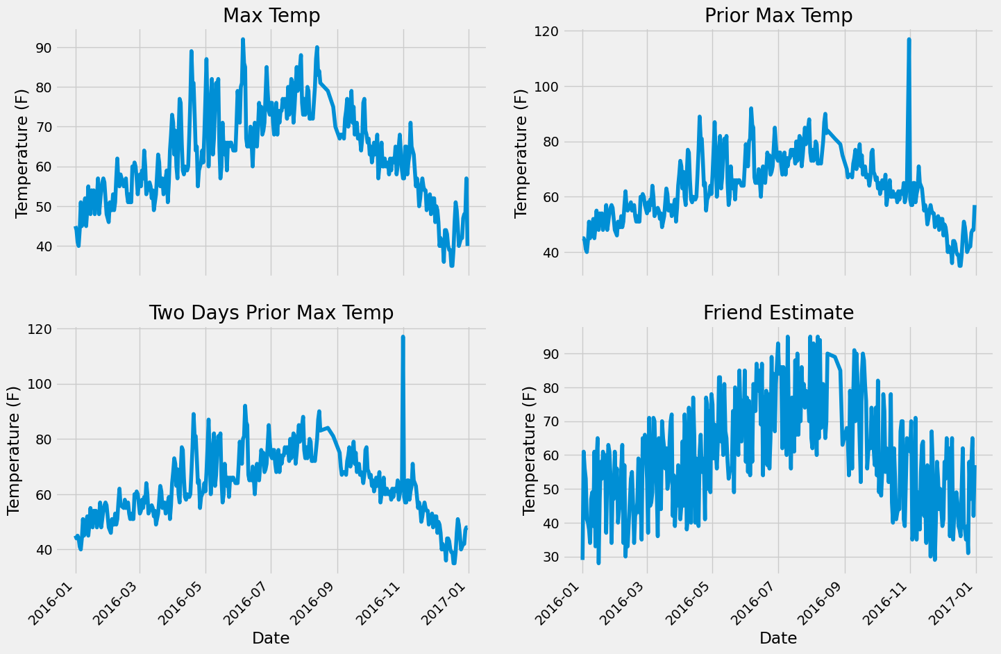
Quality Check#
Identifying anomalous patterns by visually observing their plots
# Set up the plotting layout
fig, ((ax1, ax2), (ax3, ax4)) = plt.subplots(nrows=2, ncols=2, figsize = (15,10))
fig.autofmt_xdate(rotation = 45)

# Actual max temperature measurement
ax1.plot(dates, features['actual'])
ax1.set_xlabel(''); ax1.set_ylabel('Temperature (F)'); ax1.set_title('Max Temp')

# Temperature from 1 day ago
ax2.plot(dates, features['temp_1'])
ax2.set_xlabel(''); ax2.set_ylabel('Temperature (F)'); ax2.set_title('Prior Max Temp')

# Temperature from 2 days ago
ax3.plot(dates, features['temp_2'])
ax3.set_xlabel('Date'); ax3.set_ylabel('Temperature (F)'); ax3.set_title('Two Days Prior Max Temp')

# Friend Estimate
ax4.plot(dates, features['friend'])
ax4.set_xlabel('Date'); ax4.set_ylabel('Temperature (F)'); ax4.set_title('Friend Estimate')

plt.tight_layout(pad=2)
Data Preparation#
1. One-Hot Encoding#
One-hot encoding is used to convert categorical values to numerical values. If the data was labeled from 1 to 7 for the days of the week, it would artificially assign greater importance to Sunday.
# One-hot encode the data using pandas get_dummies
features = pd.get_dummies(features)
# Display the first 5 rows of the last 12 columns
features.iloc[:,5:].head(5)
| average | actual | forecast_noaa | forecast_acc | forecast_under | friend | week_Fri | week_Mon | week_Sat | week_Sun | week_Thurs | week_Tues | week_Wed | |
|---|---|---|---|---|---|---|---|---|---|---|---|---|---|
| 0 | 45.6 | 45 | 43 | 50 | 44 | 29 | True | False | False | False | False | False | False |
| 1 | 45.7 | 44 | 41 | 50 | 44 | 61 | False | False | True | False | False | False | False |
| 2 | 45.8 | 41 | 43 | 46 | 47 | 56 | False | False | False | True | False | False | False |
| 3 | 45.9 | 40 | 44 | 48 | 46 | 53 | False | True | False | False | False | False | False |
| 4 | 46.0 | 44 | 46 | 46 | 46 | 41 | False | False | False | False | False | True | False |
2. Separating Features and Labels#
labels in this case are the actual values of temperature
# Use numpy to convert to arrays
import numpy as np
# Labels are the values we want to predict
labels = np.array(features['actual'])
# Remove the labels from the features
# axis 1 refers to the columns
features= features.drop('actual', axis = 1)
# Saving feature names for later use
feature_list = list(features.columns)
# Convert to numpy array
features = np.array(features)
3. Splitting the data randomly into Test and Training sets#
random_state = 42 ensure the similarity of the split in each iteration
# Using Skicit-learn to split data into training and testing sets
from sklearn.model_selection import train_test_split
# Split the data into training and testing sets
train_features, test_features, train_labels, test_labels = train_test_split(features, labels, test_size = 0.25, random_state = 42)
print('Training Features Shape:', train_features.shape)
print('Training Labels Shape:', train_labels.shape)
print('Testing Features Shape:', test_features.shape)
print('Testing Labels Shape:', test_labels.shape)
Training Features Shape: (261, 17)
Training Labels Shape: (261,)
Testing Features Shape: (87, 17)
Testing Labels Shape: (87,)
4. Setting up the model baseline#
# The baseline predictions are the historical averages
baseline_preds = test_features[:, feature_list.index('average')]
# Baseline errors, and display average baseline error
baseline_errors = abs(baseline_preds - test_labels)
print('Average baseline error: ', round(np.mean(baseline_errors), 2))
Average baseline error: 5.06
5. Initializing a random forest regression model#
# Import the model we are using
from sklearn.ensemble import RandomForestRegressor
# Instantiate model with 1000 decision trees
rf = RandomForestRegressor(n_estimators = 1000, random_state = 42)
# Train the model on training data
rf.fit(train_features, train_labels);
6. Assessing the performance of a model#
# Use the forest's predict method on the test data
predictions = rf.predict(test_features)
# Calculate the absolute errors
errors = abs(predictions - test_labels)
# Print out the mean absolute error (mae)
print('Mean Absolute Error:', round(np.mean(errors), 2), 'degrees.')
Mean Absolute Error: 3.87 degrees.
# Calculate mean absolute percentage error (MAPE)
mape = 100 * (errors / test_labels)
# Calculate and display accuracy
accuracy = 100 - np.mean(mape)
print('Accuracy:', round(accuracy, 2), '%.')
Accuracy: 93.93 %.
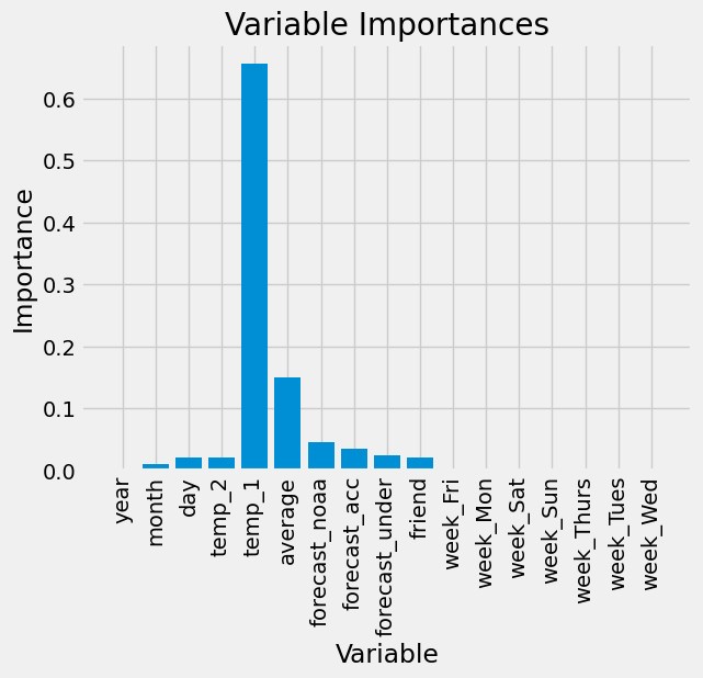
7. Computing the Feature Importances#
# Get numerical feature importances
importances = list(rf.feature_importances_)
# List of tuples with variable and importance
feature_importances = [(feature, round(importance, 2)) for feature, importance in zip(feature_list, importances)]
# Sort the feature importances by most important first
feature_importances = sorted(feature_importances, key = lambda x: x[1], reverse = True)
# Print out the feature and importances
[print('Variable: {:20} Importance: {}'.format(*pair)) for pair in feature_importances];
Variable: temp_1               Importance: 0.66
Variable: average              Importance: 0.15
Variable: forecast_noaa        Importance: 0.05
Variable: forecast_acc         Importance: 0.03
Variable: day                  Importance: 0.02
Variable: temp_2               Importance: 0.02
Variable: forecast_under       Importance: 0.02
Variable: friend               Importance: 0.02
Variable: month                Importance: 0.01
Variable: year                 Importance: 0.0
Variable: week_Fri             Importance: 0.0
Variable: week_Mon             Importance: 0.0
Variable: week_Sat             Importance: 0.0
Variable: week_Sun             Importance: 0.0
Variable: week_Thurs           Importance: 0.0
Variable: week_Tues            Importance: 0.0
Variable: week_Wed             Importance: 0.0
# New random forest with only the two most important variables
rf_most_important = RandomForestRegressor(n_estimators= 1000, random_state=42)
# Extract the two most important features
important_indices = [feature_list.index('temp_1'), feature_list.index('average')]
train_important = train_features[:, important_indices]
test_important = test_features[:, important_indices]
# Train the random forest
rf_most_important.fit(train_important, train_labels)
# Make predictions and determine the error
predictions = rf_most_important.predict(test_important)
errors = abs(predictions - test_labels)
# Display the performance metrics
print('Mean Absolute Error:', round(np.mean(errors), 2), 'degrees.')
mape = np.mean(100 * (errors / test_labels))
accuracy = 100 - mape
print('Accuracy:', round(accuracy, 2), '%.')
Mean Absolute Error: 3.92 degrees.
Accuracy: 93.76 %.
# Import matplotlib for plotting and use magic command for Jupyter Notebooks
import matplotlib.pyplot as plt
%matplotlib inline
# Set the style
plt.style.use('fivethirtyeight')
# list of x locations for plotting
x_values = list(range(len(importances)))
# Make a bar chart
plt.bar(x_values, importances, orientation = 'vertical')
# Tick labels for x axis
plt.xticks(x_values, feature_list, rotation='vertical')
# Axis labels and title
plt.ylabel('Importance'); plt.xlabel('Variable'); plt.title('Variable Importances');
# Use datetime for creating date objects for plotting
import datetime
# Dates of training values
months = features[:, feature_list.index('month')]
days = features[:, feature_list.index('day')]
years = features[:, feature_list.index('year')]
# List and then convert to datetime object
dates = [str(int(year)) + '-' + str(int(month)) + '-' + str(int(day)) for year, month, day in zip(years, months, days)]
dates = [datetime.datetime.strptime(date, '%Y-%m-%d') for date in dates]
# Dataframe with true values and dates
true_data = pd.DataFrame(data = {'date': dates, 'actual': labels})
# Dates of predictions
months = test_features[:, feature_list.index('month')]
days = test_features[:, feature_list.index('day')]
years = test_features[:, feature_list.index('year')]
# Column of dates
test_dates = [str(int(year)) + '-' + str(int(month)) + '-' + str(int(day)) for year, month, day in zip(years, months, days)]
# Convert to datetime objects
test_dates = [datetime.datetime.strptime(date, '%Y-%m-%d') for date in test_dates]
# Dataframe with predictions and dates
predictions_data = pd.DataFrame(data = {'date': test_dates, 'prediction': predictions})
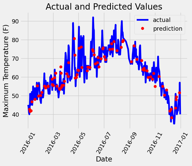
# Plot the actual values
plt.plot(true_data['date'], true_data['actual'], 'b-', label = 'actual')
# Plot the predicted values
plt.plot(predictions_data['date'], predictions_data['prediction'], 'ro', label = 'prediction')
plt.xticks(rotation = 60);
plt.legend()
# Graph labels
plt.xlabel('Date'); plt.ylabel('Maximum Temperature (F)'); plt.title('Actual and Predicted Values');
# Make the data accessible for plotting
true_data['temp_1'] = features[:, feature_list.index('temp_1')]
true_data['average'] = features[:, feature_list.index('average')]
true_data['friend'] = features[:, feature_list.index('friend')]
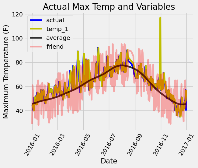
# Plot all the data as lines
plt.plot(true_data['date'], true_data['actual'], 'b-', label = 'actual', alpha = 1.0)
plt.plot(true_data['date'], true_data['temp_1'], 'y-', label = 'temp_1', alpha = 1.0)
plt.plot(true_data['date'], true_data['average'], 'k-', label = 'average', alpha = 0.8)
plt.plot(true_data['date'], true_data['friend'], 'r-', label = 'friend', alpha = 0.3)
# Formatting plot
plt.legend(); plt.xticks(rotation = 60);
# Labels and title
plt.xlabel('Date'); plt.ylabel('Maximum Temperature (F)'); plt.title('Actual Max Temp and Variables');