Data have natural variability. Any statistic we compute from a sample (a mean, a correlation, a regression slope) inherits that variability.
Resampling methods let us measure it. Broadly, resampling refers to any technique where we repeatedly draw observations from a sample, recompute a statistic on each draw, and study the distribution of results. Applications include hypothesis testing, uncertainty propagation, and confidence intervals.
The lesson has three levels. Level 1 walks through three basic resampling techniques: randomization, bootstrapping, and Monte Carlo. Level 2 applies the bootstrap to model inference for a linear regression, first on synthetic GNSS data with a known answer, then on real GNSS data from the Cascadia subduction zone. Level 3 turns to the other meaning of resampling — changing the sampling of a signal: downsampling without aliasing, interpolating gaps under an explicit policy, aggregating irregular station networks, and the block bootstrap for correlated noise.
First, import the modules we need:
import os
import requests
import matplotlib.pyplot as plt
import numpy as np
import pandas as pd
import mlgeo_synth
A note on random numbers. Older NumPy code seeds the global random state with np.random.seed(42) and then calls functions like np.random.normal. Modern NumPy replaces this with an explicit generator object: rng = np.random.default_rng(42). The generator carries its own state, so different parts of a program (or a notebook) do not interfere with each other through a hidden global. We use the generator idiom throughout this book. Fixing the seed makes the notebook reproducible from top to bottom.
# One generator for the whole notebook, with a fixed seed for reproducibility.
rng = np.random.default_rng(42)
rng
Generator(PCG64) at 0x7F778A713BC01. Examples of resampling techniques (Level 1)
1.1 Randomization
Given two datasets, and , and a parameter, , we can randomly reassign observations to either or , calculate some statistic (e.g., ), and repeat to build a distribution of that statistic under the null hypothesis that group labels do not matter.
# We begin with two datasets, A and B
A = rng.normal(5, 2.5, 100)
B = rng.normal(5.5, 2.5, 100)

# We then calculate the means of each dataset
mean_A = np.mean(A)
mean_B = np.mean(B)

print(f'The means of A and B are {mean_A:.3f} and {mean_B:.3f}, respectively.')

# And, for the sake of illustration, also calculate the difference between these means
diff_means = mean_A - mean_B
print(f'The difference of means is {diff_means:.3f}.')
The means of A and B are 4.874 and 5.473, respectively.
The difference of means is -0.599.
Now, we resample.
# First, how many times do we want to resample?
number_runs = 10000

# Next, we create an array that will store the difference of means
array_of_diffs = np.zeros(number_runs)

# To ease computational burden, declare some variables:
# a combined list of A and B, and the length of A
combined = np.concatenate((A, B))
length_A = len(A)
For each run, we shuffle the combined data, split it into two new groups of the original sizes, and recalculate the difference of means.
for i in range(number_runs):
    # Shuffle the combined list. Note that shuffle works in place!
    rng.shuffle(combined)
    # Split the list into A and B, maintaining their original sizes.
    new_A = combined[0:length_A]
    new_B = combined[length_A:len(combined)]
    # Calculate and store a difference of means
    array_of_diffs[i] = np.mean(new_A) - np.mean(new_B)
# Plot the array of diffs
plt.hist(array_of_diffs, color='black')
# Given an alpha of 0.05, can we accept or reject the null hypothesis of no difference in means?
alpha = 0.05
lower_critical_value = np.quantile(array_of_diffs, alpha / 2)
upper_critical_value = np.quantile(array_of_diffs, 1 - (alpha / 2))
# Plot the critical values and the observed value
plt.axvline(x=diff_means, color='r')
plt.axvline(x=lower_critical_value, color='g')
plt.axvline(x=upper_critical_value, color='b')
plt.xlabel('Difference of means')
plt.ylabel('Count')
plt.legend(['Observed difference of means', 'Lower critical value', 'Upper critical value'],
loc='center left', bbox_to_anchor=(1, 0.5))
plt.show()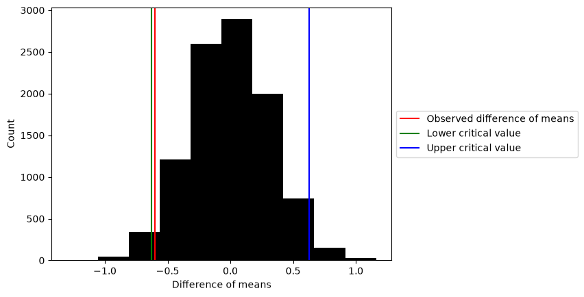
1.2 Bootstrapping
When bootstrapping, you repeatedly draw observations, with replacement, from a sample. Each bootstrap resample has the same size as the original sample. Because you draw with replacement, a resample will contain duplicate observations and omit others. The spread of the statistic across resamples estimates the sampling uncertainty of that statistic.
Bootstrapping does not make strong assumptions about the underlying distribution of the data.
We first create a synthetic “true population” of correlated data using the generator method multivariate_normal (docs here). The mean of both variables is zero and their covariance is -0.75.
# A population where two variables are strongly anticorrelated
correlated_data = rng.multivariate_normal([0, 0], [[1, -0.75], [-0.75, 1]], 1000)
Check that the data is indeed anticorrelated by plotting one variable against the other.
plt.scatter(correlated_data[:, 0], correlated_data[:, 1], marker='x', c='black')
plt.xlabel('X')
plt.ylabel('Y')
plt.legend(['Observation'])
plt.show()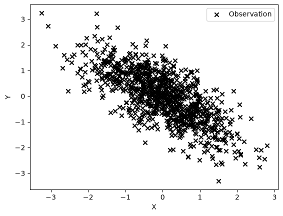
We verify that the Pearson correlation coefficient is close to our target using the numpy function corrcoef.
correlation_matrix = np.corrcoef(correlated_data[:, 0], correlated_data[:, 1])
print(f'The population correlation coefficient is {correlation_matrix[0, 1]:.3f}.')
The population correlation coefficient is -0.721.
In practice we never observe the full population. We now take a small subset of the data --- think of the subset as the sample we actually collected.
nsubset = 50
subset = rng.choice(correlated_data, size=nsubset, replace=False)

# Report the correlation coefficient of the sample
sample_corr = np.corrcoef(subset[:, 0], subset[:, 1])[0, 1]
print(f'The correlation coefficient of our sample is {sample_corr:.3f}.')

# Plot both the population and our sample
plt.scatter(correlated_data[:, 0], correlated_data[:, 1], marker='x', c='black')
plt.scatter(subset[:, 0], subset[:, 1], c='red')
plt.xlabel('X')
plt.ylabel('Y')
plt.legend(['True population', 'Sample'])
plt.show()
The correlation coefficient of our sample is -0.619.
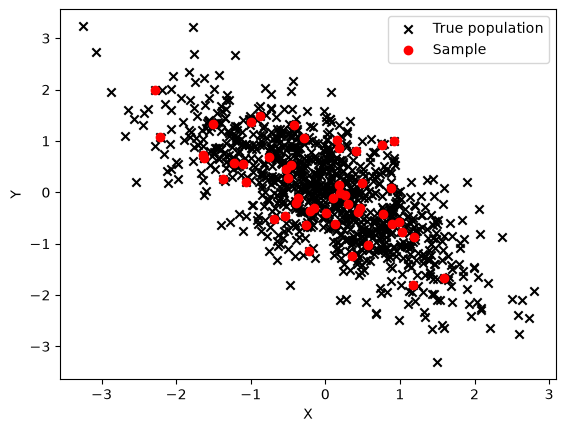
Now we bootstrap. Each resample draws len(subset) pairs from the sample itself, with replacement. The resample size matches the original sample size: that is what makes the spread of the resampled statistic mimic the sampling variability of the original estimate.
number_runs = 1000

# Array to record the correlation coefficient of each resample
corr_coef_collector = np.zeros(number_runs)

# The bootstrap resample size equals the original sample size.
length_sub = len(subset)

for i in range(number_runs):
    # Draw length_sub pairs from the sample, WITH REPLACEMENT
    new_pairs = rng.choice(subset, size=length_sub, replace=True)
    corr_coef_collector[i] = np.corrcoef(new_pairs[:, 0], new_pairs[:, 1])[0, 1]

# Plot the bootstrap distribution
plt.hist(corr_coef_collector, color='black')
plt.xlabel('Correlation coefficient')
plt.ylabel('Count')

plt.axvline(x=correlation_matrix[0, 1], color='red')
plt.axvline(x=sample_corr, color='orange')
plt.axvline(x=np.median(corr_coef_collector), color='blue')
plt.legend(['True correlation coefficient', 'Sample correlation coefficient',
            'Median of bootstrap estimates'])
plt.show()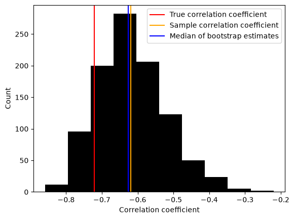
The median of the bootstrap estimates sits near the sample correlation coefficient, not the true population value. The bootstrap cannot fix the bias of a small sample; it quantifies the uncertainty around the estimate you have.
What happens if you increase the size of the original sample?
What if the resample size differs from the sample size?
The bootstrap is defined with resample size equal to the sample size. As an experiment, we deliberately break that rule and vary the resample size. Watch the spread of the bootstrap distribution.
resample_sizes = [10, 25, 50, 200]  # 50 is the actual sample size

fig, ax = plt.subplots(figsize=(8, 4))
for m in resample_sizes:
    stats_m = np.zeros(number_runs)
    for i in range(number_runs):
        new_pairs = rng.choice(subset, size=m, replace=True)
        stats_m[i] = np.corrcoef(new_pairs[:, 0], new_pairs[:, 1])[0, 1]
    ax.hist(stats_m, bins=30, histtype='step', lw=2,
            label=f'resample size {m}, std {np.std(stats_m):.3f}')

ax.axvline(sample_corr, color='k', ls='--', label='sample correlation')
ax.set_xlabel('Correlation coefficient')
ax.set_ylabel('Count')
ax.legend()
plt.show()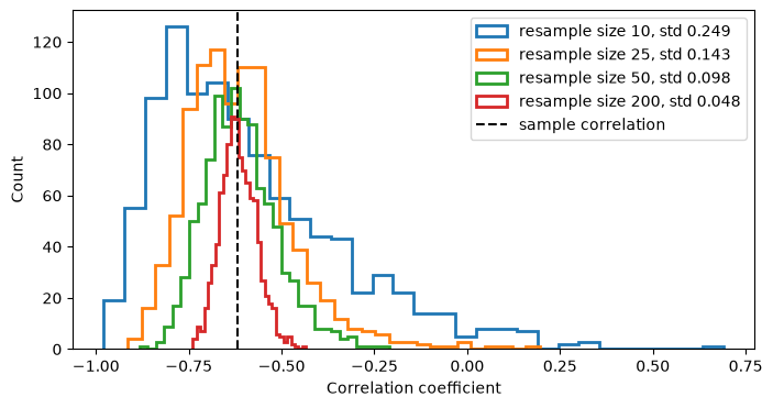
Smaller resamples produce a wider spread of the statistic: a correlation estimated from 10 pairs is noisier than one estimated from 50. Resamples larger than the sample produce a spread that is too narrow, which understates the true uncertainty. Only a resample size equal to the original sample size reproduces the sampling variability of the estimate you actually made.
1.3 Monte Carlo
Named after the casino in Monaco, Monte Carlo methods involve simulating new data based on a known (or assumed!) statistical model. Unlike the previous two examples, we do not take draws from an existing sample.
Monte Carlo techniques have many applications: probabilistic risk assessment, uncertainty propagation in models, and evaluation of systems too complicated for closed-form analysis.
Here, we demonstrate Monte Carlo sampling by estimating π.
We begin with a central conceit: the ratio of the area of a circle to the area of its bounding square is .
We then imagine a circle of radius 1 inscribed within a square with sides going from -1 to 1.
# We draw (x, y) points from a *uniform* distribution and determine whether each point
# sits within the circle. Every point lands in the square; only some land in the circle.
in_circle = np.empty([0, 2])
in_square = np.empty([0, 2])

# Generate the samples. Keep the number small at first.
number_runs = 50

for _ in range(number_runs):  # note that _ avoids creating a loop variable we never use
    x = rng.uniform(low=-1, high=1)
    y = rng.uniform(low=-1, high=1)
    # How far is this point from the origin?
    origin_dist = x**2 + y**2
    # If origin_dist is less than 1, the point is inside the circle
    if origin_dist <= 1:
        in_circle = np.append(in_circle, [[x, y]], axis=0)
    in_square = np.append(in_square, [[x, y]], axis=0)
# Visualize what we just did
plt.scatter(in_square[:, 0], in_square[:, 1], marker='x', c='black')
plt.scatter(in_circle[:, 0], in_circle[:, 1], marker='o', c='red')
plt.xlabel('X coordinate')
plt.ylabel('Y coordinate')
plt.legend(['Points in square', 'Points in circle'], loc='center left', bbox_to_anchor=(1, 0.5))
ax = plt.gca()
ax.set_aspect('equal', adjustable='box')
plt.show()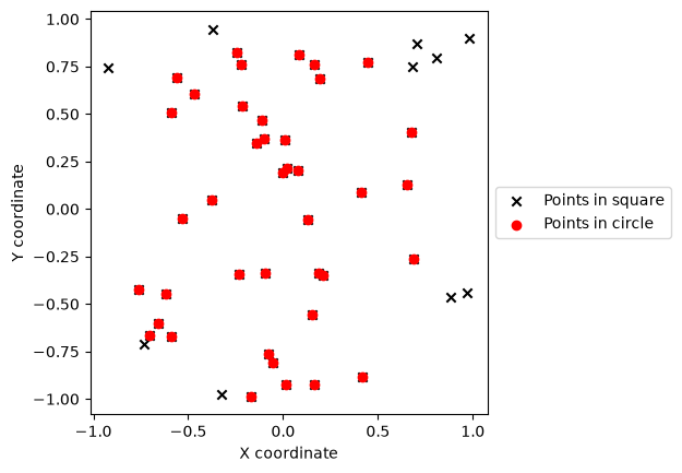
We now estimate π using the counts of points in the circle and in the square as approximations to their areas.
pi_est = 4 * (len(in_circle) / len(in_square))
print(f'We estimate the value of pi to be: {pi_est}.')
We estimate the value of pi to be: 3.2.
With a few runs, we do not get a good answer.
A Monte Carlo approach needs more runs to converge.
Explore how changing the number of runs changes your estimate of π (and how your calculation converges).
2. Using resampling for robust model inference (Level 2)
The plan: fit a linear trend to GNSS position data and use the bootstrap to put an uncertainty on the slope (the plate velocity). We start with a synthetic series, where we know the true velocity, so we can compare the bootstrap distribution against the right answer. Then we repeat the analysis on real data from station P395 in the Pacific Northwest.
2.1 Synthetic GNSS series with a known velocity
The helper mlgeo_synth.gnss_series builds a synthetic daily GNSS displacement series with a known ground truth: a linear trend, seasonal cycles, and realistic noise (white, flicker, and random walk). We set the true velocity to 12 mm/yr.
true_velocity = 12.0  # mm/yr, our ground truth

gnss = mlgeo_synth.gnss_series(n_years=10, velocity_mm_yr=true_velocity, seed=42)
gnss.head()# Time in years since the first sample
t_syn = (gnss['date'] - gnss['date'].iloc[0]).dt.days / 365.25
d_syn = gnss['disp_mm']
plt.plot(t_syn, d_syn, lw=0.5, label='synthetic displacement')
plt.plot(t_syn, gnss['trend_mm'], 'r', label='true trend (12 mm/yr)')
plt.xlabel('Time (years)')
plt.ylabel('Displacement (mm)')
plt.legend()
plt.show()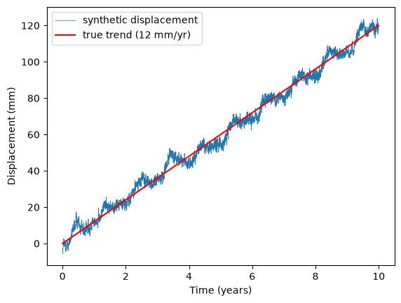
Fit a straight line with scipy.stats.linregress. The slope is our velocity estimate.
from scipy import stats

fit = stats.linregress(t_syn, d_syn)
print(f'Estimated velocity: {fit.slope:.3f} mm/yr (true value: {true_velocity} mm/yr)')
Estimated velocity: 11.838 mm/yr (true value: 12.0 mm/yr)
The point estimate is close to the truth, but how confident should we be? Bootstrap: resample the (time, displacement) pairs with replacement --- resample size equal to the data length --- refit the line each time, and collect the slopes.
k = 1000
n_syn = len(t_syn)
t_arr = t_syn.to_numpy()
d_arr = d_syn.to_numpy()

vel_syn = np.zeros(k)
for j in range(k):
    ii = rng.integers(0, n_syn, size=n_syn)  # indices drawn with replacement
    vel_syn[j] = stats.linregress(t_arr[ii], d_arr[ii]).slope

print(f'Bootstrap mean velocity: {np.mean(vel_syn):.3f} mm/yr, '
      f'standard deviation: {np.std(vel_syn):.3f} mm/yr')

plt.hist(vel_syn, bins=30, color='black')
plt.axvline(true_velocity, color='red', label='true velocity')
plt.axvline(np.mean(vel_syn), color='orange', label='bootstrap mean')
plt.xlabel('Velocity (mm/yr)')
plt.ylabel('Count')
plt.legend()
plt.show()
Bootstrap mean velocity: 11.838 mm/yr, standard deviation: 0.019 mm/yr
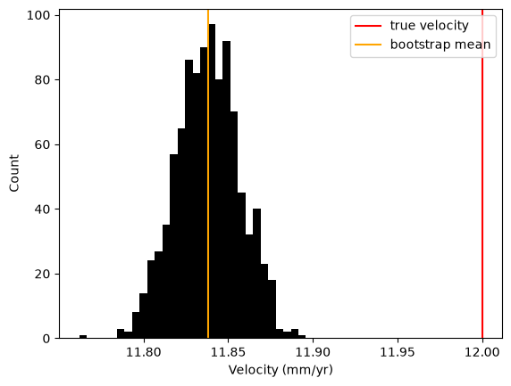
Two things to notice.
First, the bootstrap distribution is centered on the estimated slope, not on the truth. The bootstrap quantifies the variability of the estimator; it cannot remove the offset between the estimate and the true velocity that this particular noise realization produced.
Second, the distribution is very narrow --- and the true velocity sits several bootstrap standard deviations away from its center. The error bar is too small. The reason: resampling pairs treats the residuals as independent, but GNSS noise is time-correlated (flicker and random walk). The pair bootstrap therefore understates the true uncertainty. More advanced schemes (block bootstrap) resample contiguous chunks of the series to preserve the correlation. Having the ground truth is what exposed this: with real data alone, the tight histogram would have looked reassuring.
2.2 Plate motion from real geodetic data
Now the real thing. We use a GNSS time series from station P395 in the Pacific Northwest and estimate the long-term motion due to the Cascadia subduction zone.
We download the time series from the University of Nevada, Reno data center. The tenv3 file is whitespace-delimited with one header line. The columns we need are the decimal year (yyyy.yyyy) and the east, north, and up positions in meters (__east(m), _north(m), ____up(m)).
sta = "P395"
url = f"https://geodesy.unr.edu/gps_timeseries/IGS20/tenv3/IGS20/{sta}.tenv3"
print(url)

os.makedirs('data', exist_ok=True)
fname = f'data/{sta}.tenv3'
r = requests.get(url, timeout=60)
r.raise_for_status()
with open(fname, 'wb') as f:
    f.write(r.content)

# Whitespace-delimited file; the first line is the header.
df = pd.read_csv(fname, sep=r'\s+')
df.head()
https://geodesy.unr.edu/gps_timeseries/IGS20/tenv3/IGS20/P395.tenv3
# Keep only the columns we need and give them simpler names.
df = df[['yyyy.yyyy', '__east(m)', '_north(m)', '____up(m)']].rename(
    columns={'yyyy.yyyy': 'decimal year',
             '__east(m)': 'delta e (m)',
             '_north(m)': 'delta n (m)',
             '____up(m)': 'delta v (m)'})

# Drop rows with missing values. dropna returns a new frame: assign the result.
df = df.dropna()
df.head()# Reference each component to the first epoch so positions start at zero.
df['new delta e (m)'] = df['delta e (m)'] - df['delta e (m)'].values[0]
df['new delta n (m)'] = df['delta n (m)'] - df['delta n (m)'].values[0]
df['new delta v (m)'] = df['delta v (m)'] - df['delta v (m)'].values[0]
df.head()plt.plot(df['decimal year'], df['new delta e (m)'], label='East displacement')
plt.xlabel('Year')
plt.ylabel('Displacement (m)')
plt.legend()
plt.show()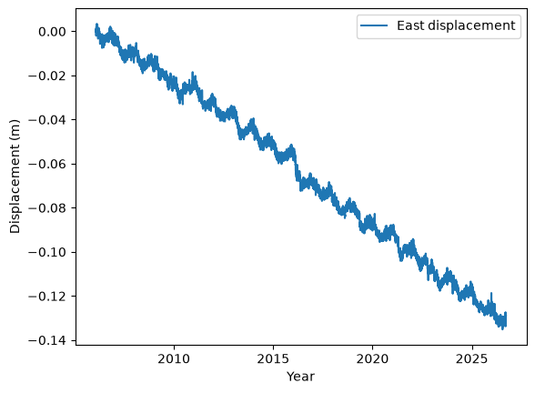
2.3 Linear regression
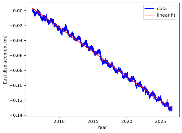
There is a clean linear trend in the horizontal position data. We can fit the data using:
where is time. We regress the data to find the coefficients , , , . The displacements are mostly westward, so we focus on the East component for this exercise. The coefficients and are the intercepts at . They are not zero here because starts in 2006. The coefficients and have the dimension of velocities:
, ,
so this example lets us discuss a simple linear regression and resampling. We use both a SciPy function and a scikit-learn function.
To measure fit performance, we measure how well the variance is reduced by fitting the data (scatter points) against the model. The variance is:
,
where is the mean of . When fitting the regression, we predict the values . The residuals are the differences between the data and the predicted values: . or coefficient of determination is:
The smaller the error, the “better” the fit (we will discuss later that a fit can be too good!), and the closer is to one.
# Linear regression: displacement = velocity * time + intercept, East component.
Ve, intercept, r_value, p_value, std_err = stats.linregress(df['decimal year'],
                                                            df['new delta e (m)'])
print(sta, "overall plate motion there", Ve, 'm/year')
print("parameters: correlation coefficient %4.2f, P-value %4.2f, standard error of the slope %g"
      % (r_value, p_value, std_err))
P395 overall plate motion there -0.006540503634979703 m/year
parameters: correlation coefficient -1.00, P-value 0.00, standard error of the slope 5.68097e-06
We can also use the scikit-learn package:
from sklearn.linear_model import LinearRegression

# Convert the data into numpy arrays. Reshaping to (n, 1) is required by scikit-learn.
E = np.asarray(df['new delta e (m)']).reshape(-1, 1)
t = np.asarray(df['decimal year']).reshape(-1, 1)

# Perform the linear regression on the entire available data
regr = LinearRegression()
regr.fit(t, E)
Epred = regr.predict(t)

# The coefficients
print('Coefficient / velocity eastward (m/year): ', regr.coef_[0][0])

# Plot the data and the fit
plt.plot(t, E, 'b', label='data')
plt.plot(t, Epred, 'r', label='linear fit')
plt.xlabel('Year')
plt.ylabel('East displacement (m)')
plt.legend()
plt.show()
Coefficient / velocity eastward (m/year): -0.006540503634979701
To evaluate the errors of the model fit using sklearn, we use the following functions:
from sklearn.metrics import mean_squared_error, r2_score

# The mean squared error
print('Mean squared error (m^2): %.6f' % mean_squared_error(E, Epred))
# The coefficient of determination: 1 is the perfect prediction
print('Coefficient of determination: %.2f' % r2_score(E, Epred))
Mean squared error (m^2): 0.000009
Coefficient of determination: 0.99
2.4 Bootstrapping the velocity
Now we use bootstrapping to estimate the slope of the regression over many resampled datasets, exactly as we did for the synthetic series.
Scikit-learn provides resample in the utils module. Make sure you use replace=True and a resample size equal to the data length (the default). For reproducible results, you can pass a fixed random_state. Bootstrapping is usually repeated many times (unlike K-fold cross-validation, the model-evaluation scheme of Chapter 3.8, which splits the data into a fixed number of non-overlapping folds).
from sklearn.utils import resample

k = 1000
vel = np.zeros(k)  # initialize a vector to store the regression slopes
for i in range(k):
    ii = resample(np.arange(len(E)), replace=True, n_samples=len(E),
                  random_state=i)  # new indices
    E_b, t_b = E[ii], t[ii]
    # Fit the resampled data
    regr = LinearRegression()
    regr.fit(t_b, E_b)
    vel[i] = regr.coef_[0][0]

# The data shows a clear trend, so the slope estimates are close to each other:
print("mean of the velocity estimates %g m/yr and standard deviation %g m/yr"
      % (np.mean(vel), np.std(vel)))

plt.hist(vel, 10)
plt.title('Distribution of eastward velocities (m/year)')
plt.xlabel('Velocity (m/year)')
plt.ylabel('Count')
plt.grid(True)
plt.show()
mean of the velocity estimates -0.00654065 m/yr and standard deviation 5.24464e-06 m/yr
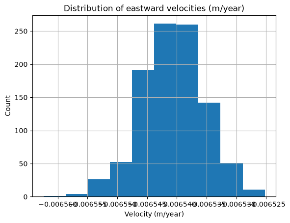
The bootstrap spread on the real data is small because the trend dominates the noise, just as it did for the synthetic case. The same caveat applies: GNSS noise is time-correlated, so treat this error bar as a lower bound.
3. Signal resampling and irregular data (Level 3)
Sections 1 and 2 used “resampling” in the statistical sense: redrawing from a sample to measure uncertainty. The word has a second meaning that every sensor stream forces on you sooner or later: changing the sampling of a time series — downsampling a high-rate record, filling or refusing to fill gaps, and putting irregular observations onto a regular grid. Both meanings share a trap: done naively, they manufacture signal that was never measured.
This section works through three data streams that cover most of what you will meet in practice:
- a regular high-rate series (an hourly tide gauge) that we downsample to daily values;
- a regular series with outages (a daily GNSS record with gaps) that we interpolate under an explicit gap policy;
- an irregular sparse point stream (a multi-decade groundwater-well network) where nothing about the sampling is regular and aggregation choices dominate the result.
Each one is synthetic with known ground truth, so every repair gets graded. We close by returning to the too-narrow bootstrap error bar of section 2.1 and fixing it with a block bootstrap.
3.1 Downsampling and aliasing
Downsampling looks harmless: keep every -th sample, discard the rest. It is not. A series sampled at interval can only represent frequencies up to the Nyquist frequency . Any signal above the new Nyquist does not disappear when you subsample — it folds (aliases) into a lower frequency, masquerading as a signal that was never there.
The clean testbed is a tide gauge. mlgeo_synth.tide_gauge_series generates hourly sea level from four astronomical constituents plus a trend, a seasonal cycle, and weather noise — and returns the tidal components as ground truth. Suppose we want a daily sea-level series to study the slow (subtidal) signal.
# Six months of hourly sea level
tide, tide_truth = mlgeo_synth.tide_gauge_series(n_days=180, seed=42)
sl = tide.set_index('time')['sea_level_m']

fig, ax = plt.subplots(figsize=(10, 3))
ax.plot(sl.iloc[:24 * 10], lw=0.8)
ax.set_ylabel('sea level (m)')
ax.set_title('Hourly tide-gauge record, first 10 days')
plt.tight_layout()
plt.show()

tide_truth['constituents']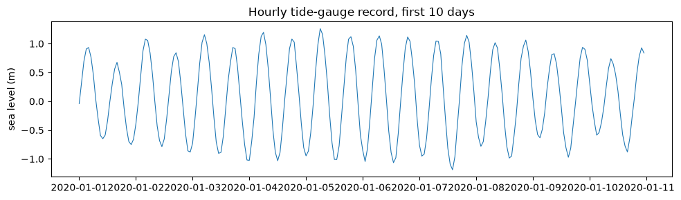
The dominant constituent is M2, the principal lunar semidiurnal tide, with a period of 12.42 hours — a frequency of 1.93 cycles per day. A daily series has a Nyquist frequency of 0.5 cycles per day, so the entire tide lives above the new Nyquist. If we keep one sample per day (say, the midnight reading), M2 folds to cycles per day: a spurious oscillation with a 14.8-day period and the full ~0.8 m tidal amplitude.
The fix is the rule every downsampling must follow: low-pass filter below the new Nyquist frequency first, then subsample. A daily mean is a crude low-pass filter (a 24-hour boxcar) and already suppresses most of the tide; scipy.signal.decimate applies a proper anti-alias filter before subsampling. We grade all three against the true tide-free daily sea level, which we can compute exactly because the generator returned the tide as a separate column.
from scipy import signal

# Ground truth: the daily mean of the tide-free sea level
subtidal = (tide.set_index('time')['sea_level_m']
            - tide.set_index('time')['tide_m']).resample('D').mean()

# WRONG: keep one sample per day (midnight), discard the rest
naive = sl.iloc[::24]

# Crude anti-alias: daily mean (a 24-h boxcar low-pass, then subsample)
daily_mean = sl.resample('D').mean()

# Proper anti-alias: decimate in two stages (scipy recommends factors <= 13)
dec = signal.decimate(signal.decimate(sl.to_numpy(), 4, ftype='fir', zero_phase=True),
                      6, ftype='fir', zero_phase=True)
dec = pd.Series(dec, index=sl.index[::24])

fig, ax = plt.subplots(figsize=(11, 4))
ax.plot(naive, color='tab:red', lw=1, label='midnight sample (aliased)')
ax.plot(daily_mean, color='tab:orange', lw=1.2, label='daily mean')
ax.plot(dec, color='tab:blue', lw=1.2, label='decimate (anti-aliased)')
ax.plot(subtidal, 'k--', lw=1.2, label='true subtidal sea level')
ax.set_ylabel('sea level (m)')
ax.legend(ncols=2)
ax.set_title('Three ways to make a daily series from an hourly one')
plt.tight_layout()
plt.show()

for name, s_daily in [('midnight sample', naive), ('daily mean', daily_mean),
                      ('decimate', dec)]:
    err = (s_daily - subtidal).dropna()
    print(f'{name:16s} RMS error vs true subtidal signal: {np.sqrt((err**2).mean()):.3f} m')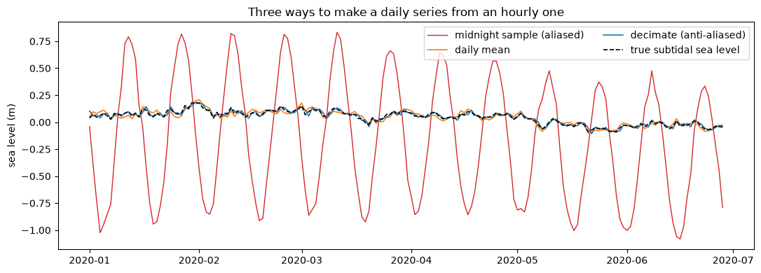
midnight sample  RMS error vs true subtidal signal: 0.589 m
daily mean       RMS error vs true subtidal signal: 0.020 m
decimate         RMS error vs true subtidal signal: 0.017 m
The midnight samples carry a ~15-day oscillation of over half a meter that does not exist in the subtidal ocean — that is the aliased M2 tide, and its RMS error is thirty times larger than either anti-aliased version. Nothing about the naive series looks wrong; the fortnightly wiggle even resembles a plausible ocean signal. That is what makes aliasing dangerous: the artifact is physically dressed. Satellite altimetry lives with exactly this problem — the TOPEX/Jason orbit samples each point every ~10 days, aliasing M2 to a 62-day signal that must be modeled away.
pandas.DataFrame.resample('D').mean() — the one-liner you will reach for most often — is already a decent anti-alias filter for this purpose. The rule to internalize: before reducing the sampling rate, ask what lives above the new Nyquist frequency and remove it. If the answer is “nothing”, say so explicitly in your data card.
3.2 Gaps: interpolation is a decision, not a default
Real daily streams arrive with outages. mlgeo_synth.degrade_series injects gaps into the synthetic GNSS series from section 2.1 — plus one 150-day outage that we place, deliberately, across an earthquake (a station knocked out by the shaking it was supposed to record is not a hypothetical). The function returns the uncensored truth, so we can grade any repair.
# The same 10-yr, 12 mm/yr station, now with a coseismic step at day 2000
gnss_eq = mlgeo_synth.gnss_series(n_years=10, velocity_mm_yr=12.0,
                                  eq_day=2000, coseismic_mm=25.0, seed=42)

# Degrade it: an imposed 150-day outage swallowing the earthquake, plus 8 random gaps
broken, truth = mlgeo_synth.degrade_series(gnss_eq, gap_windows=[(1950, 2100)],
                                           n_random_gaps=8, gap_days=(2, 25), seed=13)

s = broken.set_index('date')['disp_mm']
clean = pd.Series(truth['clean'].to_numpy(), index=s.index)

fig, ax = plt.subplots(figsize=(11, 3.5))
ax.plot(s, lw=0.5, label='observed (gaps are blank)')
for s0, e0 in truth['gap_windows']:
    ax.axvspan(s.index[s0], s.index[e0 - 1], color='tab:red', alpha=0.15)
ax.set_ylabel('displacement (mm)')
ax.legend()
ax.set_title(f'Degraded GNSS series: {len(truth["gap_windows"])} gaps (shaded)')
plt.tight_layout()
plt.show()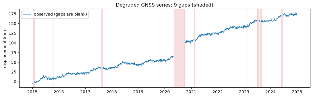
The tempting one-liner is s.interpolate(): connect the dots across every gap. Before trusting it, measure what it costs — interpolate everything and compare against the truth, gap by gap.
filled_all = s.interpolate(method='time')

noise_std = (gnss_eq['disp_mm'] - gnss_eq['trend_mm'] - gnss_eq['seasonal_mm']
             - gnss_eq['eq_mm']).std()
print(f'daily noise level of this series: {noise_std:.2f} mm RMS\n')

print('gap length   RMS error of linear interpolation inside the gap')
for s0, e0 in sorted(truth['gap_windows'], key=lambda w: w[1] - w[0]):
    idx = s.index[s0:e0]
    rms = np.sqrt(((filled_all - clean)[idx] ** 2).mean())
    print(f'{e0 - s0:7d} d   {rms:5.2f} mm')
daily noise level of this series: 2.41 mm RMS
gap length RMS error of linear interpolation inside the gap
3 d 0.74 mm
6 d 1.84 mm
16 d 1.60 mm
20 d 1.35 mm
21 d 1.87 mm
21 d 1.79 mm
23 d 1.70 mm
24 d 2.37 mm
150 d 8.09 mm
Short gaps interpolate at or below the noise level: over a few days the trend and seasonal cycle barely move, so a straight line is as good as the data. The 150-day gap is different — its error is more than three times the noise, because the interpolation drew a smooth ramp through a 25 mm coseismic step it had no way of knowing about. The filled values are not noisy; they are confidently wrong, and any downstream code (a trend fit, an ML feature window) will treat them as measurements.
So we state a gap policy as an explicit decision rather than a library default:
- Interpolate gaps of 10 days or shorter. Rationale, from the table above: at 12 mm/yr and a ~3 mm seasonal amplitude, the deterministic signal moves well under the 2.4 mm noise level in 10 days, so interpolation error is bounded by noise. The threshold is set by this station’s signal rates — a station with faster motion or larger seasonal swings earns a shorter threshold, and the threshold belongs in the data card.
- Mask longer gaps as missing. A
NaNis an honest statement: we do not know what happened in there — and in this record, something did.
max_gap_days = 10  # the decision, justified above

# Length of the gap each missing sample belongs to
isna = s.isna()
gap_id = (isna != isna.shift()).cumsum()
gap_len = isna.groupby(gap_id).transform('sum').where(isna, 0)

# Fill short gaps, keep long gaps as NaN
repaired = filled_all.where(~(isna & (gap_len > max_gap_days)))

short_filled = isna & (gap_len <= max_gap_days)
long_masked = isna & (gap_len > max_gap_days)
rms_short = np.sqrt(((repaired - clean)[short_filled] ** 2).mean())
rms_if_filled = np.sqrt(((filled_all - clean)[long_masked] ** 2).mean())

print(f'samples filled (short gaps): {short_filled.sum()},  RMS error {rms_short:.2f} mm '
      f'(noise level {noise_std:.2f} mm)')
print(f'samples masked (long gaps):  {long_masked.sum()},  RMS error if we had '
      f'interpolated them: {rms_if_filled:.2f} mm')

# Zoom on the long gap: what interpolation would have fabricated
zoom = slice('2020-01-01', '2020-12-31')
fig, ax = plt.subplots(figsize=(10, 3.5))
ax.plot(clean[zoom], color='gray', lw=0.6, label='truth (never observed)')
ax.plot(filled_all[zoom].where(long_masked[zoom]), 'r--', lw=1.5,
        label='linear interpolation (fabricated)')
ax.plot(repaired[zoom], lw=0.8, color='tab:blue', label='policy: filled + masked')
ax.set_ylabel('displacement (mm)')
ax.legend()
ax.set_title('The long gap hides an earthquake; interpolation invents a smooth story')
plt.tight_layout()
plt.show()
samples filled (short gaps): 9, RMS error 1.56 mm (noise level 2.41 mm)
samples masked (long gaps): 275, RMS error if we had interpolated them: 6.10 mm
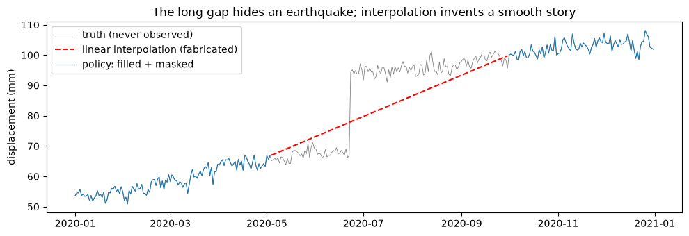
The graded result: short-gap interpolation costs less than the noise, and the mask refuses to invent the 150 days we never saw. When this series later feeds a model, the NaNs force a documented choice (drop the window, flag it, impute with an uncertainty) instead of silently feeding fiction forward. That is the pattern for every repair in this section: fix what the data constrain, mask what they do not, and write the threshold down.
3.3 Irregular sparse points: the multi-well network
The third stream has no grid to start from. mlgeo_synth.well_table mimics forty years of water-level measurements across 25 monitoring wells: every well shares one regional signal (seasonal recharge on top of a slow decline), but each has its own datum offset (meters!), its own noise level, its own active period, a multi-year gap, and uneven visit dates. A few wells were only ever visited a handful of times. This is what operational hydrology, geotechnical monitoring, and legacy archives actually look like.
wells, wtruth = mlgeo_synth.well_table(seed=42)
print(f"{wells['well_id'].nunique()} wells, {len(wells)} observations, "
      f"{wells['date'].min():%Y} to {wells['date'].max():%Y}")

fig, ax = plt.subplots(figsize=(11, 4))
sc = ax.scatter(wells['date'], wells['head_m'], c=wells['well_id'], s=4, cmap='tab20')
ax.set_ylabel('head (m, arbitrary regional datum)')
ax.set_title('25 wells: shared regional signal buried under per-well offsets and gaps')
plt.tight_layout()
plt.show()
25 wells, 2902 observations, 1981 to 2019
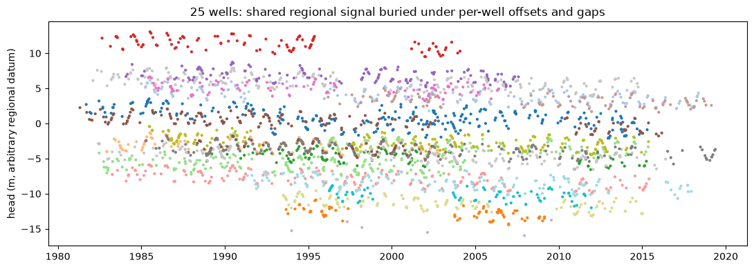
The goal: recover the regional head signal — the shared trend and seasonal cycle — as a quarterly series. The naive move is resample('QS').mean() over all observations. Watch what it does: whenever a well with a high datum offset enters or leaves the record (and they all enter and leave at different times), the mean jumps by a chunk of that offset. The “regional signal” it produces is mostly a history of which wells were being visited.
The gap-aware version makes two moves:
- Work in anomalies. Subtract each well’s own mean first, so the meter-scale datum offsets cancel before any averaging. (This is exactly how global temperature series are built from weather stations.)
- Weight by measurement quality. Each observation carries a reported
sigma_m; weighting by — the inverse-variance weight, which minimizes the variance of the combined estimate — keeps a steel-tape reading from diluting a transducer record.
Anomalies still leave a small bias — each well samples a different piece of the 40-year decline, so its own mean absorbs a slightly different trend segment — but that residual is decimeters, not the meters the offsets would inject. We grade both against truth["regional"], up to a constant (the datum is arbitrary, so we compare all series with their means removed).
# Naive: average all raw heads in each quarter
naive_q = wells.set_index('date')['head_m'].resample('QS').mean()

# Gap-aware: per-well anomalies, inverse-variance weights, quarterly aggregation
w = wells.assign(
    anom_m=wells['head_m'] - wells.groupby('well_id')['head_m'].transform('mean'),
    weight=1.0 / wells['sigma_m'] ** 2,
    quarter=wells['date'].dt.to_period('Q').dt.start_time,
)
w['wx'] = w['weight'] * w['anom_m']
g = w.groupby('quarter')
aware_q = g['wx'].sum() / g['weight'].sum()

# Grade against the true regional signal (all series demeaned: the datum is arbitrary)
def rms_vs_regional(series):
    t_yr = (series.index - wells['date'].min()).days / 365.25
    reg = wtruth['regional'](t_yr)
    return np.sqrt(np.mean(((series - series.mean()) - (reg - reg.mean())) ** 2))

t_yr = (aware_q.index - wells['date'].min()).days / 365.25
regional_true = pd.Series(wtruth['regional'](t_yr), index=aware_q.index)

fig, ax = plt.subplots(2, 1, figsize=(11, 6), sharex=True)
ax[0].plot(naive_q - naive_q.mean(), color='tab:red', lw=0.8)
ax[0].set_title(f'Naive quarterly mean — RMS error {rms_vs_regional(naive_q):.2f} m')
ax[1].plot(aware_q - aware_q.mean(), color='tab:blue', lw=0.8,
           label=r'anomaly + 1/$\sigma^2$ aggregation')
ax[1].plot(regional_true - regional_true.mean(), 'k--', lw=1,
           label='true regional signal')
ax[1].set_title(f'Gap-aware aggregation — RMS error {rms_vs_regional(aware_q):.2f} m')
ax[1].legend()
for a in ax:
    a.set_ylabel('head anomaly (m)')
plt.tight_layout()
plt.show()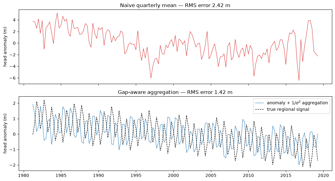
The naive mean is wrong by a factor of a few — meter-scale jumps produced entirely by wells entering and leaving the record — while the anomaly-weighted series tracks the true regional decline and its seasonal cycle to about half a meter RMS — mostly the residual trend-segment bias noted above. Nothing sophisticated happened: the entire improvement came from refusing to average incompatible things. Before aggregating any irregular multi-site stream, ask what enters and leaves the average as the composition changes, and remove per-site levels first.
3.4 Closing the loop: the moving-block bootstrap
Section 2.1 ended with a warning: the pair bootstrap gave a velocity error bar so narrow that the true velocity sat far outside it, because resampling individual days destroys the time correlation of GNSS noise, and correlated noise is exactly what makes a trend uncertain. The fix is the moving-block bootstrap: instead of resampling days, resample contiguous blocks of residuals, so that each resample preserves the noise correlation up to the block length. We fit the line once, resample blocks of its residuals, add them back to the fitted line, and refit.
The block length is — again — a stated decision: it must exceed the correlation time of the noise you care about. We use 100 days, comfortably longer than the flicker-noise correlation at the periods that matter for a decade-long trend; you can check the sensitivity by rerunning with 50 or 200.
block = 100                     # days per block: the decision
n_blocks = int(np.ceil(n_syn / block))
line = fit.intercept + fit.slope * t_arr
resid = d_arr - line

vel_block = np.zeros(k)
for j in range(k):
    starts = rng.integers(0, n_syn - block, size=n_blocks)
    boot_resid = np.concatenate([resid[s0:s0 + block] for s0 in starts])[:n_syn]
    vel_block[j] = stats.linregress(t_arr, line + boot_resid).slope

print(f'pair bootstrap:  std {np.std(vel_syn):.3f} mm/yr, '
      f'true velocity sits {abs(fit.slope - true_velocity) / np.std(vel_syn):.1f} sigma out')
print(f'block bootstrap: std {np.std(vel_block):.3f} mm/yr, '
      f'true velocity sits {abs(fit.slope - true_velocity) / np.std(vel_block):.1f} sigma out')

fig, ax = plt.subplots(figsize=(8, 4))
ax.hist(vel_syn, bins=30, color='black', alpha=0.7, label='pair bootstrap (sec. 2.1)')
ax.hist(vel_block, bins=30, color='tab:blue', alpha=0.6, label=f'block bootstrap ({block}-day blocks)')
ax.axvline(true_velocity, color='red', label='true velocity')
ax.set_xlabel('velocity (mm/yr)')
ax.set_ylabel('count')
ax.legend()
plt.show()
pair bootstrap: std 0.019 mm/yr, true velocity sits 8.6 sigma out
block bootstrap: std 0.148 mm/yr, true velocity sits 1.1 sigma out
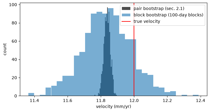
The block bootstrap widens the error bar by roughly a factor of seven — and now the true velocity sits about one standard deviation from the estimate, which is what an honest error bar looks like. Nothing about the data changed; only the resampling respected the correlation the noise actually has. The narrow pair-bootstrap histogram was not conservative, it was wrong — and on real data, with no ground truth to flag it, it would have been published.
The same caveat now transfers to the real P395 record of section 2.4: its pair-bootstrap error bar is a lower bound, and a block bootstrap on its residuals is the follow-up exercise.
4. Exercise
- Alias hunting. Regenerate the tide gauge with
n_days=365and downsample by keeping the noon sample instead of midnight. Does the aliased period change? Explain why or why not from the folding formula. - Gap policy sensitivity. Rerun section 3.2 with
max_gap_daysof 3 and of 30. Report the RMS error and the number of filled samples for each. Where would you set the threshold for a station moving at 50 mm/yr, and why? - Well weighting. In section 3.3, drop the weights (plain mean of anomalies). How much of the improvement over the naive mean survives? What does that tell you about which of the two moves (anomalies, weights) carries the load for this network?
- Block length. Rerun the block bootstrap with block lengths of 10, 50, 200, and 500 days and plot the bootstrap standard deviation against block length. Explain the trend at both extremes.