Geoscience datasets often carry many correlated features: oxide concentrations in a rock analysis, thousands of grid cells in a climate field, dozens of waveform attributes. Reducing the dimensionality before modeling helps because:
- The cost of most algorithms grows with the number of input dimensions.
- Redundant features add computation without adding information.
- Simpler models are more robust on small datasets.
- Fewer features make the data easier to understand.
- Visualization is easier in two or three dimensions.
Dimensionality reduction techniques fall into two categories: feature selection and feature extraction.
1. Feature Selection
Feature selection keeps a subset of the original dimensions. A forward selection approach starts with the single variable that reduces the error the most and adds variables one by one. A backward selection starts with all variables and removes them one by one.
A quick first step is to look at the correlation matrix: strongly correlated features carry redundant information, and one of them can often be dropped.
We use a synthetic geochemical table from the course package mlgeo_synth. Each row is a whole-rock analysis: seven major-element oxides in wt%, density, magnetic susceptibility, and a lithology label (basalt, andesite, or granite).
# Import useful modules
import matplotlib.pyplot as plt
import numpy as np
import pandas as pd

import mlgeo_synth
geochem = mlgeo_synth.geochem_table(n=5000, seed=42)
geochem.head()# The three lithology classes are imbalanced, as real map units usually are.
geochem["label"].value_counts()label
granite 2794
basalt 1713
andesite 493
Name: count, dtype: int64# Correlation matrix of the numeric features
features = geochem.drop(columns="label")
correlation_matrix = features.corr()
correlation_matrix.style.background_gradient(cmap="coolwarm", vmin=-1, vmax=1)SiO2 is strongly anticorrelated with MgO, FeO, and CaO, and density tracks the mafic oxides. Two effects drive this structure. First, igneous differentiation: as a melt evolves, SiO2 and K2O rise while MgO, FeO, and CaO fall. Second, closure: the oxides sum to roughly 100 wt%, so if one goes up, the others must come down. Which features would you drop based on this matrix?
2. Feature Extraction
Feature extraction builds a new, smaller set of dimensions as combinations of the original ones. Methods can be unsupervised (Principal Component Analysis, Independent Component Analysis) or supervised (Linear Discriminant Analysis).
3. Principal Component Analysis
PCA is an unsupervised method that maps the data to a lower dimensional space with minimum loss of variance.
Let be the data, measured times over multiple fields of measurements (the length of ). Each column of represents a unique observation. Each row of represents a single parameter.
To perform PCA:
- Center the data by subtracting the mean of each row of (and usually scale each row to unit variance).
- Calculate the covariance matrix of the centered data, . The covariance matrix is symmetric positive semi-definite, so it can be diagonalized.
- Calculate the Singular Value Decomposition (SVD):
where the columns of are the eigenvectors, or principal components. The first principal component points in the direction of highest variance.
3.1 The geometry of PCA: a rotated Gaussian cloud
To build intuition, we start with a two-dimensional point cloud: 10,000 observations drawn from a stretched, rotated Gaussian.
# Generate the toy data
rng = np.random.default_rng(42)

xC = np.array([2, 1])      # Center of data (mean)
sig = np.array([2, 0.5])   # Principal axes
theta = np.pi / 3          # Rotate cloud by pi/3
R = np.array([[np.cos(theta), -np.sin(theta)],     # Rotation matrix
              [np.sin(theta), np.cos(theta)]])
nPoints = 10000

# create the cloud of points (np.matmul can also be written @)
X = R @ np.diag(sig) @ rng.standard_normal((2, nPoints)) + np.diag(xC) @ np.ones((2, nPoints))

# plot the data
fig, ax1 = plt.subplots()
ax1.plot(X[0, :], X[1, :], '.', color='k', alpha=0.125)
ax1.grid()
ax1.set_xlim((-6, 8))
ax1.set_ylim((-6, 8))
ax1.set_aspect('equal')
plt.show()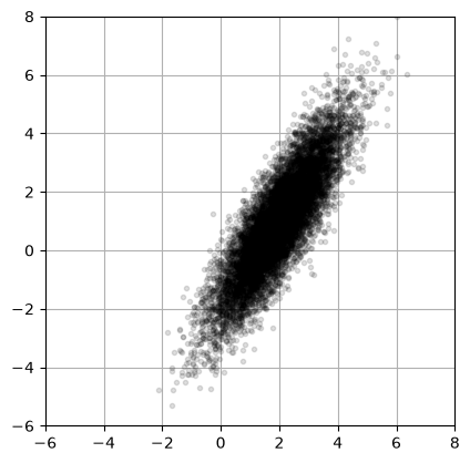
Step 1: subtract the mean
Xavg = np.mean(X, axis=1)          # Compute mean
B = X - Xavg[:, np.newaxis]        # Mean-subtracted data

plt.scatter(B[0, :], B[1, :], color='k', alpha=0.125)
plt.gca().set_aspect('equal')
plt.show()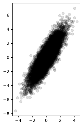
# calculate the covariance matrix
covB = (B @ B.T) / nPoints
print(f"shape of B {B.shape} and shape of covB {covB.shape}")
print(covB)
shape of B (2, 10000) and shape of covB (2, 2)
[[1.21210083 1.65131023]
[1.65131023 3.08978984]]
Step 2: SVD of the covariance matrix
U, S, VT = np.linalg.svd(covB, full_matrices=False)

print("eigenvalues (variances along each axis):", S)
print("eigenvectors (rows of VT):")
print(VT)
eigenvalues (variances along each axis): [4.05048593 0.25140474]
eigenvectors (rows of VT):
[[-0.50286768 -0.8643634 ]
[-0.8643634 0.50286768]]
The eigenvalues are close to , the squared lengths of the axes we used to build the cloud.
Step 3: explore the outcome
fig, ax2 = plt.subplots()
ax2.plot(X[0, :], X[1, :], '.', color='k', alpha=0.125)   # Plot data to overlay PCA
ax2.grid()
ax2.set_xlim((-6, 8))
ax2.set_ylim((-6, 8))
ax2.set_aspect('equal')

# Plot the eigenvectors, scaled by the standard deviation along each axis
for k, color in zip(range(2), ['cyan', 'orange']):
    scale = np.sqrt(S[k])
    ax2.plot([Xavg[0], Xavg[0] + VT[k, 0] * scale],
             [Xavg[1], Xavg[1] + VT[k, 1] * scale],
             '-', color=color, linewidth=3, label=f"PC{k+1}")
ax2.legend()
plt.show()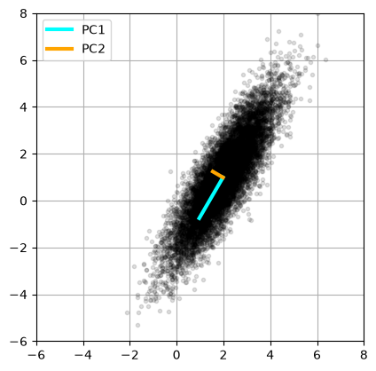
# Project the original data onto the principal axes
projected = B.T @ VT.T

plt.scatter(projected[:, 0], projected[:, 1], c='k', alpha=0.125)
ax = plt.gca()
ax.set_axisbelow(True)
ax.grid()
ax.set_aspect('equal')
ax.set_xlabel("PC1")
ax.set_ylabel("PC2")
plt.show()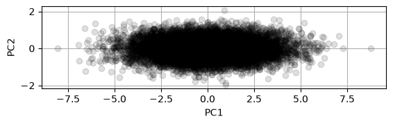
The projection rotates the cloud so that the direction of largest variance lies along the horizontal axis. PCA found the rotation we used to generate the data.
3.2 PCA on a Geochemical Table
Now we apply PCA to the geochemical table from Section 1. Features must be standardized first: oxides span tens of wt% while magnetic susceptibility is of order 10-3 SI, and without scaling the large-magnitude features would dominate the covariance.
from sklearn.preprocessing import StandardScaler
from sklearn.decomposition import PCA

feature_names = features.columns.tolist()

scaler = StandardScaler()
geochem_scaled = scaler.fit_transform(features)

pca = PCA()
geochem_pca = pca.fit_transform(geochem_scaled)

print("Explained variance ratio:", np.round(pca.explained_variance_ratio_, 3))
Explained variance ratio: [0.782 0.097 0.06 0.037 0.01 0.006 0.004 0.003 0.001]
# Scree plot: variance explained by each component
n_pc = len(pca.explained_variance_ratio_)
fig, ax = plt.subplots(figsize=(7, 4))
ax.bar(np.arange(1, n_pc + 1), pca.explained_variance_ratio_, label="per component")
ax.plot(np.arange(1, n_pc + 1), np.cumsum(pca.explained_variance_ratio_),
        'o-', color='k', label="cumulative")
ax.set_xlabel("Principal component")
ax.set_ylabel("Explained variance ratio")
ax.legend()
plt.show()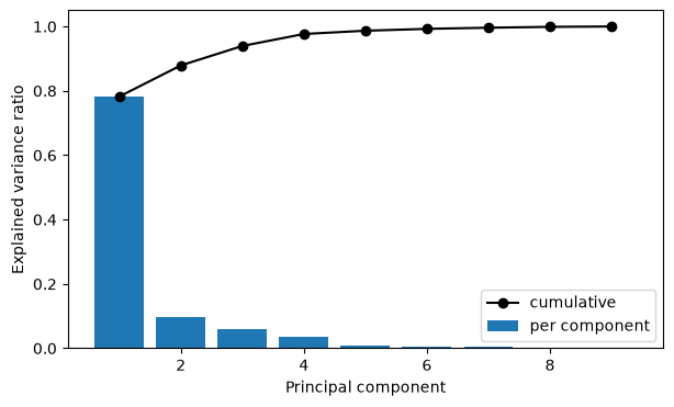
One component captures most of the variance, and two capture nearly all of it. The data live on a much lower dimensional surface than the nine measured features suggest.
The loadings tell us what the components mean. Each principal component is a weighted combination of the original features; the weights are called loadings.
fig, axes = plt.subplots(1, 2, figsize=(12, 4), sharey=True)
for k, ax in enumerate(axes):
    loadings = pca.components_[k]
    colors = ['tab:red' if v < 0 else 'tab:blue' for v in loadings]
    ax.bar(feature_names, loadings, color=colors)
    ax.axhline(0, color='k', linewidth=0.8)
    ax.set_title(f"PC{k+1} loadings "
                 f"({100*pca.explained_variance_ratio_[k]:.1f}% of variance)")
    ax.tick_params(axis='x', rotation=60)
axes[0].set_ylabel("Loading")
plt.tight_layout()
plt.show()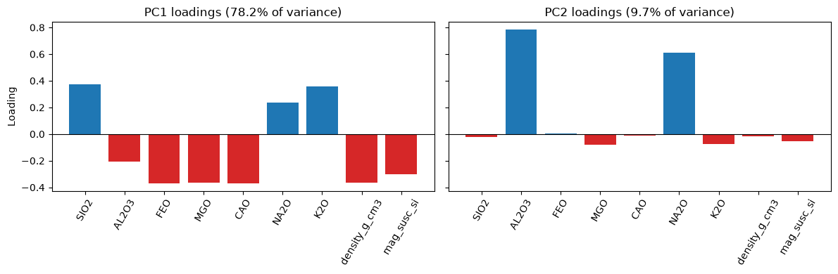
On PC1, SiO2, K2O, and Na2O load with one sign while MgO, FeO, CaO, density, and magnetic susceptibility load with the other. This is exactly the correlation structure we saw in Section 1: oxide closure plus igneous differentiation. PC1 acts as a differentiation index. A sample’s PC1 score tells you where it sits on the basalt-to-granite spectrum, in a single number.
Note that the sign of a component is arbitrary: the SVD can return either orientation, so only the relative signs of the loadings matter.
# Scatter of the first two PCs, colored by lithology
fig, ax = plt.subplots(figsize=(8, 6))
for lith in geochem["label"].unique():
    mask = (geochem["label"] == lith).to_numpy()
    ax.scatter(geochem_pca[mask, 0], geochem_pca[mask, 1],
               s=8, alpha=0.4, label=lith)
ax.set_xlabel("PC1 (differentiation index)")
ax.set_ylabel("PC2")
ax.legend()
ax.grid(True)
plt.show()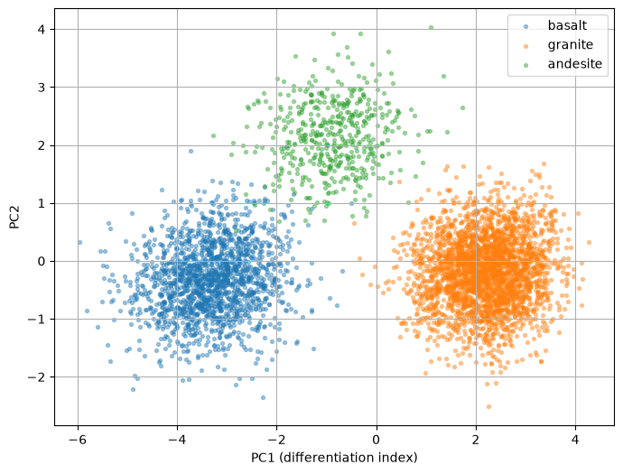
PCA never saw the labels, yet the three lithologies separate along PC1 because composition and lithology are driven by the same underlying process. This is a common and useful outcome: an unsupervised method recovers a physically meaningful axis.
A practical note: full SVD is expensive for large matrices. Scikit-learn switches to a randomized PCA solver automatically when the data are larger than 500 x 500 and the number of requested components is less than 80% of the smaller dimension.
3.3 EOF Analysis of a Climate Field
Applied to spatio-temporal data, PCA yields two linked objects:
- Empirical Orthogonal Functions (EOFs): the spatial eigenvectors of the data covariance. Each EOF is a map that explains a portion of the total variance. In climate science, EOFs identify dominant patterns such as circulation modes or temperature anomaly structures.
- Principal Components (PCs): the time series that says how strongly each EOF is expressed at each time step.
Together, EOFs and PCs describe the spatial-temporal variability of the dataset.
We use mlgeo_synth.climate_field, which generates 30 years of monthly temperature anomalies on a global grid. The generator plants known structures — a seasonal mode, a zonal (land/ocean-like) mode, and a warming trend — and returns them in a truth dictionary, so we can check whether EOF analysis recovers them.
field, truth = mlgeo_synth.climate_field(
    n_lat=40, n_lon=80, n_months=360, trend_c_per_decade=0.25, seed=42
)
lat = truth["lat"]
lon = truth["lon"]
n_months, n_lat, n_lon = field.shape
print("field shape (months, lat, lon):", field.shape)
print("truth keys:", list(truth.keys()))
field shape (months, lat, lon): (360, 40, 80)
truth keys: ['lat', 'lon', 'seasonal_pattern', 'zonal_pattern', 'trend_c_per_decade']
# One month of the field
plt.figure(figsize=(8, 4))
plt.pcolormesh(lon, lat, field[1], cmap='coolwarm', shading='auto')
plt.title('Temperature anomaly, month 2')
plt.xlabel('Longitude')
plt.ylabel('Latitude')
plt.colorbar(label='deg C', fraction=0.025, pad=0.04)
plt.show()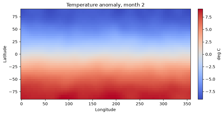
Area weighting. The grid is equal-angle: cells are spaced evenly in latitude and longitude. But the physical area of a cell shrinks toward the poles as . Without correction, the covariance matrix over-represents high latitudes — many grid cells, little actual area. The standard fix is to multiply each grid point by before the SVD, so that each cell’s contribution to the variance (which is quadratic in the data) is proportional to its area.
# Remove the time mean at each grid point, then apply area weights
anom = field - field.mean(axis=0)
w = np.sqrt(np.cos(np.deg2rad(lat)))          # shape (n_lat,)
anom_w = anom * w[None, :, None]

# Reshape to a (time x space) matrix and take the SVD
Xmat = anom_w.reshape(n_months, n_lat * n_lon)
U, S, VT = np.linalg.svd(Xmat, full_matrices=False)

variance_fraction = S**2 / np.sum(S**2)
print("Variance fraction of first 5 modes:", np.round(variance_fraction[:5], 3))
Variance fraction of first 5 modes: [0.955 0.038 0.006 0. 0. ]
n_modes = 3
# Rows of VT are the EOFs of the *weighted* field; divide the weights back
# out to display physical patterns.
eofs = VT[:n_modes].reshape(n_modes, n_lat, n_lon) / w[None, :, None]
# PC time series: projection of the data on each EOF
pcs = U[:, :n_modes] * S[:n_modes]

fig, axes = plt.subplots(n_modes, 2, figsize=(12, 3 * n_modes),
                         gridspec_kw={'width_ratios': [1.3, 1]})
time_years = np.arange(n_months) / 12
for k in range(n_modes):
    im = axes[k, 0].pcolormesh(lon, lat, eofs[k], cmap='coolwarm', shading='auto')
    axes[k, 0].set_title(f"EOF{k+1} ({100*variance_fraction[k]:.1f}% of variance)")
    axes[k, 0].set_ylabel("Latitude")
    fig.colorbar(im, ax=axes[k, 0], fraction=0.025, pad=0.04)
    axes[k, 1].plot(time_years, pcs[:, k], linewidth=0.8)
    axes[k, 1].set_title(f"PC{k+1} time series")
    axes[k, 1].grid(True)
axes[-1, 0].set_xlabel("Longitude")
axes[-1, 1].set_xlabel("Time (years)")
plt.tight_layout()
plt.show()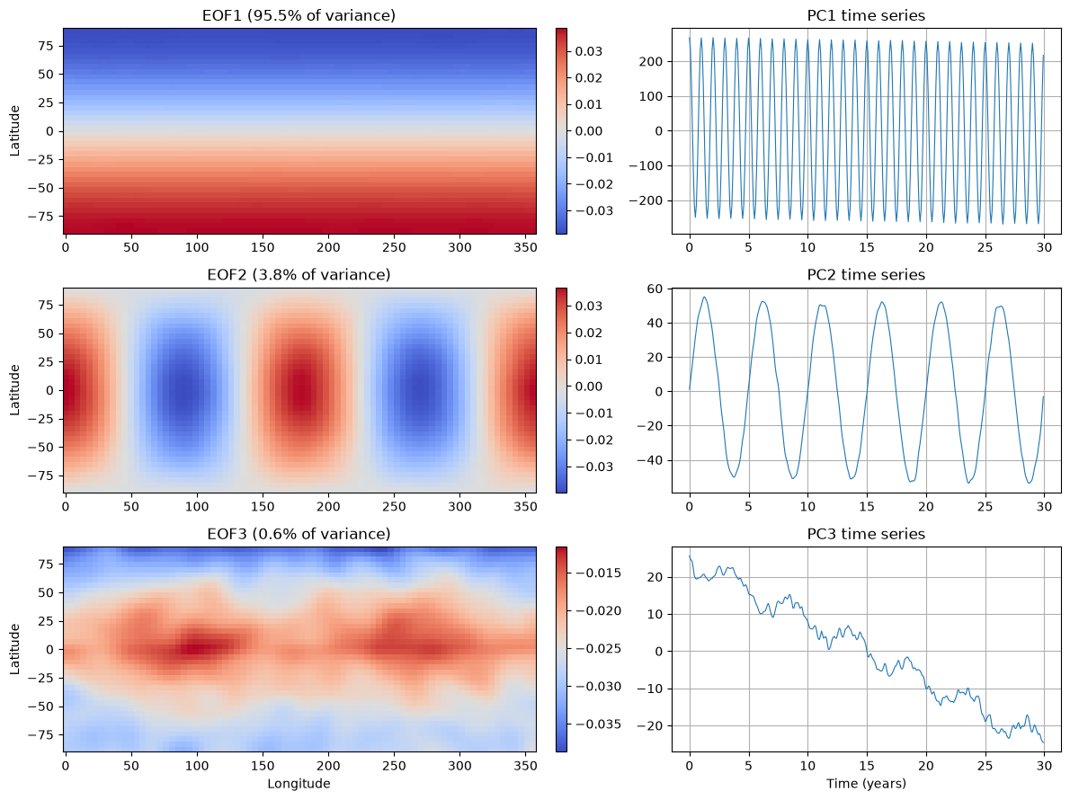
Did we recover the planted structure? The truth dictionary contains the seasonal and zonal patterns the generator used. We compare them to the recovered EOFs with a spatial pattern correlation. The sign of an EOF is arbitrary (an EOF and its negative describe the same mode, with the PC flipped to match), so we look at the magnitude of the correlation.
def pattern_corr(a, b):
    """Pearson correlation between two flattened maps."""
    return np.corrcoef(a.ravel(), b.ravel())[0, 1]

planted = {"seasonal_pattern": truth["seasonal_pattern"],
           "zonal_pattern": truth["zonal_pattern"]}

print(f"{'':>12s}" + "".join(f"{name:>20s}" for name in planted))
for k in range(n_modes):
    row = f"{'EOF' + str(k+1):>12s}"
    for name, pat in planted.items():
        row += f"{pattern_corr(eofs[k], pat):>20.2f}"
    print(row)
seasonal_pattern zonal_pattern
EOF1 -1.00 0.00
EOF2 -0.00 1.00
EOF3 -0.12 -0.23
EOF1 matches the planted seasonal pattern and EOF2 matches the planted zonal pattern, with correlations at +/-1. A correlation of -1 is as good as +1 here: it is the same mode with the map and its PC both flipped. Look also at the PC time series: the seasonal PC oscillates with a 12-month period, the zonal PC varies without a trend, and PC3 — whose map is concentrated at high northern latitudes — drifts steadily in one direction. That is the planted warming trend of 0.25 deg C per decade, amplified toward the Arctic (whether the drift appears upward or downward again depends on the arbitrary sign of the EOF).
Limitations of PCA on spatio-temporal data. EOFs are constrained to be orthogonal, but physical modes of variability are not, so a single EOF can mix several processes and split others. PCA is linear, so nonlinear dynamics spread across many components. Large-scale trends can dominate the leading modes and hide local signals. And the results are sensitive to preprocessing choices: whether to remove the seasonal cycle, how to scale variables, and how to weight the grid. Treat EOFs as a description of variance, not automatically as physical modes.
4. Independent Component Analysis
Independent Component Analysis (ICA) separates a multivariate signal into additive, statistically independent, non-Gaussian components. It is a form of blind source separation.
Differences from PCA:
- PCA finds orthogonal axes that maximize variance, using second-order statistics (covariance). Its components are uncorrelated but not necessarily independent.
- ICA finds statistically independent components, not necessarily orthogonal, by exploiting non-Gaussianity. It requires the sources to be non-Gaussian.
In the geosciences, ICA is used for blind source separation when several unknown processes are mixed in the measurements — for example, separating earthquake, hydrologic, and seasonal contributions in geodetic time series.
The classic demonstration: three known source signals are mixed into three “receivers”, and FastICA unmixes them.
from scipy import signal
from sklearn.decomposition import FastICA

rng = np.random.default_rng(0)
n_samples = 2000
time = np.linspace(0, 8, n_samples)

# create 3 source signals
s1 = np.sin(2 * time)                    # sinusoid
s2 = np.sign(np.sin(3 * time))           # square wave
s3 = signal.sawtooth(2 * np.pi * time)   # sawtooth

S_true = np.c_[s1, s2, s3]
S_true += 0.2 * rng.standard_normal(S_true.shape)   # add noise
S_true /= S_true.std(axis=0)                        # standardize

# Mix the sources: 3 signals recorded at 3 receivers
A = np.array([[1, 1, 1], [0.5, 2, 1.0], [1.5, 1.0, 2.0]])  # mixing matrix
X_mixed = S_true @ A.T
# Unmix with ICA; compare with PCA
ica = FastICA(n_components=3, random_state=0)
S_ica = ica.fit_transform(X_mixed)
pca3 = PCA(n_components=3)
S_pca = pca3.fit_transform(X_mixed)
plt.figure(figsize=(11, 8))
models = [X_mixed, S_true, S_ica, S_pca]
names = ['Observations (mixed signals)',
'True sources',
'ICA recovered signals',
'PCA recovered signals']
colors = ['red', 'steelblue', 'orange']
for ii, (model, name) in enumerate(zip(models, names), 1):
plt.subplot(4, 1, ii)
plt.title(name)
for sig_, color in zip(model.T, colors):
plt.plot(sig_, color=color)
plt.tight_layout()
plt.show()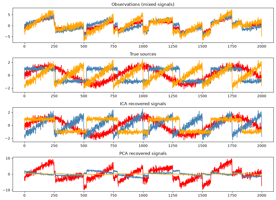
ICA recovers the three sources (up to order, sign, and scale). PCA does not: its orthogonal, maximum-variance components remain mixtures of the sources.
5. t-SNE for Visualization
PCA is linear. t-distributed Stochastic Neighbor Embedding (t-SNE) is a nonlinear method built for visualization: it places points in 2D so that neighbors in the high-dimensional space stay neighbors in the plane. It preserves local structure well, but distances between clusters in a t-SNE plot are not meaningful, and it is too slow for large datasets — so we subsample.
The perplexity parameter sets roughly how many neighbors each point considers. Small values fragment the data into many small clumps; large values blur local detail. Always try a few values.
from sklearn.manifold import TSNE

# Subsample the standardized geochemical table for speed
rng = np.random.default_rng(42)
idx = rng.choice(len(geochem), size=1500, replace=False)
X_sub = geochem_scaled[idx]
labels_sub = geochem["label"].to_numpy()[idx]

fig, axes = plt.subplots(1, 2, figsize=(12, 5))
for ax, perp in zip(axes, [5, 50]):
    emb = TSNE(n_components=2, perplexity=perp, random_state=42).fit_transform(X_sub)
    for lith in np.unique(labels_sub):
        mask = labels_sub == lith
        ax.scatter(emb[mask, 0], emb[mask, 1], s=8, alpha=0.6, label=lith)
    ax.set_title(f"t-SNE, perplexity = {perp}")
    ax.set_xticks([])
    ax.set_yticks([])
axes[0].legend()
plt.tight_layout()
plt.show()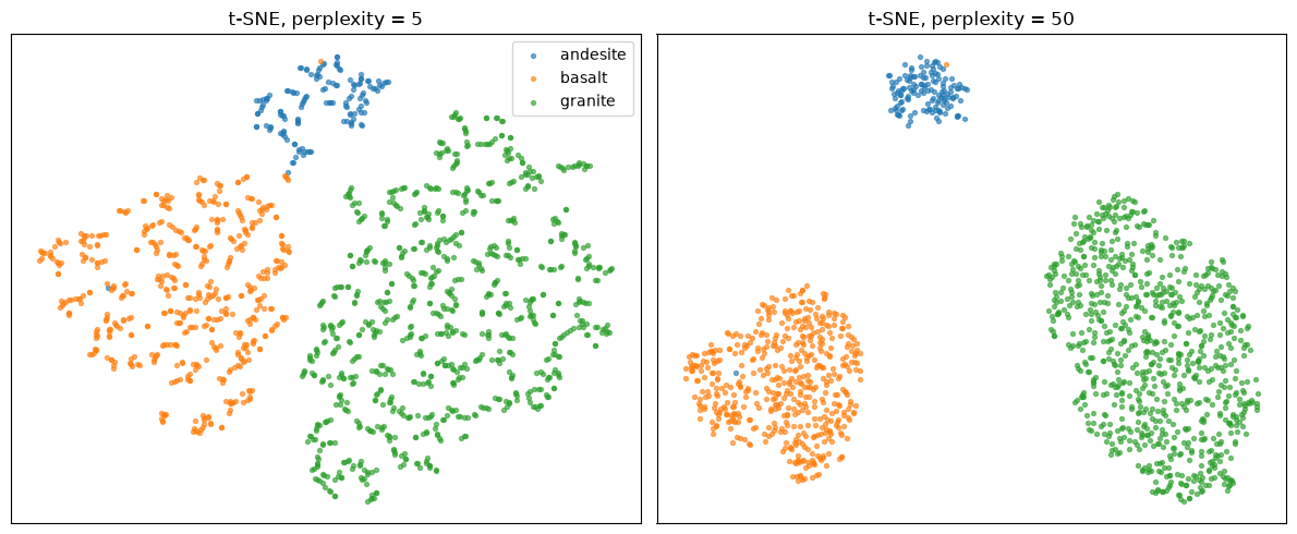
Both embeddings separate the lithologies, but the geometry changes with perplexity — a reminder that t-SNE plots are qualitative. UMAP is a popular, faster alternative with similar goals; it is not installed in the course environment, but you can add it with the umap-learn package if you want to compare.
6. Other Techniques
- Random projections
- Multidimensional scaling
- Isomap
- Linear discriminant analysis (supervised)