from IPython.display import Image
Jupyter Book and GitHub repo.
Documentation#
This chapter describes generic elements of the Oceanography Jupyter Book, for example on how to embed a YouTube video. It is the companion chapter to the technical notes chapter. There (in technical notes) we have instructions on the pandas DataFrame for shallow profiler profile metadata. Here (in documentation) we have notes on datetime64 and timedelta64 types.
Potential additional topics#
shell integration
Contents#
1 Formatting#
2 Data science#
Useful References#
[Python Data Science Handbook by Jake VanderPlas]((https://jakevdp.github.io/PythonDataScienceHandbook/) (abbreviated herein PDSH).
Markdown …including LaTeX and tables
Embedding content: Images, Animations, Audio, YouTube videos
Visualization Matplotlib, IPython interaction widgets
Other Data Resources#
Technical Elements#
Markdown#
Markdown is a specialized text formatting style that also accommodates inline HTML.
Back-ticks to delineate fixed-width font (code etc). Use three back-ticks
to offset
blocks
of code.
bullet
lists
indent 4 spaces
can also use an asterisk
*
“quotation-style” text uses greater than
>
LaTeX math formulas#
\(LaTeX\) is useful in formatting mathematical expressions. This is not a comprehensive guide; rather it serves as reminder notes for getting into the LaTeX groove after some time away from it. The delimiters of LaTeX formatting are as good a starting point as any.
Single dollar-sign delimiters put content inline: $e^x = \sum_{i=0}^{\infty}{\frac{x^i}{i!}}$ looks like this: \(e^x = \sum_{i=0}^{\infty}{\frac{x^i}{i!}}\).
The down-side of inline formatting is the scrunching looks not-so-elegant (see summation above). Next we have double dollar-sign delimiters to yield a centered equation:
Finally we have a construction making use of \begin{align} that left-justifies. Some judicious linebreaks
<br> give extra vertical spacing when needed.
\(\begin{align}n = \frac{ad + bc}{bd} \implies bdn = ad + bc \implies \textrm{ both } b|(ad+bc) \textrm{ and } d|(ad+bc)\end{align}\).
We can change font size using qualifiers such as \Large:
\(\begin{align}\Large{e^x = \sum_{i=0}^{\infty}{\frac{x^i}{i!}}}\end{align}\)
…here is some instructive LaTeX from the web…
\(\mathbf{\text{Gradient Tree Boosting Algorithm}}\)
1. Initialize model with a constant value $\(f_{0}(x) = \textrm{arg min}_{\gamma} \sum \limits _{i=1} ^{N} L(y_{i}, \gamma)\)\( 2. For m = 1 to M:<br>   (a) For \)i = 1,2,…,N\( compute<br> \)\(r_{im} = - \displaystyle \Bigg[\frac{\partial L(y_{i}, f(x_{i}))}{\partial f(x_{i})}\Bigg]_{f=f_{m−1}}\)\(   (b) Fit a regression tree to the targets \)r_{im}\( giving terminal regions<br>     \)R_{jm}, j = 1, 2, … , J_{m}.\(<br><br>   (c) For \)j = 1, 2, … , J_{m}\( compute<br> \)\(\gamma_{jm} = \underset{\gamma}{\textrm{arg min}} \sum \limits _{x_{i} \in R_{jm}} L(y_{i}, f_{m−1}(x_{i}) + \gamma)\)\( <br>   (d) Update \)f_{m}(x) = f_{m−1}(x) + \sum {j=1} ^{J{m}} \gamma_{jm} I(x \in R_{jm})\(<br><br> 3. Output \)\hat{f}(x) = f_{M}(x)$
Tables#
Tables can be written as markdown or as HTML. Markdown ‘pipe tables’ with many columns seem buggy in Jupyter notebooks, ymmv. Formatting e.g. left-justify might require some searching.
Tables |
Are |
Just So |
|---|---|---|
col 3 is |
right-aligned |
$1600 |
col 2 is |
centered |
$12 |
%%html
<br>
Here is an HTML tabl running as Python code via `%%html` cell magic.
<br>
<html>
<body>
<table>
<tr>
<th>Book</th>
<th>Author</th>
<th>Genre</th>
</tr>
<tr>
<td>Thief</td>
<td>Zusak</td>
<td>Made It Up</td>
</tr>
</table>
</body>
</html>
Here is an HTML tabl running as Python code via `%%html` cell magic.
| Book | Author | Genre |
|---|---|---|
| Thief | Zusak | Made It Up |
...while in a markdown cell:
| Book | Author | Genre |
|---|---|---|
| Thief | Zusak | Made It Up |
| $x = \pi$ | Holly Berry | Mathematics |
| Burden of Dreams | Pete | Nonfiction |
Embedding content#
Inline images#
We have “in markdown cell” methods (4) and more options “in Python cell”.
What works in Jupyter Book render but fails locally#
figure and image directives.

Fig. 1 Research Vessel Revelle (Scripps)#
What fails in Jupyter Book render but works locally#
HTML <img construct.

What works in Jupyter Book and locally but size not adjustable#
!-alt-link construct.
What works in the Jupyter Book and locally with size adjustable but is Python, not markdown#
from IPython.display import Image
Image('../img/revelle.jpg', width=400)
# More elaborate: Stipulate file or URL
Image(filename='path/to/your/image.jpg'URL
Image(url='https://www.example.com/image.jpg')
from IPython.display import Image
Image('../img/revelle.jpg', width=500)
Local animation file (mp4) playback#
from IPython.display import HTML, Video
Video('./../img/multisensor_animation.mp4', embed=True, width = 500, height = 500)
Audio file (mp3) playback#
from IPython.display import Audio
Audio("<audiofile>.mp3")
YouTube video playback#
from IPython.display import YouTubeVideo
YouTubeVideo('sjfsUzECqK0')
from IPython.display import YouTubeVideo
YouTubeVideo('sjfsUzECqK0')
Working with NetCDF XArray and Pandas#
Summary#
For a general take on data manipulation, particularly with pandas:
See Jake VanDerplas’ excellent book Python Data Science Handbook.
We have here multi-dimensional oceanography datasets in
NetCDF and CSV format. Corresponding Python libraries are XArray and pandas.
On import these libraries are abbreviated xr and pd respectively.
The XArray method .open_dataset('somefile.nc') returns an XArray Dataset:
A set of XArray DataArrays. The Dataset includes four (or more*) sections: Dimensions,
Coordinates, Data Variables, and Attributes. To examine a Dataset
called A: Run A (i.e. on a line by itself) to see these constituent sections.
“more than four”: Discovered while looking at seismic (DAS) data: Some XArray data may include yet another internal organizing structure.
In pandas the data structure is a DataFrame. Here these are used to manage shallow profiler ascent/descent/rest metadata.
Common reductive steps once data are read include removing extraneous components from
a dataset, downsampling, removing NaN values, changing the primary dimension
from obs (for ‘observation’) to time, combining multiple data files into
a single dataset, saving modified datasets to new files, and creating charts.
Datasets that reside within this GitHub repository
have to stay pretty small. Larger datasets are downloaded to an external folder.
See for example the use of wget in the Global Ocean notebook.
The following code shows reduction of a global ocean temperature data file to just
the data of interest (temperature as a 3-D scalar field).
# Reduce volume of an XArray Dataset with extraneous Data Variables:
T=xr.open_dataset('glodap_oxygen.nc')
T.nbytes
T=T[['temperature', 'Depth']]
T.nbytes
T.to_netcdf('temperature.nc')
Data can be down-sampled for example by averaging multiple samples. A tradeoff in down-sampling Regional Cabled Array shallow profiler data however is this: Data collected during profiler ascent spans 200 meters of water column depth in one hour, or about 6 centimeters per sec. A ‘thin layer’ of signal variation might be washed out by combining samples.
This repository does include a number of examples of down-sampling and otherwise selecting out data subsets.
XArray Datasets and DataArrays#
Summary#
There are a million little details about working with XArray Datasets, DataArrays, numpy arrays, pandas DataFrames, pandas arrays… let’s begin! The main idea is that a DataArray is an object containing, in the spirit of the game, one sort of data; and a Dataset is a collection of associated DataArrays.
XArray Dataset basics#
Datasets abbreviated ds have components { dimensions, coordinates, data variables,
attributes }.
A DataArray relates to a name; needs elaboration.
ds.variables
ds.data_vars # 'dict-like object'
for dv in ds.data_vars: print(dv)
choice = 2
this_data_var = list(ds.data_vars)[choice]
print(this_data_var)
ds.coords
ds.dims
ds.attrs
Load via open_mfdataset() with dimension swap from obs to time#
A single NetCDF (.nc) file can be opened as an XArray Dataset using xr.open_dataset(fnm).
Multiple files can be opened as a single XArray Dataset via xr.open_mfdataset(fnm*.nc).
mf stands for multi-file. Note
the wildcard fnm* is supported.
def my_preprocessor(fds): return fds.swap_dims({'obs':'time'})
ds = xr.open_mfdataset('files*.nc', \
preprocess = my_preprocessor, \
concat_dim='time', combine='by_coords')
Obstacle: Getting information out of a Dataset#
There is a sort of comprehension / approach that I have found hard to internalize.
With numpy ndarrays, XArray Datasets, etcetera there is this “how do I get at it?”
problem. As this documentation evolves I will try and articulate the most helpful
mindset. The starting point is that Datasets are built as collections of DataArrays;
and these have an indexing protocol the merges with a method protocol (sel, merge
and so on) where the end-result code that does what I want is inevitably very
elegant. So it is a process of learning that elegant sub-language…
Synthesizing along the dimension via .concat#
ds_concat = xr.concat([ds.sel(time=
Recover a time value as datetime64 from a Dataset by index#
If time is a dimension it can be referenced via ds.time[i]. However
this will be a 1-Dimensional, 1-element DataArray. Adding .data
and casting the resulting ndarray (with one element) as a dt64 works.
dt64(ds.time[i].data)
Example: XArray transformation flow#
As an example of the challenge of learning XArray: The reduction of this data to binned profiles
requires a non-trivial workflow. A naive approach can result in a calculation that should take
a seconds run for hours. (A key idea of this workflow – the sortby() step – is found on page 137 of PDSH.)
swap_dims()to substitutepressurefortimeas the ordinate dimensionsortby()to make thepressuredimension monotonicCreate a pressure-bin array to guide the subsequent data reduction
groupby_bins()together withmean()to reduce the data to a 0.25 meter quantized profileuse
transpose()to re-order wavelength and pressure, making the resultingDataArraysimpler to plotaccumulate these results by day as a list of
DataArraysFrom this list create an
XArray DatasetWrite this to a new NetCDF file
needs sorting#
Copy:
dsc = ds.copy()Coordinate to data variable:
ds = ds.reset_coords('seawater_pressure')
Example: XArray Dataset subset and chart#
Time dimension slice:
ds = xr.open_dataset("file.nc")
ds = ds.sel(time=slice(t0, t1))
ds
This shows that the temperature Data Variable has a cumbersome name:
sea_water_temperature_profiler_depth_enabled.
ds = ds.rename({'sea_water_temperature_profiler_depth_enabled':'temperature'})
Plot this against the default dimension time:
ds.temperature.plot()
Temperature versus depth rather than time:
fig, axs = plt.subplots(figsize=(12,4), tight_layout=True)
axs.plot(ds.temperature, -ds.z, marker='.', markersize=9., color='k', markerfacecolor='r')
axs.set(ylim = (200., 0.), title='temperature against depth')
Here ds.z is negated to indicate depth below ocean surface.
More cleanup of Datasets: rename() and drop()#
Use
ds = ds.rename(dictionary-of-from-to)to rename data variables in a DatasetUse
ds = ds.drop(string-name-of-data-var)to get rid of a data variableUse
ds = ds[[var1, var2]]to eliminate all but those two variables
XArray DataArray name and length#
sensor_t.name
len(sensor_t)
len(sensor_t.time) # gives same result
What is the name of the controlling dimension?
if sensor_t.dims[0] == 'time': print('time is dimension zero')
Equivalent; but the second version permits reference by “discoverable” string.
sensor_t = ds_CTD_time_slice.seawater_temperature
sensor_t = ds_CTD_time_slice['seawater_temperature']
Plotting with scaling and offsetting#
Suppose I wish to shift some data left to contrast it with some other data (where they would clobber one another)…
sensor_t + 0.4
Suppose I wish to scale some data in a chart to make it easier to interpret given a fixed axis range
sensor_t * 10. # this fails by trying to make ten copies of the array
np.ones(71)*3.*smooth_t # this works by creating an inner product
Time#
Missing data#
Resampling#
Filtering with xrscipy#
Some shallow profiler signals (particularly current) are noisy even at
1Min resolution. This suggests a low-pass filter. xr-scipy is a thin wrapper
of scipy for xarray eco-system. It includes digital filter machinery.
import xrscipy.other.signal as dsp
t = np.linspace(0, 1, 1000) # seconds
sig = xr.DataArray(np.sin(16*t) + np.random.normal(0, 0.1, t.size),
coords=[('time', t)], name='signal')
sig.plot(label='noisy')
low = dsp.lowpass(sig, 20, order=8) # cutoff at 20 Hz
low.plot(label='lowpass', linewidth=5)
plt.legend()
plt.show()
(package not installed yet)
Mapping#
cf PyGMT
Visualization#
Overview#
There are two Python plotting libraries: matplotlib and plotly.
plotly is more advanced and interactive.
This link provides more background on it
including a gallery of examples of what is possible.
Turning to Matplotlib: This library includes the .pyplot sub-library,
a MATLAB-parity API. It is the pyplot sub-library that is
most commonly put to use building charts; and to make matters more confusing it is
habitually imported as plt, hence the ubiquitous import line:
import matplotlib.pyplot as plt. With the API now abbreviated as plt we
proceed to generating data charts.
To make things further complicated: Herein we often generate a grid of charts
for comparison using the subplots API call. As an example:
fig,ax=plt.subplots(3,3,figsize=(12,12))
What is
fig? A figure (???)What is
ax? An array of artists (???)
The main agenda of this repository can be summarized as:
reduce a dataset to just some data of interest
obtain metadata (profile timestamps for example)
produce charts to visualize this data by means of
.scatterand.plotdirectivesproceed to various forms of data analysis
There is a utility
.plot()method built into XArray Datasets for a quick view of a particular data variable along thedimensionaxis.
Needed: Detail on how to do formatting, example arguments:
vmin=4.,vmax=22.,xincrease=False
PDSH recommends the Seaborn library as a chart-building alternative with cleaner graphics.
Matplotlib#
Big topic: Building charts using the matplotlib library. Here’s one to begin with.
from matplotlib import pyplot as plt
fig, axs = plt.subplots(figsize=(2.5,4), tight_layout=True)
axs.plot([7, 6, 2, 0, 5, 0, 0.5, 2], [1, 2, 3, 4, 5, 6, 7, 8], marker='.', markersize=14, color='black', markerfacecolor='red')
axs.set_title('some artificial data'); axs.set_ylabel('observation number'); axs.set_xlabel('measurement'); plt.show()
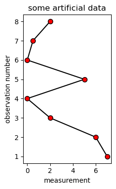
This chart is an abbreviated archetype of an initial shallow profiler chart: The vertical axis corresponds to depth, horizontal is a physical measurement. Let’s belabor this for a moment by supposing color coding the markers ‘from a separate measurement’.
from matplotlib import pyplot as plt
fig, axs = plt.subplots(figsize=(2.5,4), tight_layout=True)
axs.plot([7, 6, 2, 0, 5, 0, 0.5, 2], [1, 2, 3, 4, 5, 6, 7, 8], marker='.', markersize=14, color='black', markerfacecolor='none')
axs.scatter([7, 6, 2, 0, 5, 0, 0.5, 2], [1, 2, 3, 4, 5, 6, 7, 8], marker='.', s=120, c=['r', 'y', 'cyan', 'cyan', 'r', 'b', 'b', 'g'])
axs.set_title('some artificial data'); axs.set_ylabel('observation number'); axs.set_xlabel('measurement'); plt.show()
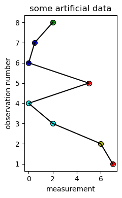
The axs.plot() line is the same but for the color change to 'none'. The result with the added scatter
plot color-codes each data marker. Building the .scatter() is not a trivial process, however,
(markersize changes to s and the value goes from 14 to 120…) and the resulting chart is not clean.
Widgets#
Widgets are an Interactive Python (IPython) library for building interactive visualizations. The idea is to set up controls such as sliders or selectors that are wired in to charting code. Move the slider: Change a parameter, redraw the chart.
Annotation#
Work started: See
Data manipulation#
XArray Dataset operations#
Slow resampling problem#
The shallow profiler spectrophotometer has 86 channels. Each observation has
a corresponding depth and time, typically several thousand per profile.
The XArray Dataset has time swapped in for obs dimension but we are
interested in resampling into depth bins. This took hours; which was
puzzling. However page 137 of PDSH, on Rearranging Multi-Indices
and Sorted and unsorted indices provides this resolution:
Rearranging Multi-indices
One of the keys to working with multiply indexed data is knowing how to effectively transform the data. There are a number of operations that will preserve all the information in the dataset, but rearrange it for the purposes of various computations. […] There are many [ways] to finely control the rearrangement of data between heirarchical indices and columns.
Sorted and unsorted indices
Earlier, we briefly mentioned a caveat, but we should emphasize it more here. Many of theMultiIndexslicing operations will fail if the index is not sorted.
# Adrift content
- merge() ...?...
- Order: `.merge()` then `.resample()` with `mean()`; or vice versa? (existing code is vice-versa)
- This approach does resampling prior to merge but was taking way too long
- resampling
```
ds = ds.reset_coords('seawater_pressure') # converts the coordinate to a data variable
ds_mean = ds.resample(time='1Min').mean()
ds_std = ds.resample(time='1Min').std()
```
- How to copy a dataset, how to move a coordinate to a data variable
- ./images/misc/optaa_spectra_0_10_20_JAN_2019.png
- ./images/misc/nitrate_2019_JAN_1_to_10.png
- pH sensor fire once at the end of every profile; back in the platform***
- Manufacturer etc: [here](https://interactiveoceans.washington.edu/instruments/).
- ...but the DataArray can itself be invoked with `.attrs` to see additional attributes that are invisible
```
ds.density.attrs
```
- Optical absorption spectrophotometer
* Seabird Scientific (acquired WETLABS): 'AC-S' model (shallow profilers)
* 86 wavelengths per sample; in practice some nan values at both ends
* Interview Chris for more procedural / interpretive SME
* Operates only during shallow profiler ascents
* Only on the two "nitrate" ascents each day
* One sample per 0.27 seconds
* However it often does a "skip" with a sample interval about 0.5 seconds
* Spectral absorption: parameter `a`, values typically 20 - 45.
* Attenuation is `c` with values on 0 to 1.
* Coordinates we want are `time`, `int_ctd_pressure`, `wavelength`
* `time` and `wavelength` are also dimensions
* Data variables we want are `beam_attenuation` (this is `c`) and `optical_absorption` (`a`)
* Per year data is about 1.7 billion floating point numbers
* 86 wavelengths x 2 (c, a) x 2 (ascent / day) x 14,000 (sample / ascent) x 365
- Photosynthetically Active Radiation (PAR)
* Devices mounted on the shallow profiler and the SP platform
* Seabird Scientific (from acquisition of Satlantic): PAR model
* Some ambiguity in desired result: `par`, `par_measured` and `par_counts_output` are all present in the data file
* Since `qc` values are associated with it I will simply use `par_counts_output`
- Fluorometer
* WETLABS (Seabird Scientific from acquisition) Triplet
* Chlorophyll emission is at 683 nm
* Measurement wavelengths in nm are 700.0 (scattering), 460.0 (cdom) and 695.0 (chlorophyll)
* Candidate Data variables
* Definites are `fluorometric_chlorophyll_a` and `fluorometric_cdom`
* Possibles are `total_volume_scattering_coefficient`, `seawater_scattering_coefficient`, `optical_backscatter`
* qc points to total volume scattering and optical backscatter but I'll keep all three
- Nitrate nutnr_a_sample and nutnr_a_dark_sample
* The nitrate run ascent is ~62 minutes (ascent only); ~3 meters per minute
* Ascent is about 14,000 samples; so 220 samples per minute
* That is 70 samples per meter depth over 20 seconds
* Per the User's Manual post-processing gets rather involved
- pCO2 water (two streams: pco2w_b_sami_data_record and pco2w_a_sami_data_record)
Cell In[8], line 58
* qc points to total volume scattering and optical backscatter but I'll keep all three
^
SyntaxError: unterminated string literal (detected at line 58)
Top and Table of Contents#
One minute resampling#
This is the practical implementation of index sorting described above and in PDSH.
XArray Datasets feature selection by time range: ds.sel(time=slice(timeA, timeB))
and resampling by time interval: ds.resample(time='1Min').mean().
(Substitute .std() to expand into standard deviation signals.)
ds = xr.open_dataset(ctd_data_filename)
tJan1 = dt64('2019-01-01')
tFeb1 = dt64('2019-02-01')
ds = ds.sel(time=slice(tJan1, tFeb1))
ds1Min = ds.resample(time='1Min').mean()
The problem however is that the resample() execution in the code above
can hang. The select operation .sel() is not understood by XArray as a monotonic
time dimension monotonic. It may be treated as a jumble even if it is not!
This can become even more catastrophic when other dimensions are present.
The following work-around uses pandas Dataframes.
This code moves the XArray Dataset contents into a pandas DataFrame. Here they are resampled properly; and the resulting columns are converted into a list of XArray DataArrays. These are then combined to form a new Dataset with the desired resampling completed quickly.
df = ds.to_dataframe().resample("1Min").mean()
vals = [xr.DataArray(data=df[c], \
dims=['time'], \
coords={'time':df.index}, \
attrs=ds[c].attrs) \
for c in df.columns]
ds = xr.Dataset(dict(zip(df.columns, vals)), attrs=ds.attrs)
ds.to_netcdf('new_data_file.nc')
Flourometry code redux: For OSB shallow profiler triplet, to 1Min samples, JAN 2019
ds_Fluorometer = xr.open_dataset('/data/rca/fluorescence/osb_sp_flort_2019.nc')
time_jan1, time_feb1 = dt64('2019-01-01'), dt64('2019-02-01')
ds_Fluor_jan2019 = ds_Fluorometer.sel(time=slice(time_jan1, time_feb1))
df = ds_Fluor_jan2019.to_dataframe().resample("1Min").mean()
vals = [xr.DataArray(data=df[c], dims=['time'], coords={'time':df.index}, \
attrs=ds_Fluor_jan2019[c].attrs) for c in df.columns]
xr.Dataset(dict(zip(df.columns, vals)), \
attrs=ds_Fluor_jan2019.attrs).to_netcdf('./data/rca/fluorescence/osb_sp_fluor_jan2019.nc')
Spectral irradiance stopgap version: Break out by spectrum (should be dimension of just one file).
spectral_irradiance_source = '/data/rca/irradiance/'
spectral_irradiance_data = 'osb_sp_spkir_2019.nc'
ds_spectral_irradiance = xr.open_dataset(spectral_irradiance_source + spectral_irradiance_data)
ds_spectral_irradiance
time_jan1, time_feb1 = dt64('2019-01-01'), dt64('2019-02-01')
ds_Irr_jan2019 = ds_spectral_irradiance.sel(time=slice(time_jan1, time_feb1))
df = [ds_Irr_jan2019.sel(spectra=s).to_dataframe().resample("1Min").mean() for s in ds_Irr_jan2019.spectra]
r = [xr.Dataset(dict(zip(q.columns,
[xr.DataArray(data=q[c], dims=['time'], coords={'time':q.index}, \
attrs=ds_Irr_jan2019[c].attrs) for c in q.columns] \
) ),
attrs=ds_Irr_jan2019.attrs)
for q in df]
for i in range(7): r[i].to_netcdf('./data/rca/irradiance/osb_sp_irr_spec' + str(i) + '.nc')
Spectral irradiance related skeleton code showing use of .isel(spectra=3):
ds = ds_spkir.sel(time=slice(time0, time1))
da_depth = ds.int_ctd_pressure.resample(time='1Min').mean()
dsbar = ds.resample(time='1Min').mean()
dsstd = ds.resample(time='1Min').std()
dsbar.spkir_downwelling_vector.isel(spectra=3).plot()
plot_base_dimension = 4
indices = [0, 1, 2, 3, 4, 5, 6]
n_indices = len(indices)
da_si, da_st = [], []
for idx in indices:
da_si.append(dsbar.spkir_downwelling_vector.isel(spectra=idx))
da_st.append(dsstd.spkir_downwelling_vector.isel(spectra=idx))
fig, axs = plt.subplots(n_indices, 2, figsize=(4*plot_base_dimension, plot_base_dimension*n_indices), /
sharey=True, tight_layout=True)
axs[0][0].scatter(da_si[0], da_depth, marker=',', s=1., color='k')
axs[0][0].set(ylim = (200., 0.), xlim = (-.03, .03), title='spectral irradiance averaged')
axs[0][1].scatter(da_st[0], da_depth, marker=',', s=1., color='r')
axs[0][1].set(ylim = (200., 0.), xlim = (0., .002), title='standard deviation')
for i in range(1, n_indices):
axs[i][0].scatter(da_si[i], da_depth, marker=',', s=1., color='k')
axs[i][0].set(ylim = (200., 0.), xlim = (-.03, .03))
axs[i][1].scatter(da_st[i], da_depth, marker=',', s=1., color='r')
axs[i][1].set(ylim = (200., 0.), xlim = (0., .002))
Code for PAR
par_source = '/data/rca/par/'
par_data = 'osb_sp_parad_2019.nc'
ds_par = xr.open_dataset(par_source + par_data)
time_jan1 = dt64('2019-01-01')
time_feb1 = dt64('2019-02-01')
ds_par_jan2019 = ds_par.sel(time=slice(time_jan1, time_feb1))
df = ds_par_jan2019.to_dataframe().resample("1Min").mean()
vals = [xr.DataArray(data=df[c], dims=['time'], coords={'time':df.index}, attrs=ds_par_jan2019[c].attrs) for c in df.columns]
ds_par_jan2019_1Min = xr.Dataset(dict(zip(df.columns, vals)), attrs=ds_par_jan2019.attrs)
osb_par_nc_file = "./data/rca/par/osb_sp_par_jan2019.nc"
ds_par_jan2019_1Min.to_netcdf(osb_par_nc_file)
PAR view: during shallow profiler rise/fall sequences
t0, t1 = '2019-07-17T13', '2019-07-18T05'
t0, t1 = '2019-07-17T18:40', '2019-07-17T19:40'
t0, t1 = '2019-07-17T21', '2019-07-17T23:00' # These are the nitrate profiles
t0, t1 = '2019-07-18T21', '2019-07-18T23:00'
t0, t1 = '2019-07-19T21', '2019-07-19T23:00'
t0, t1 = '2019-07-17T18:40', '2019-07-17T19:40' # These are the profiles prior to nitrate
t0, t1 = '2019-07-18T18:40', '2019-07-18T19:40'
t0, t1 = '2019-07-19T18:40', '2019-07-19T19:40'
da = ds_parad.sel(time=slice(t0, t1)).par_counts_output
p=da.plot.line(marker='o', figsize = (14,8), markersize=1, yincrease = True)
Staged ‘nitrate’ profile compared with ‘normal’ profile
t0, t1 = '2019-07-19T20:30', '2019-07-19T23:50' # USE THIS!! This is a good nitrate profile time bracket
t0, t1 = '2019-07-19T18:40', '2019-07-19T19:40'
da = ds_parad.sel(time=slice(t0, t1)).int_ctd_pressure
p=da.plot.line(marker='o', figsize = (14,8), markersize=1, yincrease = False)
Top and Table of Contents#
Event handling and debugging#
See the Annotate notebook on creating an event handler for interactivity.
Key: Declare an event handler variable as
global. It can now be examined in a subsequent cell.
Dual-purpose axis#
Place two charts adjacent with the same y-axis (say depth). Now combine them, trading off
condensed information with clutter. This is done using the .twiny() or .twinx() methods.
See the BioOptics notebook for examples.
Grid of charts#
This is example code for time-series data. It sets up a 3 x 3 grid of charts. These are matched to a 2-D set of axes (the ‘a’ variable) with both the scatter() and plot() constructs.
rn = range(9); rsi = range(7)
p,a=plt.subplots(3, 3, figsize=(14,14)) # first 3 is vertical count, second 3 is horizontal count
plt.rcParams.update({'font.size': 10})
a[0,0].plot(ctdF.time, ctdF.depth, color='r'); a[0,0].set(ylim=(200.,0.), title='Depth')
a[0,1].plot(ctdF.time, ctdF.salinity, color='k'); a[0,1].set(title='Salinity')
a[0,2].plot(ctdF.time, ctdF.temperature, color='b'); a[0,2].set(title='Temperature')
a[1,0].plot(ctdF.time, ctdF.dissolved_oxygen, color='b'); a[1,0].set(title='Dissolved Oxygen')
a[1,1].scatter(phF.time.values, phF.ph_seawater.values, color='r'); a[1,1].set(title='pH')
a[1,2].scatter(nitrateF.time.values, nitrateF.scn.values, color='k'); a[1,2].set(title='Nitrate')
a[2,0].plot(parF.time, parF.par_counts_output, color='k'); a[2,0].set(title='Photosynthetic Light')
a[2,1].plot(fluorF.time, fluorF.fluorometric_chlorophyll_a, color='b'); a[2,1].set(title='Chlorophyll')
a[2,2].plot(siF.time, siF.si0, color='r'); a[2,2].set(title='Spectral Irradiance')
a[2,0].text(dt64('2017-08-21T07:30'), 155., 'local midnight', rotation=90, fontsize=15, color='blue', fontweight='bold')
a[2,2].text(dt64('2017-08-21T07:30'), 4.25, 'local midnight', rotation=90, fontsize=15, color='blue', fontweight='bold')
tFmt = mdates.DateFormatter("%H") # an extended format for strftime() is "%d/%m/%y %H:%M"
t0, t1 = ctdF.time[0].values, ctdF.time[-1].values # establish same time range for each chart
tticks = [dt64('2017-08-21T06:00'), dt64('2017-08-21T12:00'), dt64('2017-08-21T18:00')]
for i in rn: j, k = i//3, i%3; a[j, k].set(xlim=(t0, t1),xticks=tticks); a[j, k].xaxis.set_major_formatter(tFmt)
print('')
Please note that Software Carpentry (Python) uses a post-facto approach to axes.
In what follows there is implicit use of numpy ‘collapse data along a particular
dimension’ using the axis keyword. So this is non-trivial code; but main point
it shows adding axes to the figure.
fig = plt.figure(figsize=(10,3))
axes1 = fig.add_subplot(1,3,1)
axes2 = fig.add_subplot(1,3,2)
axes3 = fig.add_subplot(1,3,3)
avg_data = numpy.mean(data, axis=0)
min_data = numpy.min(data, axis=0)
max_data = numpy.max(data, axis=0)
Top and Table of Contents#
Making animations#
This section was lifted from the BioOptics.ipynb notebook and simplified. It illustrates overloading a chart to show multiple sensor profiles evolving over time (frames). It also illustrates using markers along a line plot to emphasize observation spacing.
# This code creates the animation; requires some time so it is commented out for now.
# anim = animation.FuncAnimation(fig, AnimateChart, init_func=AnimateInit, \
# frames=nframes, interval=250, blit=True, repeat=False)
#
# Use 'HTML(anim.to_html5_video())'' for direct playback
# anim.save(this_dir + '/Images/animations/multisensor_animation.mp4')
3D Charts#
First chart encodes data as shade of green.
import matplotlib.pyplot as plt
from mpl_toolkits import mplot3d
import numpy as np
%matplotlib inline
zline = np.linspace(0,15,1000)
xline = np.sin(zline)
yline = np.cos(zline)
zdata = 15*np.random.random(100)
xdata = np.sin(zdata) + 0.1 * np.random.randn(100)
ydata = np.sin(zdata) + 0.1 * np.random.randn(100)
ax=plt.axes(projection='3d')
ax.plot3D(xline, yline, zline, 'gray')
ax.scatter3D(xdata, ydata, zdata, c=zdata, cmap='Greens')
ax.view_init(20,35)
Second chart derives data from the busy beaver algorithm: An automaton moving about on a 2D plane. The rules are encoded as changes to a velocity vector v; and cells have a binary ‘visit’ status that toggles on each arrival.
nt, ngrid = 500000, 61
Z, W, x, y, v = np.zeros((ngrid,ngrid), dtype=int), np.zeros((ngrid,ngrid), dtype=int), ngrid//2, ngrid//2, (1, 0)
def newv(b, v):
if b == 0: return (v[1], -v[0])
else: return (-v[1], v[0])
for n in range(nt):
if x < 0 or y < 0 or x >= ngrid or y >= ngrid: break
v = newv(Z[x][y], v)
Z[x][y] = 1 - Z[x][y]
W[x][y] += 1
x += v[0]
y += v[1]
fig = plt.figure(figsize=(8,8))
ax = plt.axes(projection='3d')
xg, yg = np.linspace(0, ngrid - 1, ngrid), np.linspace(0, ngrid - 1, ngrid)
X, Y = np.meshgrid(xg, yg)
ax.plot_wireframe(X,Y,W,color='red')
ax.view_init(40,-80)
To do#
Print some 3D view with a rotating reference view. Write each view to an image file; and use that in a flip book sense to create an animation. See the animation code preceding this section, above, and the bio-optics notebook.
Top and Table of Contents#
Binder-friendly playback#
The cell above creates an animation file that is stored within this repository. The cell below plays it back (for example in binder) to show multiple profile animations. Nitrate is intermittent, appearing as a sky-blue line in 2 of every 9 frames. The remaining sensors are present in each frame.
There animation begins March 1 2021 and proceeds at a rate of nine frames (profiles) per day. Change playback speed using the video settings control at lower right.
Top and Table of Contents#
Pandas Series and DataFrames#
Summary#
DataFrames#
DataFrames:
constructor takes
data=<ndarray>and bothindexandcolumnsarguments……2 dimensions only: higher dimensions and they say ‘use XArray’
…and switching required a
.Ttranspose
indexing by column and row header values, separated as in
[column_header][row_header]as this reverses order from ndarrays: Better confirm… seems to be the case
skip index/columns: defaults to integers.
Below this section we go into n-dimensional arrays in Numpy, the ndarray. Here we take this for granted and look at the relationship with DataFrames.
###################
#
# A micro study of ndarray to DataFrame translation
#
###################
import numpy as np
import pandas as pd
# Here is an ndarray construction from a built list of lists (not used in what follows):
# arr = np.array([range(i, i+5) for i in [2, 4, 6]])
# ... where the range() runs across columns; 2 4 6 are rows
# ndarray construction: Notice all list elements are of the same type (strings)
arr = np.array([['l','i','s','t','1'],['s','c','n','d','2'],['t','h','r','d', '3']])
print('\nndarray from a list of lists (notice no comma delimiter):\n\n', arr, \
'\n\nand indexing comparison: first [0][2] then [2][0]:', arr[0][2], arr[2][0])
print('\nand tuplesque indexing [0, 2] or [2, 0] equivalently gives:', arr[0,2], arr[2,0])
print('\nSo ndarrays index [slow][fast] equivalent to [row][column]\n\n\n')
print("Now let's create a 2D ndarray of zeros that is 3 rows by 5 columns")
z = np.zeros((3,5))
print("used np.zeros((3,5)) to set up 3 rows / 5 columns of zeros")
print("set [0,1] to 3 and [1][0] to 4:\n")
z[0,1]=3
z[1][0]=4
print(z)
print('\n\nSo that first index is row, second index is column')
print('\n\n\n\n')
ndarray from a list of lists (notice no comma delimiter):
[['l' 'i' 's' 't' '1']
['s' 'c' 'n' 'd' '2']
['t' 'h' 'r' 'd' '3']]
and indexing comparison: first [0][2] then [2][0]: s t
and tuplesque indexing [0, 2] or [2, 0] equivalently gives: s t
So ndarrays index [slow][fast] equivalent to [row][column]
Now let's create a 2D ndarray of zeros that is 3 rows by 5 columns
used np.zeros((3,5)) to set up 3 rows / 5 columns of zeros
set [0,1] to 3 and [1][0] to 4:
[[0. 3. 0. 0. 0.]
[4. 0. 0. 0. 0.]
[0. 0. 0. 0. 0.]]
So that first index is row, second index is column
print('Moving on to DataFrames:\n\n')
rowlist=["2row", "4row", "6row"]
columnlist = ["col_a", "col_b", "col_c", "col_d", "col_e"]
df = pd.DataFrame(data=arr, index=rowlist, columns=columnlist)
print(df, '\n\nis a DataFrame from the ndarray; so now index ["col_c"]["6row"]:', df['col_c']['6row'])
df = pd.DataFrame(data=arr.T, index=columnlist, columns=rowlist)
print('\nHere is a Dataframe from a transpose of the ndarray\n\n', df, \
'\n\nindexing 2row then col_e:', df['2row']['col_e'])
print('\nSo the column of a DataFrame is indexed first, then the row: Reverses the sense of the 2D ndarray.\n')
print('Now skipping the "index="" argument so the row labels default to integers:\n')
df = pd.DataFrame(data=arr, columns=columnlist)
print(df, '\n\n...so now indexing ["col_d"][0]:', df['col_d'][0], '\n')
df = pd.DataFrame(data=arr, index=rowlist)
print(df, '\n\nhaving done it the other way: used index= but not columns=. Here is element [0]["4row"]:', \
df[0]['4row'])
print('\n\nStarting from an XArray Dataset and using .to_dataframe() we arrive at a 2D structure.\n')
print('For example: df = ds_CTD.seawater_pressure.to_dataframe()')
print(' ')
print('The problem is that the resulting dataframe may not be indexed (row sense) using integers. A fix')
print('is necessary to override the index and columns attributes of the dataframe, as in:')
print(' ')
print(' df.index=range(len(df))')
print(' df.columns=range(1)')
print(' ')
print('results in a dataframe that one can index with integers [0] for column first then [n] for row.')
print('This example came from the profile time series analysis to get ascent start times and so on.')
print('The problem is it is a case of too much machinery. It is far simpler to use a pandas Series.')
ndarray from a list of lists (notice no comma delimiter):
[['l' 'i' 's' 't' '1']
['s' 'c' 'n' 'd' '2']
['t' 'h' 'r' 'd' '3']]
and indexing comparison: first [0][2] then [2][0]: s t
and tuplesque indexing [0, 2] or [2, 0] equivalently gives: s t
So ndarrays index [slow][fast] equivalent to [row][column]
Moving on to DataFrames:
col_a col_b col_c col_d col_e
2row l i s t 1
4row s c n d 2
6row t h r d 3
is a DataFrame from the ndarray; so now index ["col_c"]["6row"]: r
Here is a Dataframe from a transpose of the ndarray
2row 4row 6row
col_a l s t
col_b i c h
col_c s n r
col_d t d d
col_e 1 2 3
indexing 2row then col_e: 1
So the column of a DataFrame is indexed first, then the row: Reverses the sense of the 2D ndarray.
Now skipping the "index="" argument so the row labels default to integers:
col_a col_b col_c col_d col_e
0 l i s t 1
1 s c n d 2
2 t h r d 3
...so now indexing ["col_d"][0]: t
0 1 2 3 4
2row l i s t 1
4row s c n d 2
6row t h r d 3
having done it the other way: used index= but not columns=. Here is element [0]["4row"]: s
Starting from an XArray Dataset and using .to_dataframe() we arrive at a 2D structure.
For example: df = ds_CTD.seawater_pressure.to_dataframe()
The problem is that the resulting dataframe may not be indexed (row sense) using integers. A fix
is necessary to override the index and columns attributes of the dataframe, as in:
df.index=range(len(df))
df.columns=range(1)
results in a dataframe that one can index with integers [0] for column first then [n] for row.
This example came from the profile time series analysis to get ascent start times and so on.
The problem is it is a case of too much machinery. It is far simpler to use a pandas Series.
Top and Table of Contents#
Selecting based on a range#
Suppose we have a DataFrame with a column of timestamps over a broad time range and we would like to focus on only a subset. One approach would be to generate a smaller dataframe that meets the small time criterion and iterate over that.
The following cell builds a pandas DataFrame with a date column; then creates a subset DataFrame where only rows in a time range are preserved. This is done twice: First using conditional logic and then using the same with ‘.loc’. (‘loc’ and ‘iloc’ are location-based indexing, the first relying on labels and the second on integer position.)
from numpy import datetime64 as dt64, timedelta64 as td64
t0=dt64('2020-10-11')
t1=dt64('2020-10-12')
t2=dt64('2020-10-13')
t3=dt64('2020-10-14')
t4=dt64('2020-10-15')
r0 = dt64('2020-10-12')
r1 = dt64('2020-10-15')
arr = np.array([[t0,7,13,6],[t1,7,9,6],[t2,7,8,6],[t3,7,5,6],[t4,7,11,6]])
print(arr)
print('\narr[0][2] then [2][0]:', arr[0][2], arr[2][0])
print('\nand tuplesque indexing [0, 2] or [2, 0] equivalently gives:', arr[0,2], arr[2,0])
rowlist = ["day1", "day2","day3","day4","day5"]
columnlist = ["date", "data1", "data2", "data3"]
df = pd.DataFrame(data=arr, index=rowlist, columns=columnlist)
df_conditional = df[(df['date'] > r0) & (df['date'] < r1)]
print('\nusing conditionals:\n\n', df_conditional, '\n')
df_loc = df.loc[(df['date'] > r0) & (df['date'] < r1)]
print('\nusing loc:\n\n', df_loc)
print('\nnotice the results are identical; so it is an open question "Why use `loc`?"')
[[numpy.datetime64('2020-10-11') 7 13 6]
[numpy.datetime64('2020-10-12') 7 9 6]
[numpy.datetime64('2020-10-13') 7 8 6]
[numpy.datetime64('2020-10-14') 7 5 6]
[numpy.datetime64('2020-10-15') 7 11 6]]
arr[0][2] then [2][0]: 13 2020-10-13
and tuplesque indexing [0, 2] or [2, 0] equivalently gives: 13 2020-10-13
using conditionals:
date data1 data2 data3
day3 2020-10-13 7 8 6
day4 2020-10-14 7 5 6
using loc:
date data1 data2 data3
day3 2020-10-13 7 8 6
day4 2020-10-14 7 5 6
notice the results are identical; so it is an open question "Why use `loc`?"
Top and Table of Contents#
Numpy ndarrays#
do not have row and column headers; whereas pandas DataFrames do have typed headers
indexing has an equivalence of
[2][0]to[2,0]The latter (with comma) is the presented way in PDSH
This duality does not work for DataFrames
has row-then-column index order…
….with three rows in
[['l','i','s','t','1'],['s','c','n','d','2'],['t','h','r','d','3']]
has slice by dimension as
start:stop:stepby default0, len (this dimension), 1…exception: when
stepis negativestartandstopare reversed…multi-dimensional slices separated by commas
Top and Table of Contents#
Time#
Summary#
There is time in association with data (when a sample was recorded) and time in association with code development (how long did this cell take to run?) Let’s look at both.
Sample timing#
See PDSH-189. There are two time mechanisms in play: Python’s built-in datetime and an improvement called
datetime64 from numpy that enables arrays of dates, i.e. time series.
Consider these two ways of stipulating time slice arguments for .sel() applied to a DataSet.
First: Use a datetime64 with precision to minutes (or finer).
Second: Pass strings that are interpreted as days, inclusive. In pseudo-code:
if do_precision:
t0 = dt64('2019-06-01T00:00')
t1 = dt64('2019-06-01T05:20')
dss = ds.sel(time=slice(t0, t1))
else:
day1 = '24'
day2 = '27' # will be 'day 27 inclusive' giving four days of results
dss = ds.sel(time=slice('2019-06-' + day1, '2019-08-' + day2))
len(dss.time)
Execution timing#
Time of execution in seconds:
from time import time
toc = time()
for i in range(12): j = i + 1
tic = time()
print(tic - toc)
7.82012939453125e-05
Introduction, Contents#
ipywidgets#
Summary#
Introduction and Contents#
Holoview#
Instruments#
Specifically spectrophotometer (SP) and Nitrate#
Summary#
The SP runs on ascent only, at about 3.7 samples per second. Compare nitrate that also runs on ascent only at about 3 samples per minute. Nitrate data is fairly straightforward; SP data is chaotic/messy. The objective is to reduce the SP to something interpretable.
Deconstructing data: process pattern#
ds = xr.open_dataset(fnm)Data dispersed across files: Variant + wildcard:
ds = xr.open_mfdataset('data_with_*_.nc')
obsdimensional coordinate creates degeneracy over multiple filesUse
.swap_dimsto swap time forobs
ds.time[0].values, ds.time[-1].valuesgives a timespan but nothing about duty cycles2019 spectrophotometer data at Oregon Slope Base: 86 channels, 7 million samples
…leading to…
Only operates during midnight and noon ascent; at 3.7 samples per second
Optical absorbance and beam attenuation are the two data types
Data has frequent dropouts over calendar time
Data has spikes that tend to register across all 86 channels
Very poor documentation; even the SME report is cursory
Nitrate#
This code follows suit the spectrophotometer. It is simpler because there is only a nitrate value and no wavelength channel.
I kept the pressure bins the same even though the nitrate averates about 3 three samples or less per minute during a 70 minute ascent. That’s about three meters per minute so one sample per meter. Since the spectrophotometer bin depth is 0.25 meters there are necessarily a lot of empty bins (bins with no data) for the nitrate profile.
Two open issues#
A curious artifact of the situation is from a past bias: I had understood that the SCIP makes pauses on descent to accommodate the nitrate sensor. I may be in error but now it looks like this sensor, the nitrate sensor, is observing on ascent which is continuous. This leaves open the question of why the pauses occur on the descent. If I have that right.
Finally there are two nitrate signals: ‘samp’ and ‘dark’. This code addresses only ‘samp’ as ‘dark’ is showing nothing of interest. So this is an open issue.
# Animation in Python is one thing. Animation in a Jupyter notebook is another.
# Animation in binder is yet another. Rather than try and bootstrap a lesson here
# I present a sequence of annotated steps that create an animation, save it as
# an .mp4 file, load it and run it: In a Jupyter notebook of course. Then we
# will see how it does in binder.
# At some point in working on this I did a conda install ffmpeg. I am not clear
# right now on whether this was necessary or not; I suspect not.
%matplotlib inline
# With [the inline] backend activated with this line magic matplotlib command, the output
# of plotting commands is displayed inline within frontends like the Jupyter notebook,
# directly below the code cell that produced it. The resulting plots will then also be stored
# in the notebook document.
# de rigeur, commented out here as this runs at the top of the notebook
# import numpy as np
# import matplotlib.pyplot as plt
from matplotlib import animation, rc # animation provides tools to build chart-based animations.
# Each time Matplotlib loads, it defines a runtime configuration (rc)
# containing the default styles for every plot element you create.
# This configuration can be adjusted at any time using
# the plt. ... matplotlibrc file, which you can read about
# in the Matplotlib documentation.
from IPython.display import HTML, Video # HTML is ...?...
# Video is used for load/playback
# First set up the figure, the axis, and the plot element we want to animate
fig, ax = plt.subplots()
ax.set_xlim(( 0, 2))
ax.set_ylim((-2, 2))
line, = ax.plot([], [], lw=2)
# initialization function: plot the background of each frame
def init():
line.set_data([], [])
return (line,)
# animation function. This is called sequentially
def animate(i):
x = np.linspace(0, 2, 1000)
y = np.sin(2 * np.pi * (x - 0.01 * i))
line.set_data(x, y)
return (line,)
# call the animator. blit=True means only re-draw the parts that have changed.
anim = animation.FuncAnimation(fig, animate, init_func=init,
frames=100, interval=12, blit=True)
HTML(anim.to_html5_video())
# print(anim._repr_html_() is None) will be True
# anim
def update_line(num, data, line):
line.set_data(data[..., :num])
return line,
fig1 = plt.figure()
data = .05 + 0.9*np.random.rand(2, 200)
l, = plt.plot([], [], 'r-') # l, takes the 1-tuple returned by plt.plot() and grabs that first
# and only element; so it de-tuples it
plt.xlim(0, 1); plt.ylim(0, 1); plt.xlabel('x'); plt.title('test')
lines_anim = animation.FuncAnimation(fig1, update_line, 200, fargs=(data, l), interval=1, blit=True)
# fargs are additional arguments to 'update_line()' in addition to the frame number: data and line
# interval is a time gap between frames (guess is milliseconds)
# blit is the idea of modifying only pixels that change from one frame to the next
# For direct display use this: HTML(line_ani.to_html5_video())
lines_anim.save('./lines_tmp3.mp4') # save the animation to a file
Video("./lines_tmp3.mp4") # One can add , embed=True
fig2 = plt.figure()
x = np.arange(-9, 10)
y = np.arange(-9, 10).reshape(-1, 1)
base = np.hypot(x, y)
ims = []
for add in np.arange(15):
ims.append((plt.pcolor(x, y, base + add, norm=plt.Normalize(0, 30)),))
im_ani = animation.ArtistAnimation(fig2, ims, interval=50, repeat_delay=3000,
blit=True)
# To save this second animation with some metadata, use the following command:
# im_ani.save('im.mp4', metadata={'artist':'Guido'})
HTML(im_ani.to_html5_video())
Binder#
Create a binder badge in the home page
README.mdof the repository.
[](https://mybinder.org/v2/gh/<accountname>/<reponame>/HEAD)
In
<repo>/bindercreateenvironment.ymlto match the working environmentFor this repo as of 10/23/2021
binder/environment.ymlwas:
channels:
- conda-forge
dependencies:
- python=3
- numpy
- pandas
- matplotlib
- netCDF4
- xarray
- ffmpeg
Part 2 Sensors and Instruments#
Code Archive#
Contents#
Nitrate#
ds_n03dark = xr.open_dataset("/data/rca/simpler/osb_sp_nutnr_a_dark_2019.nc")
ds_n03samp = xr.open_dataset("/data/rca/simpler/osb_sp_nutnr_a_sample_2019.nc")
warnings.filterwarnings('ignore')
include_charts = False
m_strs = ['01', '02', '03', '04', '05', '06', '07', '08', '09'] # relevant 2019 months
m_days = [31, 28, 31, 30, 31, 30, 31, 31, 30] # days per month in 2019
month_index = 0 # manage time via months and days; 0 is January
month_str = m_strs[month_index]
year_str = '2019'
n_meters = 200
n_bins_per_meter = 4
halfbin = (1/2) * (1/n_bins_per_meter)
n_pressure_bins = n_meters * n_bins_per_meter
p_bounds = np.linspace(0., n_meters, n_pressure_bins + 1) # 801 bounds: 0., .25, ..., 200.
pressure = np.linspace(halfbin, n_meters - halfbin, n_pressure_bins) # 800 centers: 0.125, ..., 199.875
nc_upper_bound = 40.
ndays = m_days[month_index]
ndayplots, dayplotdays = 10, list(range(10))
l_da_nc_midn, l_da_nc_noon = [], [] # these lists accumulate DataArrays by day
if include_charts:
fig_height, fig_width, fig_n_across, fig_n_down = 4, 4, 2, ndayplots
fig, axs = plt.subplots(ndayplots, fig_n_across, figsize=(fig_width * fig_n_across, fig_height * fig_n_down), tight_layout=True)
for day_index in range(ndays):
day_str = day_of_month_to_string(day_index + 1); date_str = year_str + '-' + month_str + '-' + day_str
this_doy = doy(dt64(date_str))
clear_output(wait = True); print("on day", day_str, 'i.e. doy', this_doy)
midn_start = date_str + 'T07:00:00'
midn_done = date_str + 'T10:00:00'
noon_start = date_str + 'T20:00:00'
noon_done = date_str + 'T23:00:00'
# pull out OA and BA for both midnight and noon ascents; and swap in pressure for time
ds_midn = ds_n03samp.sel(time=slice(dt64(midn_start), dt64(midn_done))).swap_dims({'time':'int_ctd_pressure'})
ds_noon = ds_n03samp.sel(time=slice(dt64(noon_start), dt64(noon_done))).swap_dims({'time':'int_ctd_pressure'})
# print('pressures:', ds_midn.int_ctd_pressure.size, ds_noon.int_ctd_pressure.size, '; times:', ds_midn.time.size, ds_noon.time.size)
midn = True if ds_midn.time.size > 0 else False
noon = True if ds_noon.time.size > 0 else False
if midn:
da_nc_midn = ds_midn.nitrate_concentration.expand_dims({'doy':[this_doy]})
del da_nc_midn['time']
l_da_nc_midn.append(da_nc_midn.sortby('int_ctd_pressure').groupby_bins("int_ctd_pressure", p_bounds, labels=pressure).mean().transpose('int_ctd_pressure_bins', 'doy'))
if noon:
da_nc_noon = ds_noon.nitrate_concentration.expand_dims({'doy':[this_doy]})
del da_nc_noon['time']
l_da_nc_noon.append(da_nc_noon.sortby('int_ctd_pressure').groupby_bins("int_ctd_pressure", p_bounds, labels=pressure).mean().transpose('int_ctd_pressure_bins', 'doy'))
if include_charts and day_index in dayplotdays: # if this is a plotting day: Add to the chart repertoire
dayplotindex = dayplotdays.index(day_index)
if midn:
axs[dayplotindex][0].scatter(l_da_nc_midn[-1], pressure, marker=',', s=2., color='r')
axs[dayplotindex][0].set(xlim = (.0, nc_upper_bound), ylim = (200., 0.), title='NC midnight')
axs[dayplotindex][0].scatter(ds_midn.nitrate_concentration, ds_midn.int_ctd_pressure, marker=',', s=1., color='b');
if noon:
axs[dayplotindex][1].scatter(l_da_nc_noon[-1], pressure, marker=',', s=2., color='g')
axs[dayplotindex][1].set(xlim = (.0, nc_upper_bound), ylim = (200., 0.), title='NC noon')
axs[dayplotindex][1].scatter(ds_noon.nitrate_concentration, ds_noon.int_ctd_pressure, marker=',', s=1., color='k');
save_figure = False
if save_figure: fig.savefig('/home/ubuntu/chlorophyll/images/misc/nitrate_2019_JAN_1_to_10.png')
save_nitrate_profiles = False
if save_nitrate_profiles:
ds_nc_midn = xr.concat(l_da_nc_midn, dim="doy").to_dataset(name='nitrate_concentration')
ds_nc_noon = xr.concat(l_da_nc_noon, dim="doy").to_dataset(name='nitrate_concentration')
ds_nc_midn.to_netcdf("/data1/nutnr/nc_midn_2019_01.nc")
ds_nc_noon.to_netcdf("/data1/nutnr/nc_noon_2019_01.nc")
Table of Contents#
Mooring#
"""
Stand-alone code to plot a user-specified mooring extraction.
"""
from pathlib import Path
moor_fn = Path('/Users/pm8/Documents/LO_output/extract/cas6_v3_lo8b/'
+'moor/ooi/CE02_2018.01.01_2018.12.31.nc')
import xarray as xr
import matplotlib.pyplot as plt
import pandas as pd
import numpy as np
# load everything using xarray
ds = xr.load_dataset(moor_fn)
ot = ds.ocean_time.values
ot_dt = pd.to_datetime(ot)
t = (ot_dt - ot_dt[0]).total_seconds().to_numpy()
T = t/86400 # time in days from start
print('time step of mooring'.center(60,'-'))
print(t[1])
print('time limits'.center(60,'-'))
print('start ' + str(ot_dt[0]))
print('end ' + str(ot_dt[-1]))
print('info'.center(60,'-'))
VN_list = []
for vn in ds.data_vars:
print('%s %s' % (vn, ds[vn].shape))
VN_list.append(vn)
# populate lists of variables to plot
vn2_list = ['zeta']
if 'shflux' in VN_list:
vn2_list += ['shflux', 'swrad']
vn3_list = []
if 'salt' in VN_list:
vn3_list += ['salt', 'temp']
if 'oxygen' in VN_list:
vn3_list += ['oxygen']
# plot time series using a pandas DataFrame
df = pd.DataFrame(index=ot)
for vn in vn2_list:
df[vn] = ds[vn].values
for vn in vn3_list:
# the -1 means surface values
df[vn] = ds[vn][:, -1].values
plt.close('all')
df.plot(subplots=True, figsize=(16,10))
plt.show()
Table of Contents#
Spectral Irradiance#
Introduction#
This notebook should run in binder. It uses small datasets stored within this repo.
The notebook charts CTD data, dissolved oxygen, nitrate, PAR, spectral irradiance, fluorescence and pH in relation to pressure/depth. The focus is shallow (photic zone) profilers from the Regional Cabled Array component of OOI. Specifically the Oregon Slope Base site in 2019. Oregon Slope Base is an instrumentation site off the continental shelf west of the state of Oregon.
Photic Zone CTD and other low data rate sensors#
The ‘photic zone’ is the upper layer of the ocean regularly illuminated by sunlight. This set of photic zone notebooks concerns sensor data from the surface to about 200 meters depth. Data are acquired from two to nine times per day by shallow profilers. This notebook covers CTD (salinity and temperature), dissolved oxygen, nitrate, pH, spectral irradiance, fluorometry and photosynthetically available radiation (PAR).
Data are first taken from the Regional Cabled Array shallow profilers and platforms. A word of explanation here: The profilers rise and then fall over the course of about 80 minutes, nine times per day, from a depth of 200 meters to within about 10 meters of the surface. As the ascend and descend they record data. The resting location in between these excursions is a platform 200 meters below the surface that is anchored to the see floor. The platform also carries sensors that measure basic ocean water properties.
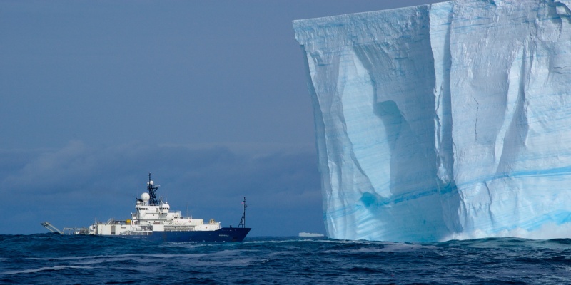
Research ship Revelle in the southern ocean: 100 meters in length. Note: Ninety percent of this iceberg is beneath the surface.
More on the Regional Cabled Array oceanography program here.
The data variable is
spkir_downwelling_vectorx 7 wavelengths per below9 months continuous operation at about 4 samples per second gives 91 million samples
DataSet includes
int_ctd_pressureandtimeCoordinates; Dimensions arespectra(0–6) andtimeOregon Slope Base
node : SF01A,id : RS01SBPS-SF01A-3D-SPKIRA101-streamed-spkir_data_recordCorrect would be to plot these as a sequence of rainbow plots with depth, etc
See Interactive Oceans:
The Spectral Irradiance sensor (Satlantic OCR-507 multispectral radiometer) measures the amount of downwelling radiation (light energy) per unit area that reaches a surface. Radiation is measured and reported separately for a series of seven wavelength bands (412, 443, 490, 510, 555, 620, and 683 nm), each between 10-20 nm wide. These measurements depend on the natural illumination conditions of sunlight and measure apparent optical properties. These measurements also are used as proxy measurements of important biogeochemical variables in the ocean.
Spectral Irradiance sensors are installed on the Science Pods on the Shallow Profiler Moorings at Axial Base (SF01A), Slope Base (SF01A), and at the Endurance Array Offshore (SF01B) sites. Instruments on the Cabled Array are provided by Satlantic – OCR-507.
spectral_irradiance_source = './data/rca/irradiance/'
ds_irradiance = [xr.open_dataset(spectral_irradiance_source + 'osb_sp_irr_spec' + str(i) + '.nc') for i in range(7)]
# Early attempt at using log crashed the kernel
day_of_month_start = '25'
day_of_month_end = '27'
time0 = dt64('2019-01-' + day_of_month_start)
time1 = dt64('2019-01-' + day_of_month_end)
spectral_irradiance_upper_bound = 10.
spectral_irradiance_lower_bound = 0.
ds_irr_time_slice = [ds_irradiance[i].sel(time = slice(time0, time1)) for i in range(7)]
fig, axs = plt.subplots(figsize=(12,8), tight_layout=True)
colorwheel = ['k', 'r', 'y', 'g', 'c', 'b', 'm']
for i in range(7):
axs.plot(ds_irr_time_slice[i].spkir_downwelling_vector, \
ds_irr_time_slice[i].int_ctd_pressure, marker='.', markersize = 4., color=colorwheel[i])
axs.set(xlim = (spectral_irradiance_lower_bound, spectral_irradiance_upper_bound), \
ylim = (60., 0.), title='multiple profiles: spectral irradiance')
plt.show()
Shallow Profiler#
Working with shallow profiler ascent/descent/rest cycles#
This topic is out of sequence intentionally. The topics that follow are in more of a logical order.
The issue at hand is that the shallow profiler ascends and descends and rests about nine times per day; but the time of day when these events happen is not perfectly fixed. As a result we need a means to identify the start and end times of (say) an ascent so that we can be confident that the data were in fact acquired as the profiler ascended through the water column. This is also useful for comparing ascent to descent data or comparing profiler-at-rest data to platform data (since the profiler is at rest on the platform).
To restate the task: From a conceptual { time window } we would like very specific { metadata } for time windows when the profiler ascended while collecting data. That is, we want accurate subsidiary time windows for successive profiles within our conceptual time window; per site and year. We can then use these specific { time window } boundaries to select data subsets from corresponding profiling runs.
The first step in this process is to get CTD data for the shallow profiler since it will have a record of depth over time. This record is scanned in one-year chunks to identify the UTM start times of each successive profile. Also determined: The start times of descents and the start times of rests.
From these three sets of timestamps we can make the assumption that the end of an ascent corresponds to the start of a descent. Likewise the end of a descent is the start of a rest; and the start of an ascent is the end of the previous rest. Each ascent / descent / rest interval is considered as one profile (in that order). The results are written to a CSV file that has one row of timing metadata per profile.
Now suppose the goal is to create a sequence of temperature plots for July 2019 for the Axial
Base shallow profiler. First we would identify the pre-existing CSV file for Axial Base for the
year 2019 and read that file into a pandas Dataframe. Let’s suppose it is read into a profile
Dataframe called p and that we have labled the six columns that correspond to
ascent start/end, descent start/end and rest start/ned. Here is example code from BioOpticsModule.py.
p = pd.read_csv(metadata_filename, usecols=["1", "3", "5", "7", "9", "11"])
p.columns = ['ascent_start', 'ascent_end', 'descent_start', 'descent_end', 'rest_start', 'rest_end']
p['ascent_start'] = pd.to_datetime(pDf['ascent_start'])
p['ascent_end'] = pd.to_datetime(pDf['ascent_end'])
p['descent_start'] = pd.to_datetime(pDf['descent_start'])
p['descent_end'] = pd.to_datetime(pDf['descent_end'])
p['rest_start'] = pd.to_datetime(pDf['rest_start'])
p['rest_end'] = pd.to_datetime(pDf['rest_end'])
Let’s examine two rows of this Dataframe:
print(p['ascent_start'][0])
2019-01-01 00:27:00
print(p['ascent_start'][1600])
2019-07-04 15:47:00
That is, row 0 corresponds to the start of 2019, January 1, and row 1600 occurs on July 4.
For a 365 day year with no missed profiles (9 profiles per day) this file would contain 365 * 9 = 3285 profiles. In practice there will be fewer owing to storms or other factors that interrupt data acquisition.
Each row of this dataframe corresponds to a profile run (ascent, descent, rest) of the shallow
profiler. Consequently we could use the time boundaries of one such row to select data that was
acquired during the ascent period of that profile. Suppose a temperature dataset for the month of July
is called T. T is constructed as an xarray Dataset with dimension time.
We can use the xarray select method .sel, as in T.sel(time=slice(time0, time1)), to
produce a Dataset with only times
that fall within a profile ascent window.
time0 = p['ascent_start'][1600]
time1 = p['ascent_end'][1600]
T_ascent = T.sel(time=slice(time0, time1))
Now T_ascent will contain about 60 minutes worth of data.
This demonstrates loading time boundaries from the metadata p.
The metadata informs the small time box. Now we need the other direction
as well: Suppose the interval of interest is the first four days of July 2019.
We have no idea which rows of the metadata p this corresponds to. We need
a list of row indices for p in that time window. For this we
have a utility function.
def GenerateTimeWindowIndices(pDf, date0, date1, time0, time1):
'''
Given two day boundaries and a time window (UTC) within a day: Return a list
of indices of profiles that start within both the day and time bounds. This
works from the passed dataframe of profile times.
'''
nprofiles = len(pDf)
pIndices = []
for i in range(nprofiles):
a0 = pDf["ascent_start"][i]
if a0 >= date0 and a0 <= date1 + td64(1, 'D'):
delta_t = a0 - dt64(a0.date())
if delta_t >= time0 and delta_t <= time1: pIndices.append(i)
return pIndices
This function has both a date range and a time-of-day range. The resulting row index list corresponds to profiles that satisfy both time window constraints: Date and time of day.
The end-result is this: We can go from a conceptual { time window } to a list of { metadata rows }, i.e. a
list of integer row numbers, using the above utility function. Within the metadata structure p we can
use these rows to look up ascent / descent / rest times for profiles.
At that point we have very specific { time window } boundaries for selecting data
from individual profiles.
order data
clean the data to regular 1Min samples
scan the data for profiles; write these to CSV files
load in a profile list for a particular site and year
Now we start charting this data. We’ll begin with six signals, three each from the CTD and the fluorometer. Always we have two possible axes: Depth and time. Most often we chart against depth using the y-axis and measuring from a depth of 200 meters at the bottom to the surface at the top of the chart.
CTD signals
Temperature
Salinity
Dissolved oxygen
Fluorometer signals
CDOM: Color Dissolved Organic Matter)
chlor-a: Chlorophyll pigment A
scatt: Backscatter
The other sensor signals will be introduced subsequently. These include nitrate concentration, pH, pCO2, PAR, spectral irradiance, local current and water density.
# Create a pandas DataFrame: Six columns of datetimes for a particular year and site
# The six columns are start/end for, in order: ascent, descent, rest: See column labels below.
def ReadProfiles(fnm):
"""
Profiles are saved by site and year as 12-tuples. Here we read only
the datetimes (not the indices) so there are only six values. These
are converted to Timestamps. They correspond to ascend start/end,
descend start/end and rest start/end.
"""
df = pd.read_csv(fnm, usecols=["1", "3", "5", "7", "9", "11"])
df.columns=['ascent_start', 'ascent_end', 'descent_start', 'descent_end', 'rest_start', 'rest_end']
df['ascent_start'] = pd.to_datetime(df['ascent_start'])
df['ascent_end'] = pd.to_datetime(df['ascent_end'])
df['descent_start'] = pd.to_datetime(df['descent_start'])
df['descent_end'] = pd.to_datetime(df['descent_end'])
df['rest_start'] = pd.to_datetime(df['rest_start'])
df['rest_end'] = pd.to_datetime(df['rest_end'])
return df
# FilterSignal() operates on a time series DataArray passed in as 'v'. It is set up to point to multiple possible
# smoothing kernels but has just one at the moment, called 'hat'.
def FilterSignal(v, ftype='hat', control1=3):
"""Operate on an XArray data array (with some checks) to produce a filtered version"""
# pre-checks
if not v.dims[0] == 'time': return v
if ftype == 'hat':
n_passes = control1 # should be a kwarg
len_v = len(v)
for n in range(n_passes):
source_data = np.copy(v) if n == 0 else np.copy(smooth_data)
smooth_data = [source_data[i] if i == 0 or i == len_v - 1 else \
0.5 * source_data[i] + 0.25 * (source_data[i-1] + source_data[i + 1]) \
for i in range(len_v)]
return smooth_data
return v
Table of Contents#
Coding Environment#
bash, text editor, git, GitHub#
running a Jupyter notebook server (code and markdown)#
I learn the basic commands of the
bashshell; including how to use a text editor likenanoorvimI create an account at
github.comand learn to use the basicgitcommandsgit pull,git add,git commit,git push,git clone,git stashI plan to spend a couple of hours learning
git; I find good YouTube tutorials
I create my own GitHub repository with a
README.mdfile describing my research goalsI set up a Jupyter notebook server on my local machine
As I am using a PC I install WSL-2 (Windows Subsystem for Linux v2)…
…and install Miniconda plus some Python libraries
I clone my “empty” repository from GitHub to my local Linux environment
I start my Jupyter notebook server, navigate to my repo, and create a first notebook
I save my notebook and use
git add, commit, pushto save it safely on GitHubOn GitHub: Add and test a
binderbadgeOnce that works, be sure to
git pullthe modified GitHub repo back into the local copy
Table of Contents#
OOI Data#
Ordering, retrieving and cleaning datasets from OOI#
At this point we do not have any data; so let’s do that next. There are two important considerations. First: If the data volume will exceed 100MB: That is too much to keep in a GitHub repository. The data must be staged “nearby” in the local environment; outside the repository but accessible by the repository code, as in:
------------- /repo directory
/
/home --------
\
-------------- /data directory
Second: Suppose the repo does contain (smaller) datasets, to be read by the code.
If the intent is to use binder to make a sandbox version of the repo
available, all significant changes to this code should be tested: First locally
and then (after a push to GitHub) in binder. This ensures that not too
many changes pile up, breaking binder in mysterious and hard-to-debug ways.
Now that we have a dataset let’s open it up and examine it within a Notebook.
The data are presumed to be in NetCDF format; so we follow common practice of
reading the data into an xarray Dataset which is a composition of xarray DataArrays. There is a certain amount of learning here, particularly as this
library shares some Python DNA with pandas and numpy. Deconstructing an
xarray Dataset can be very challenging; so a certain amount of ink is devoted
to that process in this repo.
Table of Contents#
NetCDF#
NetCDF is the primary data file format
Consists of a two-level heirarchy
Top level: Groups (may or may not be present)
Second level: Subdivided into Dimensions, Coordinates, Data Variables, Indices (?), and Metadata (?)
Python is the operative programming language
XArray is the Python library used to parse and manipulate NetCDF data
The central data structure in XArray is the DataArrays
DataArrays are often bundled together to form Datasets
Both DataArrays and Datasets as objects include parsing and filtering methods
Open and subset a NetCDF data file via the xarray Dataset#
Data provided by OOI tends to be “not ready for use”. There are several steps needed; and these are not automated. They require some interactive thought and refinement.
Convert the principal dimension from
obsorrowtotimeobs/roware generic terms with values running 1, 2, 3… (hinders combining files into longer time series)
Re-name certain data variables for easier use; and delete anything that is not of interest
Identify the time range of interest
Write a specific subset file
For example: Subset files that are small can live within the repo
# This code runs 'one line at a time' (not as a block) to iteratively streamline the data
# Suggestion: Pay particular attention to the construct ds = ds.some_operation(). This ensures
# that the results of some_operation() are retained in the new version of the Dataset.
ds = xr.open_dataset(filename)
ds # notice the output will show dimension as "row" and "time" as a data variable
ds = ds.swap_dims({'row': 'time'}) # moves 'time' into the dimension slot
ds = ds.rename({'some_ridiculously_long_data_variable_name':'temperature'})
ds = ds.drop('some_data_variable_that_has_no_interest_at_this_point')
ds = ds.dropna('time') # if any data variable value == 'NaN' this entry is deleted: Includes all
# corresponding data variable values, corresponding coordinates and
# the corresponding dimension value. This enables plotting data such
# as pH that happens to be rife with NaNs.
ds.z.plot() # this produces a simple chart showing gaps in the data record
ds.somedata.mean() # prints the mean of the given data variable
ta0 = dt64_from_doy(2021, 60) # these time boundaries are set iteratively...
ta1 = dt64_from_doy(2021, 91) # ...to focus in on a particular time range with known data...
ds.sel(time=slice(ta0, ta1)).z.plot() # ...where this plot is the proof
ds.sel(time=slice(ta0, ta1)).to_netcdf(outputfile) # writes a time-bounded data subset to a new NetCDF file
Table of Contents#
Depth And Time#
Datasets have a depth attribute z and a time dimension time. These are derived by the data
system and permit showing sensor values (like temperature) either in terms of depth below the
surface; or in time relative to some benchmark.
Table of Contents#
Data Features#
Some signals may have dropouts: Missing data is usually flagged as
NaNSee the section above on using the xarray
.dropna(dimension)feature to clean this up
Nitrate data also features dark sample data
Spectrophotometer instruments measure both optical absorption and beam attenuation
For both of these about 82 individual channel values are recorded
Each channel is centered at a unique wavelength in the visible spectrum
The wavelength channels are separated by about 4 nm
The data are noisy
Some channels contain no data
Sampling frequency needed
Spectral irradiance carries seven channels (wavelengths) of data
Current measurements give three axis results: north, east, up
ADCP details needed
The OOI Data Catalog Documentation describes three levels of data product, summarized:
Level 1 Instrument deployment: Unprocessed, parsed data parameter that is in instrument/sensor units and resolution. See note below defining a deployment. This is not data we are interested in using, as a rule.
Level 1+ Full-instrument time series: A join of recovered and telemetered streams for non-cabled instrument deployments. For high-resolution cabled and recovered data, this product is binned to 1-minute resolution to allow for efficient visualization and downloads for users that do not need the full-resolution, gold copy (Level 2) time series. We’d like to hold out for ‘gold standard’.
Level 2 Full-resolution, gold standard time series: The calibrated full-resolution dataset (scientific units). L2 data have been processed, pre-built, and served from the OOI system to the OOI Data Explorer and to Users. The mechanisms are THREDDS and ERDDAP; file format
NetCDF-CF. There is one file for every instrument, stream, and deployment. For more refer to this Data Download link.
Deprecated Content on Data Downloads#
…from the OOI Data Explorer…
Access Array Data, Oregon Margin, Profiling Assets, All Instrument Types, All Parameters, Go
A very dense page with charts, tabs, multiple scroll bars and so forth
Exploration of the various tabs encouraged
Data, Inventory, Downloads, Annotations, Deployments
Downloads tab
Full resolution data: 1 second per sample
Choose link ‘full resolution downloads’
Page of fluorometer datasets in deployment sequence: time ranges shown
Select Downloads > THREDDS Catalog > Dataset > page listing files
Deployment 8, FLORT for the triplet
Check the time range in the filename for best match to March 2021
Click to go to yet another page, this one for “ACCESS” and multiple choices
Select HTTPServer to download the NetCDF data file: 600+ MB
1Min resolution: 1 minute per sample
Green Download button for various streams / sensors
Three format options: ERDDAP (+ 3 sub-options), CSV and NetCDF
NetCDF URL gives a shareable download link
NetCDF Download button > 1Min downsampled data
These datasets extend over the full OOI program duration: 2014 to present
Data description text + chart symbol (left) produces a curtain plot
Full resolution data is sub-divided into consecutive time ranges called “deployments”. The resulting NetCDF files have these distinctions compared to the 1Min data:
Data is sampled at about one sample per second
Sensors are combined in NetCDF files
For example a CTD file includes salinity, temperature, pressure, density and conductivity
The data files are much larger on average
The sample dimension is
obs(observation number) rather thanrowHowever the swap procedure is the same: Swap in
time
operating on '../../../data/rca/OregonSlopeBase/profiler/ctd/ooi-rs01sbps-sf01a-2a-ctdpfa102_6974_57e0_dbda.nc' and so on
Contents#
Computing Infrastructure#
bash
editors
git
GitHub
Python
nbpuller
binder
wget
pickle
modules
condaenvironments
vocabulary
generating replicators
wget#
wget can be used recursively to copy files from the web, i.e. to make local copies.
wget used in the Global Ocean notebook to get 500MB of data from the
cloud that would otherwise make the repository too bulky for GitHub.
Example usage, typically run from the command line, run from a Jupyter notebook
cell, or placed in a bash script:
wget -q https://kilroybackup.s3.us-west-2.amazonaws.com/glodap/GLODAPv2.2016b.NO3.nc -O glodap/NO3.nc
The -q flag suppresses output (‘quiet’) and -O specifies the local name of the data file.
Jupyter servers#
Littlest and so on
flag move up to RCA OOI Terminology#
instrument: A physical device with one or more sensors.
stream: Sensor data.
deployment: The act of putting infrastructure in the water, or the length of time between a platform going in the water and being recovered and brought back to shore.There are multiple deployment files per instrument.
Diagnostics#
#########################
#
# Profiler diagnostic view
#
#########################
# This is a diagnostic for a sequence of four profiles:
for i in [503, 504, 505, 506]: print(i, 'profile start / end:', pDf21["ascent_start"][i], \
pDf21["descent_end"][i], ' duration: ', pDf21["descent_end"][i] - pDf21["ascent_start"][i])
# Results, noting the fourth one is a midnight (slow descent) profile
503 profile start / end: 2021-03-01 00:27:00 2021-03-01 02:05:00 duration: 0 days 01:38:00
504 profile start / end: 2021-03-01 02:42:00 2021-03-01 04:21:00 duration: 0 days 01:39:00
505 profile start / end: 2021-03-01 04:52:00 2021-03-01 06:31:00 duration: 0 days 01:39:00
506 profile start / end: 2021-03-01 07:22:00 2021-03-01 10:03:00 duration: 0 days 02:41:00
# Profile 506 is an hour longer in duration than the three prior. The profiler pauses during descent
# to give the pH sensor time to equilibrate. The following chart shows depth with time over 24 hours
# including slowed descents for midnight and noon.
#####################
#
# Saving a figure
#
#####################
fig.savefig(os.getcwd() + "/Images/charts/ABCOST_signals_vs_depth_and_time.png")
#####################
#
# Generate / Save / Play Back an animated chart
#
#####################
# This code (animate / playback / save) takes time to run so commented out by default
# if False:
# anim = animation.FuncAnimation(fig, AnimateChart, init_func=AnimateInit, \
# frames=nframes, interval=200, blit=True, repeat=False)
# play immediately: HTML(anim.to_html5_video())
# anim.save(this_dir + '/Images/animations/multisensor_animation.mp4')
#######################################
#
# Specific to BioOptics: Generate a five-signal animation
#
#######################################
# Animated time series
site = 'osb'
year = '2021'
pDf21 = ReadProfileMetadata(os.getcwd() + "/./Profiles/" + site + year + ".csv")
firstframe = 506 # march 1 in 2021 at OSB
nframes = 279 # 279 max for one month
ncharts = 5
fig, axs = plt.subplots(figsize=(12.5,14), tight_layout=True)
# configuration lists with seven elements each, one for each sensor
clr = ['red', 'black', 'xkcd:bronze', 'green', 'magenta']
lows = [temp_lo, salinity_lo, do_lo, chlora_lo, cdom_lo]
highs = [temp_hi, salinity_hi, do_hi, chlora_hi, cdom_hi]
lbls = ["Temperature","Salinity","Dissolved Oxygen","Chlorophyll-A","CDOM"]
offs = [1.0, 1.065, 1.130, 1.195, 1.260]
mrkrs = ['o', 's', 'D', 'v', '^']
axs.set_title('Temp, Salinity, DO, Chl-A, CDOM with Depth/Time')
axs.title.set_fontsize(22)
axs.yaxis.label.set_color('k')
axs.yaxis.label.set_fontsize(18)
axs.set_ylabel("Depth (m)")
axs.xaxis.label.set_fontsize(18)
atw = [axs.twiny() for i in range(ncharts)] # twin y-axes supporting the multiple sensor types
# Configures all of the twin axes per the above configuration lists
for i in range(ncharts):
atw[i].set(xlim = (lows[i], highs[i]), ylim = (-200., 0.))
atw[i].xaxis.label.set_fontsize(18)
atw[i].set_xlabel(lbls[i])
atw[i].xaxis.set_ticks_position('top')
atw[i].spines['top'].set_position(('axes', offs[i]))
atw[i].xaxis.label.set_color(clr[i])
atw[i].tick_params(axis='x', colors=clr[i], size=4, width=1.5)
lines = [atw[i].plot([], [], lw=1, marker=mrkrs[i], ms = 6., c=clr[i], mfc=clr[i])[0] for i in range(ncharts)]
def AnimateInit():
for i in range(ncharts): lines[i].set_data([], [])
return lines
pIdcs = [i for i in range(firstframe, firstframe + nframes)]
def AnimateChart(frame):
global pIdcs
t0, t1 = pDf21['ascent_start'][pIdcs[frame]], pDf21['ascent_end'][pIdcs[frame]]
Ts = dsT.sel(time=slice(t0, t1))
Ss = dsS.sel(time=slice(t0, t1))
Os = dsO.sel(time=slice(t0, t1))
As = dsA.sel(time=slice(t0, t1))
Cs = dsC.sel(time=slice(t0, t1))
lines[0].set_data(Ts.temp, Ts.z)
lines[1].set_data(Ss.salinity, Ss.z)
lines[2].set_data(Os.doxygen, Os.z)
lines[3].set_data(As.chlora, As.z)
lines[4].set_data(Cs.cdom, Cs.z)
clear_output(wait = True)
print("animating frame", frame)
return lines
##########################################################
#
# Organizational remarks across 16 datatypes (spectrophotometer not included
#
##########################################################
#
# Concerning the names of data variables
# Some engineering elements of OOI result in complex names. This commented-out code fragment demonstrates
# opening a NetCDF file as an XArray Dataset and renaming a data variable to something simpler.
#
# dsO = xr.open_dataset("../data/data_explorer_1Min/axb/profiler/axb_profiler_doxygen_1Min.nc")
# dsO = dsO.rename_vars({"moles_of_oxygen_per_unit_mass_in_sea_water_profiler_depth_enabled":"doxygen"})
# dsO
#
# This cell formerly loaded selected datasets from the large (multi-year) data pool. This pool is
# external to the repository owing its large volume. This read cell is therefore now deprecated
# in favor of subsequent cells that load smaller datasets from within the repository.
#
# To keep code compact I use the following table of abbreviations for sensors.
# BioOptics includes Fluorometers, the main emphasis here. Fluorometers carry either two or
# three sensor types: Chlorophyll-A, Color Dissolved Organic Matter (CDOM), and particulate backscatter.
# The BioOptics ensemble also includes PAR and Spectral Irradiance. PAR measurements are individual
# values. Spectral irradiance is seven values per observation. Spectrophotometers are not considered
# in this notebook.
#
# Dictionary of single-letter sensor keys: The capitalized letter follows 'ds', an abbreviation for
# an XArray Dataset. We have therefore: dsA, dsB, dsC, etcetera
#
# Desig Data Renamed Instrument Runs during
# ----- ---- ------- ---------- -----------
# A Chlorophyll-A chlora fluorometer continuous
# B backscatter backscatter fluorometer continuous
# C CDOM cdom fluorometer continuous
# G pCO2 pco2 ? midnight/noon descent
# H pH ph pH midnight/noon descent
# I Spectral Irradiance ? spkir continuous
# M Reserved for Nitrate' ? nitrate midnight/noon ascent
# N Nitrate ? nitrate midnight/noon ascent
# P PAR par PAR continuous
# Q pressure pressure CTD continuous
# O dissolved oxygen doxygen CTD continuous
# S salinity salinity CTD continuous
# T temperature temp CTD continuous
# U velocity east veast xyz-current continuous
# V velocity north vnorth xyz-current continuous
# W velocity up vup xyz-current continuous
#
#
# Shallow profilers begin at rest at a depth of 200 meters. They ascend to within
# about 10 meters of the surface, then descend to create a double profile dataset;
# whereupon they return to the at-rest state. This cycle repeats nine times per
# day. What follows is a simple dictionary of interval designators: The capital letter
# follows the sensor key
#
# A Ascent
# D Descent
# R Rest
#
#
# There are three RCA shallow profiler sites with names abbreviated herein:
#
# osb Oregon Slope Base
# axb Axial Base
# oos Oregon Offshore (part of the Endurance array)
#
# For more on this see the README.md file and the Notebooks subdirectory.
#
################################################################################################
####################
####################
####
#### IMPORTANT!!!!!!!!!!!
####
#### The code below loads data and ***renames*** the data variables to make them easier to work with
####
####################
####################
.......................................
# This cell can be used to glance at data availability for each type of data. It uses a
# very simple plot call to show presence/absence over the history of the cabled array
# deployment. Both pCO2 and pH are 'no data' results; and upward velocity looks suspicious.
# The other datasets look to be present during the first half of 2021.
#
# To recap the relevant part of the single-letter-designator table...
#
# Desig Data Renamed Instrument
# ----- ---- ------- -----------
# G pCO2 pco2 ?
# H pH ph pH
# I Spectral Irradiance si412, si443, si490, spkir
# si510, si555, si620, si683
# N Nitrate nitrate nitrate
# P PAR par PAR
# U velocity east veast ADCP?
# V velocity north vnorth ADCP?
# W velocity up vup ADCP?
# un-comment the next line and one of the sensor lines that follow
# fig, ax = plt.subplots(figsize=(12, 8), tight_layout=True)
# ax.plot(dsG.time, dsG.pco2, ms = 1., color='blue', mfc='blue') # no data
# ax.plot(dsH.time, dsH.ph, ms = 1., color='blue', mfc='blue') # no data
# ax.plot(dsI.time, dsI.si412, ms = 1., color='blue', mfc='blue') # good first half of 2021 (max 80)
# ax.plot(dsI.time, dsI.si443, ms = 1., color='blue', mfc='blue') # "
# ax.plot(dsI.time, dsI.si490, ms = 1., color='blue', mfc='blue') # "
# ax.plot(dsI.time, dsI.si510, ms = 1., color='blue', mfc='blue') # "
# ax.plot(dsI.time, dsI.si555, ms = 1., color='blue', mfc='blue') # "
# ax.plot(dsI.time, dsI.si620, ms = 1., color='blue', mfc='blue') # " (max down around 15)
# ax.plot(dsI.time, dsI.si683, ms = 1., color='blue', mfc='blue') # " (max down around 6)
# ax.plot(dsN.time, dsN.nitrate, ms = 1., color='blue', mfc='blue') # "
# ax.plot(dsO.time, dsO.doxygen, ms = 1., color='blue', mfc='blue') # "
# ax.plot(dsP.time, dsP.par, ms = 1., color='blue', mfc='blue') # "
# ax.plot(dsS.time, dsS.salinity, ms = 1., color='blue', mfc='blue') # "
# ax.plot(dsT.time, dsT.temp, ms = 1., color='blue', mfc='blue') # "
# ax.plot(dsU.time, dsU.veast, ms = 1., color='blue', mfc='blue') # "
# ax.plot(dsV.time, dsV.vnorth, ms = 1., color='blue', mfc='blue') # "
# ax.plot(dsW.time, dsW.vup, ms = 1., color='blue', mfc='blue') # " suspiciously high amplitude in 2021
########################
#
# shear calculation code removed from BioOptics.ipynb
#
########################
# get a list of ascent indices (for dataframe pDf21, OSB 2021) for March 1, 2021
t_midnight = td64(0, 'm')
t_almost_midnight = td64(24*60-1, 'm')
list_of_ascents = GenerateTimeWindowIndices(pDf21, dt64('2021-03-01'), dt64('2021-03-02'), noon0, noon1)
print(list_of_ascents)
# attempt a shear calculation
def ShearProfile(v, offset):
"""Calculate shear from a Dataset dim=time, data vars = veast, vnorth, z"""
# verify the time dimension
if not v.dims['time']: return v
len_v = v.dims['time']
return [0. if i + offset >= len_v else \
np.sqrt((vel['veast'][i]-vel['veast'][i + offset])**2 + \
(vel['vnorth'][i]-vel['vnorth'][i + offset])**2) \
for i in range(len_v)]
i=0
offset=2
veast = dsU.sel(time=slice(pDf21['ascent_start'][list_of_ascents[i]], pDf21['ascent_end'][list_of_ascents[i]]))
vnorth = dsV.sel(time=slice(pDf21['ascent_start'][list_of_ascents[i]], pDf21['ascent_end'][list_of_ascents[i]]))
vel = xr.merge([veast, vnorth])
shear = ShearProfile(vel, offset)
fig, axs = plt.subplots(figsize=(12,4), tight_layout=True)
axs.plot(shear, vel.z, marker='.', ms=9., color='k', mfc='r')
axs.set(ylim = (-200., 0.), title='--------------')
# Some additional poking around code...
# fig, axs = plt.subplots(figsize=(12,4), tight_layout=True)
# axs.plot(vel.time, vel.z, marker='.', ms=9., color='k', mfc='r')
# axs.set(ylim = (-200., 0.), title='Depth versus time: Ascent per velocity sensor')
# vel.var
Part 3 Getting Data#
Get Started With Data#
This notebook introduces working with OOI data: From file to data structure to time series chart.
Visualization of data with depth (for example using profilers) is done in BioOptics.ipynb.
Starting assumption: A Dataset has been secured from OOI as a NetCDF file.
Within this directory we have dataset.nc to serve this role: Surface water
Chlorophyll-A fluorescence from Global Station Papa.
Using XArray Dataset methods we proceed:
Read the file into memory as an XArray Dataset
Print an overview of the Dataset: Dimensions, Coordinates, Data Variables and Attributes
Modify the ordinal dimension
rowtotimeAlong the time dimension: Drop all entries with value NAN (not a number)
Rename the Data Variable for
chlorophyllfrom a very long descriptive term to simplychloraPrint an overview of the Dataset to note these changes
Plot the chlorophyll data over the full time interval
…noting this runs from 2014 through 2020 with some gaps
…noting that August through October 2018 appears to be good data
import numpy as np, pandas as pd, xarray as xr
from numpy import datetime64 as dt64, timedelta64 as td64
import matplotlib.pyplot as plt
D = xr.open_dataset('./../dataset.nc')
D
D = D.swap_dims({'row':'time'}) # make 'time' the Dimension
D = D.dropna('time') # drop NaN data values
D=D.rename({'mass_concentration_of_chlorophyll_a_in_sea_water':'chlora'})
D
print('Dataset starts:', D.time[0].time.data, '.....and ends:', D.time[-1].time.data)
D.chlora.plot()
Interpretation so far…#
The dataset D was read from a NetCDF file and manipulated in the above cells. The last step was plotting the Chlorophyll A concentration as a time series. Data is present in intermittent stretches along the time axis. The line jumps indicate no data are available.
Next we focus on a time range in 2018 where we appear to have good data: Aug 1 through Nov 1.
Extract a time sub-range Aug 1 - Nov 1, 2018
Drop NaN values
Examine the resulting Dataset
Examine a rough plot of the chlorophyll with time
Resample the data from 15 minute intervals to day intervals
Plot both day-interval and 15-minute-interval versions of chlorophyll with time
time0 = dt64('2018-08-01')
time1 = dt64('2018-11-01')
D = D.sel(time=slice(time0, time1)) # slice out data from the chosen time range
D = D.dropna('time') # (redundant) drop NaN values
D # inspect the dataset
D.chlora.plot() # this plot shows a contiguous data record
D24=D.resample(time='24H').mean()
fig, ax = plt.subplots(figsize=(8, 8), tight_layout=True)
ax.plot(D.time, D.chlora, color='red')
ax.plot(D24.time, D24.chlora, color='black')
ax.set(title = 'Chlorophyll (time): Global Station Papa 15 min (red) and daily (black)')
ax.set(ylim = (0., 3.))
Interpretation#
The chlorophyll signal shows a four-fold increase through mid-October and then drops sharply towards the end of the time series.
This fluorometer resides at a fixed depth on a mooring as part of the Station Papa global array.
Profiling sensors add an additional level of complexity.
Here on: Residual notes#
To Do List#
interactive oceans data?
reimagine ocean.py without charting; then depthchart.py
maybe ./../data/experiment01 with a readme.txt and all the data in one place
charts folder; then decorate the narrative with the charts
make dim dropouts not plot diagonal lines
revisit generating profiles from a depth time series
programmatic data access through an API
data streamlining
Understand/annotate shallow profiler profile intervals (r,a,d)
Sampling rates: Optional
Profiler metadata: Calculate / Load timing data for rest - ascent - descent timestamps#
destination: subfolder
profiles:.csvfiles corresponding to pandas dataframesrow includes a profiler ascent start, descent start, rest start
axb, osb, oos
Annotate pH equil stops: both local midnight and noon
Are things like T/C/DO stable during equil stops?
Does chlorophyll versus backscatter show more zooplankton at depth? Diel?
ArcticGRO 29
Spectrophotometer#
Dimensions obs and wavelength
This goes into technicalnotes.ipynb#
Selecting profile ascent data from the profiler time series#
A separate set of notebooks (see Notebooks folder) produced tables of profile start/end times
Results are saved in the Profiles folder of this repository
Each saved CSV file is for a single year and a single location (from OSB, OOS, AXB)
Starting from 2015 and running through 2021 this results in 3 x 7 = 21 files
Owing to technical issues: Oregon Offshore is missing for 2021
Here we use strictly one of these: For OSB and 2021:
osb2021.csv.
ReadProfileMetadata(fnm)loads profile metadata into a (pandas) DataframepDfEach row of
pDf: dt64 times: start/end for all three of: ascent, descent, restWe focus on
ascent_startandascent_endThe reference is hence pDf[‘ascent_start’][integer_index]
For OSB and 2021: integer_index = 0 will be the first (UTC) profile on January 1, 2021 at OSB
At nine profiles per day there are a maximum of 365 * 9 profiles in a year
We expect occasional drops and intervals of time when the profiler was not running
GenerateTimeWindowIndices(pDf, date0, date1, time0, time1)produces a list of table row-indices forpDfdate0 and date1 define a range of days
time0 and time1 define a time range applied to each day
the list is extended for each
ascent_startinpDfthat falls within both
Suppose we want to see only nitrate profiles, i.e. the noon and midnight profiles from each day
First generate a list using the midnight time range, say
list_midnSecond generate a list using the noon time range, say
list_noonCombine the lists: These will be non-sequential indices for
pDfrowsUse the list sorting method
list.sort()to order this combined list. Result will be time-sequential.
Suppose we want sensor vs depth charts for a set of profiles
…we have the corresponding list of profile indices (indexing into
pDf) calledpIdcs.…we have a Dataset of data from sensor X called
dsXRun an index
iacrosspIdcsFor index
iset a time range:t0, t1 = pDf['ascent_start'][pIdcs[i]], pDf['ascent_end'][pIdcs[i]]Select data from the Dataset using this time range:
Xs = dsX.sel(time=slice(t0, t1))
To streamline comparison-charting for two sensors A and B we have the function
ChartAB()def ChartAB(pDf, xrng, pIdcs, A, Az, Albl, Acolor, B, Bz, Blbl, Bcolor)pDfis the profile metadata described abovexrngis a list of low/high tuples for A and BpIdcsis a list of profile indices.The length of this list corresonds to the number of charts to be produced
A and Az are data and z-value DataArrays, same for B and Bz
From a Dataset
Asthese would be passed asAs.sensornameandAs.z
nitrate sequence to include midnight and noon both
Place in this section a brief description of element-wise calculation (see shear, below)
Include integrating shear as a new DataArray in a Dataset
Consider: Filter velocity e.g. 30 meter box filter before calculating shear
def streamline_data(source, output, keep_dims, keep_coords, keep_data_vars, keep_attrs):
def timeswap_preprocessor(fds): # per-file datasets have dimension 'obs'
a = fds.swap_dims({'obs':'time'}) # ...so we pre-swap that for time
for key in a.dims:
if key not in keep_dims: a = a.drop_dims(key)
for key in a.coords:
if key not in keep_coords: a = a.drop(key)
for key in a.data_vars:
if key not in keep_data_vars: a = a.drop(key)
attrs_dict = a.attrs.copy()
for key in attrs_dict:
if key not in keep_attrs: a.attrs.pop(key)
return a
ds = xr.open_mfdataset(source, preprocess = timeswap_preprocessor, concat_dim='time', combine='by_coords')
ds.to_netcdf(output)M
return ds
# Example: pH sampling tracking the profiler
ds_phsen.sel(time=slice(dt64('2020-11-23T00:00:00'),dt64('2020-11-26T00:00:00'))).depth.plot()
def prepro(fds):
return fds.swap_dims({'obs':'time'})
sample_file = 'deployment*.nc'
ds = xr.open_mfdataset(os.getenv("HOME") + '/data_CTD_entire_time_range/' + sample_file, preprocess = prepro, compat='no_conflicts')
# - 3-Wavelength fluorometer (flort: got it for OSB SP 2019)
# - CTD (ctdpf: got it for OSB SP 2019)
# - Photosynthetically Available Radiation (parad: got it for OSB SP 2019)
# - pH (phsen: got it for OSB SP 2019)
# - Spectral Irradiance (spkir: got)
# - Spectrophotometer (optaa: got)
# - NOT YET: Single Point Velocity Meter (velpt: )
# - Nitrate (nutnr: Got both nutnr_a_sample and nutnr_a_dark_sample)
# - pCO2 water (two streams: pco2w_a_sami_data_record and pco2w_b (no data past 2018; placed 2018 data
# instrument 2014 2015 2016 2017 2018 2019 2020
#
# Oregon Slope Base
# SP flort 3-wavelength !
# SP ctdpf !
# SP parad !
# SP phsen !
# SP spkir !
# SP optaa !
# SP velpt !
# SP nutnr_a, nutnr_a_dark !
# SP pco2w_a_sami !
# SP pco2w_b_sami ! NA
# 200m ctdpf !
# 200m flort !
# 200m phsen !
# 200m do_stable !
# DP ctdpf wfp ! NA NA NA
# DP ctdpf inst !
# DP acm (VEL3D) inst !
# DP flcdrdt inst fluorometer !
#
# Axial Base
# SP flort !
# SP ctdpf !
# SP parad !
# SP phsen !
# SP spkir ?
# SP optaa !
# SP velpt ?
# SP nutnr_a, nutnr_a_dark ?
# SP pco2w_a_sami !
# SP pco2w_b_sami ?
# 200m ctdpf !
# 200m flort !
# 200m phsen !
# 200m do_stable !
# DP ctdpf wfp !
# DP ctdpf inst !
# DP acm (VEL3D) inst ?
# DP flcdrdt inst CDOM fluorometer !
# DP fl????? inst 2-Wav fluorometer ?
# DP dissolved oxygen !
#
# filename anatomy
# deployment0005 or 0006 etc
# _RS03AXPS site: AX is Axial, SB is slope base
# -SF03A platform: SF is shallow profiler, DP is deep profiler, PC is 200m platform
# -3B number + letter: unknown
# -OPTAAD301 6-letter instrument + 'A'/'D' + 30X/10X
# -streamed 'streamed' or 'recovered_inst' or 'recovered_wfp'
# -optaa_sample instrument designator, sometimes 'dpc_xxxxx_instrument_recovered'
# _20191004T073957.414490 datetime start
# -20191014T220233.907019 datetime end
# .nc NetCDF file
#
ds=xr.open_mfdataset(…filename description string including wildcard…) ds = ds.swap_dims({‘obs’:’time’})
See use of a preprocessor function; or avoid this by putting the data into ‘time’ dimension first
More un-sorted code resources#
colorT = 'black'
colorS = 'xkcd:blood orange'
colorO = 'xkcd:blue'
colorA = 'xkcd:green'
colorB = 'xkcd:dark cyan'
colorC = 'red'
colorN = 'xkcd:gold'
colorP = 'magenta'
colorH = 'xkcd:purple blue'
colorTd = 'grey'
colorSd = 'xkcd:yellow orange'
colorOd = 'xkcd:azure'
colorAd = 'xkcd:pale green'
colorBd = 'xkcd:light turquoise'
colorCd = 'xkcd:pinkish'
colorNd = 'xkcd:brownish yellow'
colorPd = 'xkcd:barbie pink'
colorHd = 'xkcd:pastel purple'
# time ranges for midnight and noon profiles, adjusted for UTC
# midn0 - midn1 is a time range for the midnight profile start
# noon0 - noon1 is a time range for the noon profile start
midn0 = td64( 7*60 + 10, 'm') # 7 hours 10 minutes
midn1 = td64( 7*60 + 34, 'm') # 7 hours 34 minutes
noon0 = td64(20*60 + 30, 'm') # 20 hours 30 minutes
noon1 = td64(20*60 + 54, 'm') # 20 hours 54 minutes
def GetDiscreteSummaryCastSubset(dsDf, cast, columns):
'''
dsDf is a Discrete Summary Dataframe
cast is a string corresponding to the cast identifier, e.g. 'CTD-001'
columns is a list of column names to extract from the full Dataframe
Returns a Dataframe for 'just that cast' and 'just those parameters'
'''
return dsDf.loc[(dsDf['cast']==cast)][columns]
def CompareAscentDescent(p, T, S, O, A, B, C):
'''Get a sense of variability between ascent and subsequent descent'''
pw = GenerateTimeWindowIndices(p, dt64_from_doy(2021, 65), dt64_from_doy(2021, 65), td64(0, 'h'), td64(24, 'h'))
ncharts = len(pw)
fig, axs = plt.subplots(ncharts, 3, figsize=(15, 4*ncharts), tight_layout=True)
axt0 = [axs[i][0].twiny() for i in range(ncharts)]
axt1 = [axs[i][1].twiny() for i in range(ncharts)]
axt2 = [axs[i][2].twiny() for i in range(ncharts)]
for i in range(pw[0], pw[-1]+1):
axi = i - pw[0]
t0, t1, t2 = p["ascent_start"][i], p["ascent_end"][i], p["descent_end"][i]
Ta = T.sel(time=slice(t0, t1))
Td = T.sel(time=slice(t1, t2))
Sa = S.sel(time=slice(t0, t1))
Sd = S.sel(time=slice(t1, t2))
Oa = O.sel(time=slice(t0, t1))
Od = O.sel(time=slice(t1, t2))
Aa = A.sel(time=slice(t0, t1))
Ad = A.sel(time=slice(t1, t2))
Ba = B.sel(time=slice(t0, t1))
Bd = B.sel(time=slice(t1, t2))
Ca = C.sel(time=slice(t0, t1))
Cd = C.sel(time=slice(t1, t2))
axs[axi][0].plot(Ta.temp, Ta.z, color=colorT, marker='s', ms=4., mfc=colorT)
axs[axi][0].plot(Td.temp, Td.z, color=colorTd, marker='v', ms=4., mfc=colorTd)
axt0[axi].plot(Sa.salinity, Sa.z, color=colorS, marker='o', ms=4., mfc=colorS)
axt0[axi].plot(Sd.salinity, Sd.z, color=colorSd, marker='^', ms=4., mfc=colorSd)
axs[axi][1].plot(Oa.doxygen, Oa.z, color=colorO, marker='s', ms=4., mfc=colorO)
axs[axi][1].plot(Od.doxygen, Od.z, color=colorOd, marker='v', ms=4., mfc=colorOd)
axt1[axi].plot(Aa.chlora, Aa.z, color=colorA, marker='o', ms=4., mfc=colorA)
axt1[axi].plot(Ad.chlora, Ad.z, color=colorAd, marker='^', ms=4., mfc=colorAd)
axs[axi][2].plot(Ba.backscatter, Ba.z, color=colorB, marker='s', ms=4., mfc=colorB)
axs[axi][2].plot(Bd.backscatter, Bd.z, color=colorBd, marker='v', ms=4., mfc=colorBd)
axt2[axi].plot(Ca.cdom, Ca.z, color=colorC, marker='o', ms=4., mfc=colorC)
axt2[axi].plot(Cd.cdom, Cd.z, color=colorCd, marker='^', ms=4., mfc=colorCd)
axs[axi][0].set(ylim=(-200., 0.))
axs[axi][1].set(ylim=(-200., 0.))
axs[axi][2].set(ylim=(-200., 0.))
axs[axi][0].set(xlim=(temp_lo, temp_hi))
axs[axi][1].set(xlim=(do_lo, do_hi))
axs[axi][2].set(xlim=(bb_lo, bb_hi))
axs[0][0].set(title='Temp (black) and Salinity (orange)')
axs[0][1].set(title='Oxygen (blue) and Chlorophyll (green)')
axs[0][2].set(title='CDOM (red) and Backscatter (cyan)')
fig.show()
# For additional labeling:
# axs[iC][0].text(7.4, -14, 'S')
# axs[iC][0].text(10.2, -14, 'T')
# axs[iC][1].text(170, -30, 'Chl-A')
# axs[iC][1].text(300, -150, 'DO')
# axs[iC][2].text(.0007, -20, 'CDOM')
# axs[iC][2].text(.0013, -75, 'SCATT')
return
# GLODAP Data Loader
# Requires boto + target directory has write permission
if False: # disabled once the datasets are loaded into /data/glodap
glodapTemperatureFnm = data_dir + '/glodap/glodap_temperature.nc'
glodapSalinityFnm = data_dir + '/glodap/glodap_salinity.nc'
glodapOxygenFnm = data_dir + '/glodap/glodap_oxygen.nc'
import boto
from boto.s3.key import Key
connection = boto.connect_s3(anon=True)
bucket = connection.get_bucket('fixthisshouldhavesecurebucketnamehere')
for key in bucket.list():
filename = key.name.encode('utf-8')
if b'glodap' in filename:
if b'salinity.nc' in filename:
print ('salinity file is', filename)
salinityfilename = filename
if b'temperature.nc' in filename:
print ('temperature file is', filename)
temperaturefilename = filename
if b'oxygen.nc' in filename:
print('oxygen file is', filename)
oxygenfilename = filename
k = Key(bucket)
k.key = salinityfilename
k.get_contents_to_filename(glodapSalinityFnm)
k.key = temperaturefilename
k.get_contents_to_filename(glodapTemperatureFnm)
k.key = oxygenfilename
k.get_contents_to_filename(glodapOxygenFnm)
print('\ndata load complete for glodap')
Dashboards#
temporary notes stash; comments in bold italics.
Bottom line: This is a great deal of inside baseball.
URL is https://qaqc.ooi-rca.net/
APL Status Dashboards
Notice
ooirsn.uw.eduis the base URL.eng.prefix not working today; Nereus works fine.Nereus Works: Looks like the main operational status dashboard
Nereus M2M Plots (‘Machine 2 Machine’ is a legacy term for an API interface I think)
APL PP-Up Tried: Nope. Power graphs?
APL Camera Videos by Day Tried: Could not reach
OMS Very down-in-the-weeds engineering data (see profiler summaries, for example)
I do not see OrcaSound: Does that still exist?
Data: by Site
English site names would be pleasant
Axial Base is easy enough AXBS but… no profiles; just fixed depth
Ok a User Manual would be good
AXPS is more the ticket for profiler data
Fixed Depths works out of the box: One week of Density Oxygen Salinity Temperature (Density shows tides)
Is this the shallow profiler platform maybe?
Depth binned
Standard range ought to be the default for apples to apples slider experience
Slider left to right is surface to depth; depth ranges in title (fine print)
Multi-sensor (VEL, SPKIR) seems to be folded into the charts; very beta
Chlorophyll is a good example (AXPS) of using the slider to prospect in time with depth
Profiles
Another nice way to prospect with the slider
Daily and Yearly are puzzling; Weekly and Monthly seem more functional
In weekly mode: How many profiles do we see? Density does not look like 7 x 9 profiles
In weekly mode: Is the slider quantized at days to give a moving time window view?
Data: by Platform Type
Shallow Profilers
Deep Profilers: Anything to be found here???
Data Stage 1:
Data Stage 2:
Data Stage 3:
Data Stage 4: Not much here; maybe some HITL stuff?
sklearn#
# NOTE: Using dir() on sklearn and sub-libraries can be confusing. Not everything
# we want shows up. Left as an exercise: Find out how to find out what sklearn
# can do. Here follow some puzzling fragments.
#
# import sklearn
# dir(sklearn)
# dir(sklearn.utils)
# dir(sklearn.cluster.KMeans)
#
# from sklearn.cluster import KMeans
# kmeans = KMeans()