Binary classification assigns each sample to one of two classes. Our task in this chapter is a standard one in seismology: given a short window of seismogram data, decide whether it contains a seismic event (label 1) or only noise (label 0). Instead of raw waveforms, we work with four physical features computed from each window:
sta_lta: the ratio of a short-term average amplitude to a long-term average amplitude. An impulsive arrival raises the short-term average and pushes the ratio well above 1. The distribution is heavy-tailed, spanning roughly 0.4 to 40.kurtosis: how impulsive the amplitude distribution is; spiky arrivals raise it.spectral_centroid_hz: the amplitude-weighted mean frequency of the window, roughly 0.2 to 24 Hz. Local events carry more high-frequency energy than ocean-generated microseism noise.dominant_freq_hz: the frequency of the spectral peak.
For the two-dimensional plots in this notebook we use sta_lta and spectral_centroid_hz: an event window tends to have both a high STA/LTA ratio and a high spectral centroid, while noise sits at low values of both.
1. Event versus noise data
We load a balanced set of 2000 windows, half events and half noise, from the course’s synthetic data package.
import numpy as np
import pandas as pd
import matplotlib.pyplot as plt
import mlgeo_synth

df = mlgeo_synth.detector_features(n=2000, event_fraction=0.5, seed=42)
df.head()fig, ax = plt.subplots()
for label, name, color in [(0, "noise", "tab:gray"), (1, "event", "tab:red")]:
sub = df[df["label"] == label]
ax.scatter(sub["sta_lta"], sub["spectral_centroid_hz"],
s=14, alpha=0.5, color=color, edgecolors="k", linewidths=0.3, label=name)
plt.xscale('log')
ax.set_xlabel("STA/LTA ratio")
ax.set_ylabel("Spectral centroid (Hz)")
ax.legend()
ax.grid(True)
plt.show()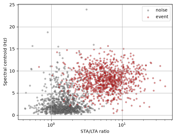
The log-scaled x-axis already tells us how to build the feature matrix: taking the logarithm of a heavy-tailed ratio like STA/LTA is standard feature engineering, and we do it before handing the features to any model.
X = np.column_stack([np.log10(df["sta_lta"]), df["spectral_centroid_hz"]])
y = df["label"].values
Before any classifier, the baseline. We split the data first: everything that gets fit — a scaler, a trivial baseline, a classifier — sees only the training split, and the test split stays untouched until scoring. The trivial predictor assigns every window to the most frequent class; on this balanced set that gives close to 0.5 accuracy, and every classifier below must beat it.
from sklearn.dummy import DummyClassifier
from sklearn.model_selection import train_test_split

# split first: the baseline, like any model, is fit on the training split only
X_train, X_test, y_train, y_test = train_test_split(X, y, test_size=0.4, random_state=42)

baseline = DummyClassifier(strategy="most_frequent").fit(X_train, y_train)
print(f"Majority-class baseline accuracy: {baseline.score(X_test, y_test):.2f}")
Majority-class baseline accuracy: 0.49
We will start with the fundamental LDA.
from sklearn.discriminant_analysis import LinearDiscriminantAnalysis
from sklearn.preprocessing import StandardScaler

# define ML
clf = LinearDiscriminantAnalysis()

# normalize data: fit the scaler on the training split only, then apply it to
# both splits. Fitting on the full dataset would leak the test set's statistics
# into training — the exact flaw the audit exercise in 3.10 teaches you to catch.
scaler = StandardScaler().fit(X_train)
X_train = scaler.transform(X_train)
X_test = scaler.transform(X_test)
X_scaled = scaler.transform(X)  # transform-only, for plotting the full set

# Fit the model.
clf.fit(X_train, y_train)

# calculate the mean accuracy on the given test data and labels.
score = clf.score(X_test, y_test)
print("The mean accuracy on the given test and labels is %f" % score)
The mean accuracy on the given test and labels is 0.952500
from sklearn.inspection import DecisionBoundaryDisplay
ax = plt.subplot()
# plot the decision boundary as a background
DecisionBoundaryDisplay.from_estimator(clf, X_scaled, cmap='PiYG', alpha=0.8, ax=ax, eps=0.5)
ax.scatter(X_scaled[:, 0], X_scaled[:, 1], c=y, cmap='PiYG', alpha=0.6, edgecolors="k")
ax.set_xlabel("log10(STA/LTA), scaled")
ax.set_ylabel("Spectral centroid, scaled")
plt.show()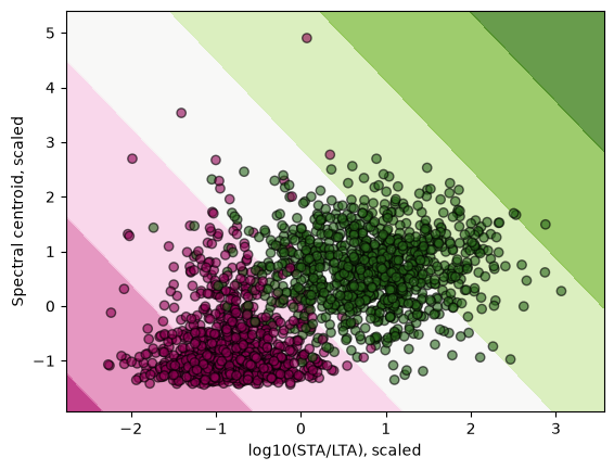
LDA draws a single straight line through the feature space. It does well here because the two classes are roughly separable by a line.
Let’s try a different classifier: KNN.
from sklearn.neighbors import KNeighborsClassifier

# define ML
K = 5
clf = KNeighborsClassifier(K)

# same split, same train-fit scaling as above

# Fit the model.
clf.fit(X_train, y_train)

# calculate the mean accuracy on the given test data and labels.
score = clf.score(X_test, y_test)
print("The mean accuracy on the given test and labels is %f" % score)
The mean accuracy on the given test and labels is 0.960000
# plot the decision boundary as a background
ax = plt.subplot()
DecisionBoundaryDisplay.from_estimator(clf, X_scaled, cmap='PiYG', alpha=0.8, ax=ax, eps=0.5)
ax.scatter(X_scaled[:, 0], X_scaled[:, 1], c=y, cmap='PiYG', alpha=0.6, edgecolors="k")
ax.set_xlabel("log10(STA/LTA), scaled")
ax.set_ylabel("Spectral centroid, scaled")
plt.show()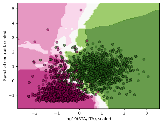
Features with different physical units
Now we test what happens when we do not normalize the features. Our two features have different physical meanings: log-STA/LTA is dimensionless, the spectral centroid is a frequency. Suppose a colleague hands us the centroid in millihertz instead of hertz. Nothing physical has changed, but one axis is now numerically a thousand times larger.
# rebuild the raw features, spectral centroid now in millihertz
X_raw = np.column_stack([np.log10(df["sta_lta"]), df["spectral_centroid_hz"] * 1000.0])

# same KNN, but no scaling this time
clf_raw = KNeighborsClassifier(K)
Xr_train, Xr_test, yr_train, yr_test = train_test_split(X_raw, y, test_size=0.4, random_state=42)
clf_raw.fit(Xr_train, yr_train)
score = clf_raw.score(Xr_test, yr_test)
print("The mean accuracy without scaling is %f" % score)

# plot the decision boundary as a background
ax = plt.subplot()
DecisionBoundaryDisplay.from_estimator(clf_raw, X_raw, cmap='PiYG', alpha=0.8, ax=ax, eps=0.5)
ax.scatter(X_raw[:, 0], X_raw[:, 1], c=y, cmap='PiYG', alpha=0.6, edgecolors="k")
ax.set_xlabel("log10(STA/LTA)")
ax.set_ylabel("Spectral centroid (mHz)")
plt.show()
The mean accuracy without scaling is 0.865000
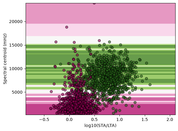
Accuracy drops and the decision boundary is now a set of horizontal bands: the classifier is effectively using the centroid alone. Distance-based classifiers see only numbers, not units. Euclidean distance in the (log-STA/LTA, millihertz) plane is dominated by the millihertz axis, so the STA/LTA information is ignored. Scaling with StandardScaler puts both features on equal footing, which is why we normalized before fitting.
2. Classifier Performance Metrics
In a binary classifier, we label one of the two classes as positive, the other class as negative. Let’s consider N data samples.
| True Class \ predicted Class | Negative | Positive | Total |
|---|---|---|---|
| Negative | True Negative | False Positive | n |
| Positive | False Negative | True Positive | p |
| Total | n’ | p’ | N |
In this example, there were originally a total of positive labels and negative labels. We ended up with predicted as positive and predicted as negative.
True positive TP: the number of data predicted as positive that were originally positive.
True negative TN: the number of data predicted as negative that were originally negative.
False positive FP: the number of data predicted as positive but that were originally negative.
False negative FN: the number of data predicted as negative but that were originally positive.
Confusion matrix:
Count the instances that an element of class A is classified in class B: entry is the number of samples of true class predicted as class . scikit-learn sorts the classes by label, so with noise = 0 (negative) and event = 1 (positive) the matrix confusion_matrix prints is:
The first row is the true-noise windows, the second row the true events; correct predictions sit on the diagonal. The confusion matrix can be extended for a multi-class classification and the matrix is KxK instead of 2x2. The best confusion matrix is one that is close to diagonal, with little off diagonal terms.
Other model performance metrics Model performance can be assessed with the following:
Error : the fraction of the data that was misclassified
-> 0
Accuracy: the fraction of the data that was correctly classified:
--> 1
TP-rate: the fraction of the truly positive samples that are correctly classified:
--> 1
This ratio is also the recall value or sensitivity.
TN-rate: the fraction of the truly negative samples that are correctly classified:
--> 1
This ratio is also the specificity.
Precision: the ratio of samples predicted in the positive class that were indeed positive to the total number of samples predicted as positive.
--> 1
F1 score:
--> 1.
The harmonic mean gives more weight to the lower of the two, so the F1 score is high only if both recall and precision are high.
How do precision and recall co-vary?
def returnPrecisionAndRecall(TP, FP, TN, FN):
    precision = TP / (TP + FP) if (TP + FP) else 0
    recall = TP / (TP + FN) if (TP + FN) else 0
    return {'precision': precision, 'recall': recall}

# Okay, set how many true and false values are in the original dataset

actualTrueValues = 10
actualFalseValues = 10

sumValues = actualTrueValues + actualFalseValues

precisionRecallCollector = []

# Now, run a set of simulations

for n in range(5000):
    TP = 0
    FP = 0
    TN = 0
    FN = 0
    # Begin by randomly setting the total number of true values returned
    totalTrue = np.random.randint(0, high=sumValues)
    # The total number of false values is sumValues - totalTrue
    totalFalse = sumValues - totalTrue
    # Partition totalTrue and totalFalse into TP, FP and TN, FN, respectively
    if totalTrue != 0:
        TP = np.random.randint(0, high=totalTrue)
        FP = totalTrue - TP
    if totalFalse != 0:
        TN = np.random.randint(0, high=totalFalse)
        FN = totalFalse - TN
    thisPandR = returnPrecisionAndRecall(TP, FP, TN, FN)
    precisionRecallCollector.append([thisPandR['precision'], thisPandR['recall']])
pAndRArray = np.asarray(precisionRecallCollector)
plt.scatter(pAndRArray[:,0], pAndRArray[:,1], color='k', alpha=0.25)
plt.xlabel('Precision')
plt.ylabel('Recall')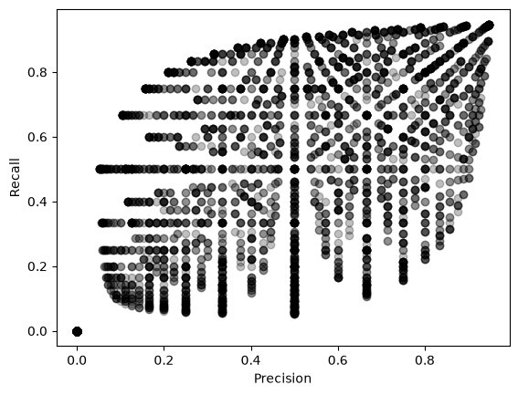
From above, we see that a wide range of behavior between precision and recall can be expected. It is not because a classifier might do well in predicting one class than it does predicting the other class. This demonstrates the important of reporting both metrics.
Let’s print these measures for our scaled KNN classifier, evaluated on the test set, using scikit-learn.
from sklearn.metrics import confusion_matrix,precision_score,recall_score,f1_score

# Fit the model.
y_test_pred=clf.predict(X_test)

print("confusion matrix")
print(confusion_matrix(y_test,y_test_pred))
print("precison, recall")
print(precision_score(y_test,y_test_pred),recall_score(y_test,y_test_pred))
print("F1 score")
print(f1_score(y_test,y_test_pred))
confusion matrix
[[384 12]
[ 20 384]]
precison, recall
0.9696969696969697 0.9504950495049505
F1 score
0.96
A complete well-formatted report of the performance can be called using the function classification_report:
from sklearn.metrics import classification_report
print(f"Classification report for classifier {clf}:\n"
      f"{classification_report(y_test, y_test_pred)}\n")
Classification report for classifier KNeighborsClassifier():
precision recall f1-score support
0 0.95 0.97 0.96 396
1 0.97 0.95 0.96 404
accuracy 0.96 800
macro avg 0.96 0.96 0.96 800
weighted avg 0.96 0.96 0.96 800
Precision and recall trade off: increasing precision reduces recall.
The classifier uses a threshold value to decide whether a data belongs to a class. Increasing the threshold gives higher precision score, decreasing the thresholds gives higher recall scores. Let’s look at the various score values.
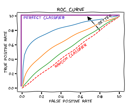
Receiver Operating Characteristics ROC
It plots the true positive rate against the false positive rate. The ROC curve is visual, but we can quantify the classifier performance using the area under the curve (aka AUC). Ideally, AUC is 1.
[source: https://
We compute the curve on the test set: earlier editions of this book plotted the training-set ROC, and that flatters the model.
y_scores = clf.predict_proba(X_test)
print(y_scores[:5])
[[1. 0. ]
[1. 0. ]
[0. 1. ]
[0.8 0.2]
[0. 1. ]]
from sklearn.metrics import roc_curve

fpr,tpr,thresholds=roc_curve(y_test,y_scores[:,1])
plt.plot(fpr,tpr,linewidth=2);plt.grid(True)
plt.xlabel('False Positive Rate')
plt.ylabel('True Positive Rate')
plt.plot([0,1],[0,1],'k--')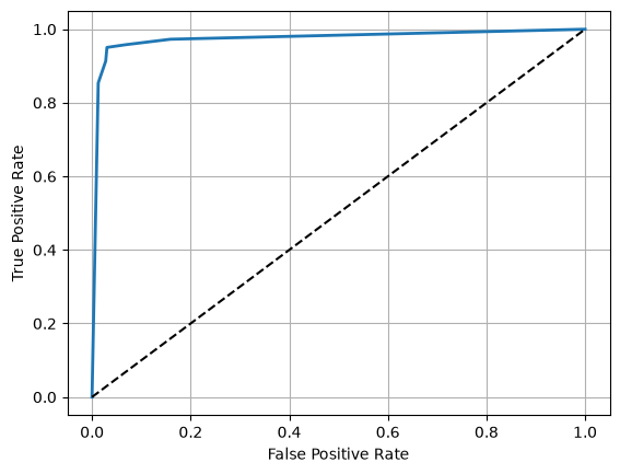
We now explore the different classifiers packaged in scikit-learn. We can systematically test their performance and save the precision, recall, and F1 scores.
A word of caution on one entry: GaussianProcessClassifier training scales as with the number of samples. It is fine here at , but it is a trap on real detection catalogs, which routinely hold 105 to 106 windows.
from sklearn.svm import SVC
from sklearn.gaussian_process import GaussianProcessClassifier
from sklearn.gaussian_process.kernels import RBF
from sklearn.tree import DecisionTreeClassifier
from sklearn.ensemble import RandomForestClassifier, AdaBoostClassifier
from sklearn.naive_bayes import GaussianNB
from sklearn.discriminant_analysis import QuadraticDiscriminantAnalysis

# define models
names = [
    "Nearest Neighbors",
    "Linear SVM",
    "RBF SVM",
    "Gaussian Process",
    "Decision Tree",
    "Random Forest",
    "AdaBoost",
    "Naive Bayes",
    "QDA",
]

classifiers = [
    KNeighborsClassifier(7),
    SVC(kernel="linear", C=0.025),
    SVC(gamma=2, C=1),
    GaussianProcessClassifier(1.0 * RBF(1.0)),
    DecisionTreeClassifier(max_depth=5),
    RandomForestClassifier(max_depth=5, n_estimators=10, max_features=1),
    AdaBoostClassifier(),
    GaussianNB(),
    QuadraticDiscriminantAnalysis(),
]
3. Model exploration
Explore How each of these models perform on the synthetic data.
Save in an array the precision, recall, F1 score values.
Find the best performing model
# reuse the train/test split and train-fit scaling from section 1
pre=np.zeros(len(classifiers))
rec=np.zeros(len(classifiers))
f1=np.zeros(len(classifiers))

for ii,iclass in enumerate(classifiers):
    iclass.fit(X_train, y_train)
    y_test_pred=iclass.predict(X_test)
    pre[ii] =precision_score(y_test,y_test_pred)
    rec[ii] =recall_score(y_test,y_test_pred)
    f1[ii] =f1_score(y_test,y_test_pred)

df_scores=pd.DataFrame({'CLF name':names,'precision':pre,'recall':rec,'f1_score':f1})
print(df_scores)
CLF name precision recall f1_score
0 Nearest Neighbors 0.969620 0.948020 0.958698
1 Linear SVM 0.969309 0.938119 0.953459
2 RBF SVM 0.967005 0.943069 0.954887
3 Gaussian Process 0.971939 0.943069 0.957286
4 Decision Tree 0.966837 0.938119 0.952261
5 Random Forest 0.964824 0.950495 0.957606
6 AdaBoost 0.959900 0.948020 0.953923
7 Naive Bayes 0.966921 0.940594 0.953576
8 QDA 0.966921 0.940594 0.953576
Imbalanced detection: when accuracy stops meaning anything
The balanced set above was a convenient classroom fiction. On a real station, event windows are rare: most of the day is noise. We now draw 5000 windows with an event fraction of 2 percent, about 100 events among 4900 noise windows — a 1:50 imbalance. Same features, same log transform, same scaling. The split is stratified so that the rare class keeps the same proportion in train and test.
df_imb = mlgeo_synth.detector_features(n=5000, event_fraction=0.02, seed=42)
print(df_imb["label"].value_counts())

X_imb = np.column_stack([np.log10(df_imb["sta_lta"]), df_imb["spectral_centroid_hz"]])
y_imb = df_imb["label"].values

Xi_train, Xi_test, yi_train, yi_test = train_test_split(
    X_imb, y_imb, stratify=y_imb, test_size=0.4, random_state=42
)

# same discipline as before: the scaler is fit on the training split only
scaler_imb = StandardScaler().fit(Xi_train)
Xi_train = scaler_imb.transform(Xi_train)
Xi_test = scaler_imb.transform(Xi_test)

baseline = DummyClassifier(strategy="most_frequent").fit(Xi_train, yi_train)
print(f"Majority-class baseline accuracy: {baseline.score(Xi_test, yi_test):.3f}")
label
0 4900
1 100
Name: count, dtype: int64
Majority-class baseline accuracy: 0.980
The trivial predictor that never declares an event already scores 0.98. Accuracy is now useless as a metric. Let’s train two real classifiers and look at the metrics that matter for the event class.
from sklearn.linear_model import LogisticRegression
from sklearn.metrics import accuracy_score

logreg = LogisticRegression().fit(Xi_train, yi_train)
forest = RandomForestClassifier(n_estimators=100, random_state=42).fit(Xi_train, yi_train)

for name, model in [("Logistic regression", logreg), ("Random forest", forest)]:
    yp = model.predict(Xi_test)
    print(name)
    print(f"  accuracy         : {accuracy_score(yi_test, yp):.3f}")
    print(f"  precision (event): {precision_score(yi_test, yp):.3f}")
    print(f"  recall (event)   : {recall_score(yi_test, yp):.3f}")
    print(f"  F1 (event)       : {f1_score(yi_test, yp):.3f}")
Logistic regression
  accuracy         : 0.992
  precision (event): 0.929
  recall (event)   : 0.650
  F1 (event)       : 0.765
Random forest
  accuracy         : 0.992
  precision (event): 0.853
  recall (event)   : 0.725
  F1 (event)       : 0.784
Both models beat the baseline accuracy by less than one percentage point, yet they miss roughly a third of the events. Recall on the event class is the number the analyst cares about: it counts the earthquakes the detector actually catches. The trade-off is operational. A detector tuned for high recall floods the analyst with false triggers to review; a detector tuned for high precision keeps the trigger list clean but misses small events. Where to sit on that curve is a decision about analyst time and scientific cost, not a modeling detail.
We can see the whole trade-off at once by plotting the ROC curve and the precision-recall curve side by side.
from sklearn.metrics import PrecisionRecallDisplay, RocCurveDisplay

fig, (ax1, ax2) = plt.subplots(1, 2, figsize=(11, 4.5))
for name, model in [("Logistic regression", logreg), ("Random forest", forest)]:
    RocCurveDisplay.from_estimator(model, Xi_test, yi_test, ax=ax1, name=name)
    PrecisionRecallDisplay.from_estimator(model, Xi_test, yi_test, ax=ax2, name=name)
ax1.plot([0, 1], [0, 1], 'k--', linewidth=1)
ax1.set_title("ROC curve")
ax2.set_title("Precision-recall curve")
ax1.grid(True)
ax2.grid(True)
plt.tight_layout()
plt.show()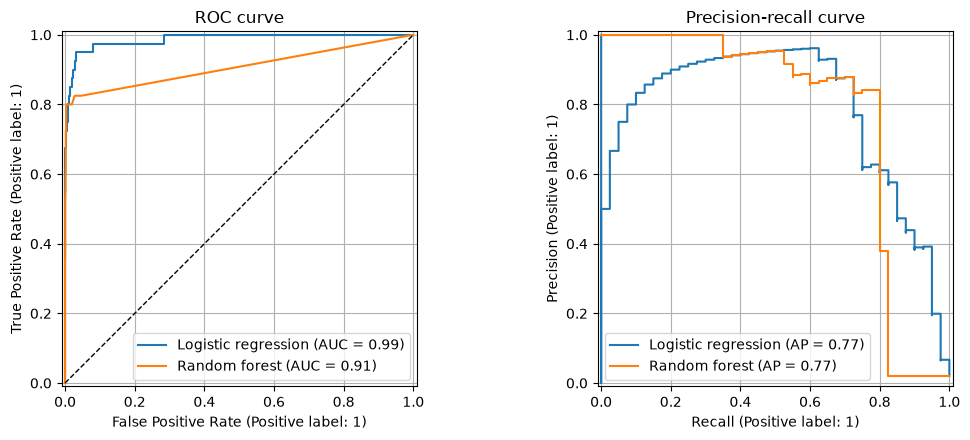
The ROC curve looks excellent, and that is exactly the problem. With a 1:50 imbalance the false-positive rate divides by the roughly 1960 noise windows in the test split, so it stays tiny even when false positives outnumber true detections. The precision-recall curve divides by the number of predicted positives instead, so it tracks the analyst’s actual workload: it drops as soon as the trigger list fills with noise. When the positive class is rare, read the PR curve, not the ROC.
Treating the imbalance
Diagnosing the imbalance is only half the job. Two standard knobs move the operating point without collecting new data:
class_weight="balanced"reweights the training loss so that each event error counts as much as roughly 49 noise errors, pushing the fitted boundary toward the rare class.- Threshold moving:
predictcuts the predicted probability at 0.5, but nothing forces that choice. Lowering the threshold trades precision for recall along the curve we just plotted.
logreg_bal = LogisticRegression(class_weight="balanced").fit(Xi_train, yi_train)

# threshold moving: same model as before, decision cut lowered from 0.5 to 0.25
proba = logreg.predict_proba(Xi_test)[:, 1]
yp_thresh = (proba >= 0.25).astype(int)

rows = []
for name, yp in [
    ("logreg, threshold 0.5", logreg.predict(Xi_test)),
    ("logreg, class_weight='balanced'", logreg_bal.predict(Xi_test)),
    ("logreg, threshold 0.25", yp_thresh),
]:
    rows.append({"model": name,
                 "precision (event)": precision_score(yi_test, yp),
                 "recall (event)": recall_score(yi_test, yp),
                 "F1 (event)": f1_score(yi_test, yp)})
pd.DataFrame(rows).round(3)Both knobs raise event recall by paying with precision: the trigger list gets longer, but fewer events are missed. Neither is “better” — they slide along the same precision-recall curve, and the choice of operating point belongs to the analyst, not the model.
Closing
The choice of metric is a design decision, not an afterthought. It encodes the operational cost of each error type: a missed event costs science, a false trigger costs analyst time. Decide what each error costs in your application, pick the metric that prices it, and only then compare models.